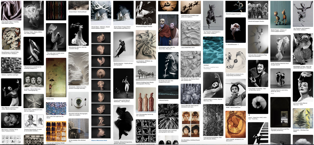
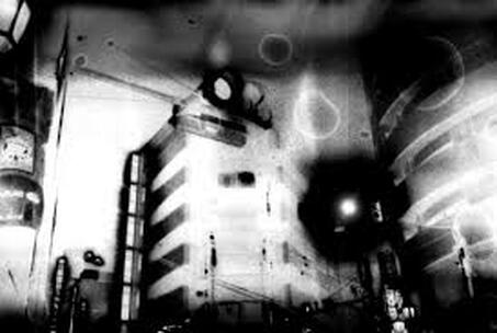
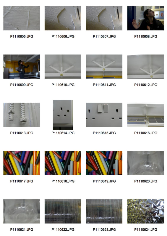
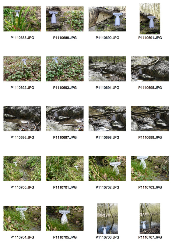
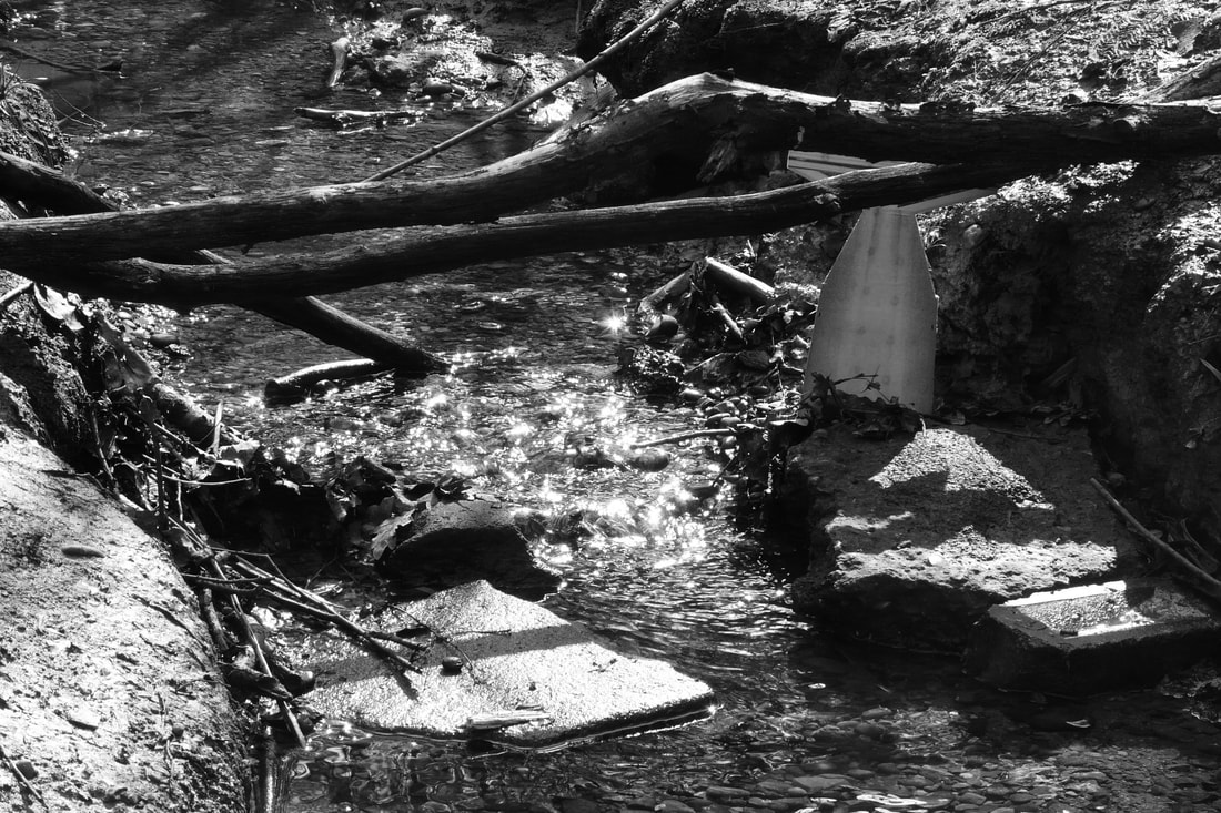
- Mime
- movement
- Contemporary dance/movement with fabric, other textures
- moving fabric
- puppetry
- shadow puppetry
- drama
- theatre
- animation
- of people moving
- smaller characters?
- typology
Exhibition: Don McCullin a the Tate Britain:
|
Don McCullin: 1935- present
McCullin was born into an impoverished family in Finsbury Park, London. His father died when he was about 13 and his mother when he was in his early 20s. Having a difficult childhood he found that he had to "make the most of things when [he] had nothing". He joined the National Service in the RAF at age 15. After several postings across the world, McCullin came back to Finsbury Park with his very own twin reflex Rolleicord camera. Here, in 1959, he photographed some young men from a local gang, 'The Guv'nors", who were involved in a murder. After some persuasion, he took it to The Observer; it was his first ever published photograph which then lead to him taking up a contract with The Observer in 1961. This exhbition began with McCullin's photographs in his home town, London, and then spanned across the conflict he covered in Berlin, Biafra, Cyprus and Vietnam, to name a few. It then finished off with images from the area he holds dearest, 'Bradford and the North', and finally some poetic landscapes which somewhat contrasted the horrors of the rooms before. Some prominent themes within McCullin's work include the divisions of classes and groups within society and England as a nation, crossing cultures, the chaos of people, war, starvation or malnutrition, death and devastation. These all explore and present the variations, but also similarities, within society, within the way that humans strive for the survival, of not only themselves, but of what they believe in. In 'Body of a North Vietnamese soldier, Hue 1968', the viewer is presented with the corpse of the soldier facing the camera in the background with a small display of their possessions in front of them, in the foreground. This is the only image that McCullin has ever manipulated. After walking across the battlefield in Vietnam, McCullin witnessed 2 American soldiers stealing from the dead body in the photo, he was furious, disturbed and sick to the stomach. Having overheard the soldiers call the man a 'dead gook', McCullin thought "he deserved a voice. He couldn't speak so I was going to do it for him." McCullin then arranged the dead soldier's belongings- trampled pictures of his sister and mother and some other children. Although the image isn't exactly a true documentation of the original scene, the viewer is thrown into an overwhelming sense of sympathy and even loss, imagining the family and the life of the soldier before the devastation of war. The use of having both the authentic photos and the body in one image, rather than one or the other, smacks us with some sort of understanding of the pain and shock that McCullin (and so many others) must have felt. |
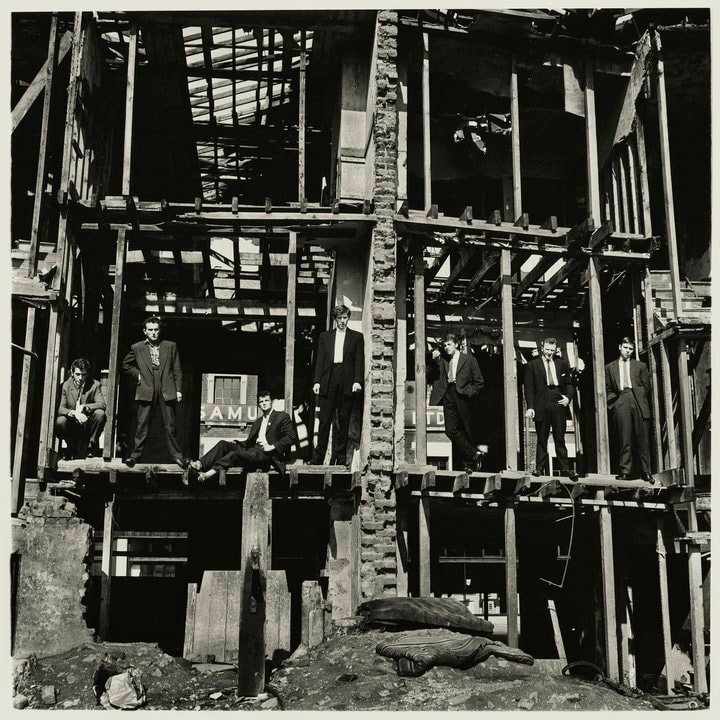
The Guv'nors in their Sunday suits, Finsbury Park, London, 1958
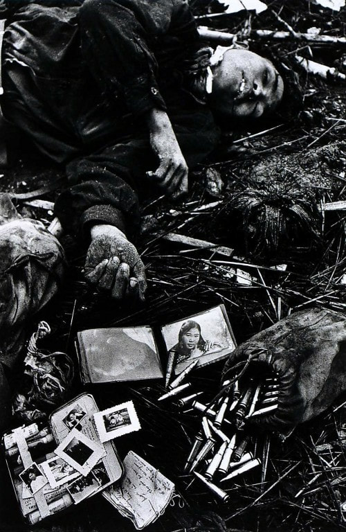
Body of a North Vietnamese soldier, Hue 1968
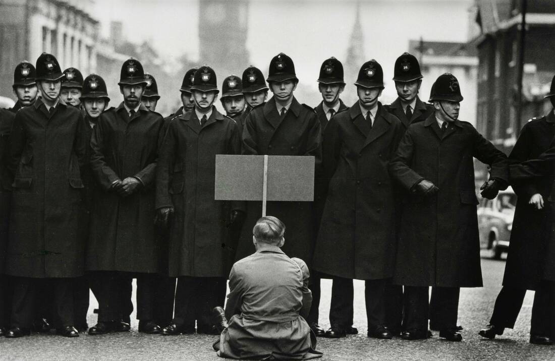
Protester, Cuban Missile Crisis, Whitehall, London, 1963
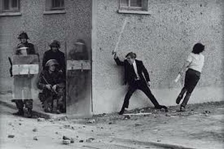
Catholic Youths Attacking British Soldiers in the Bogside of Londonderry, 1971
|
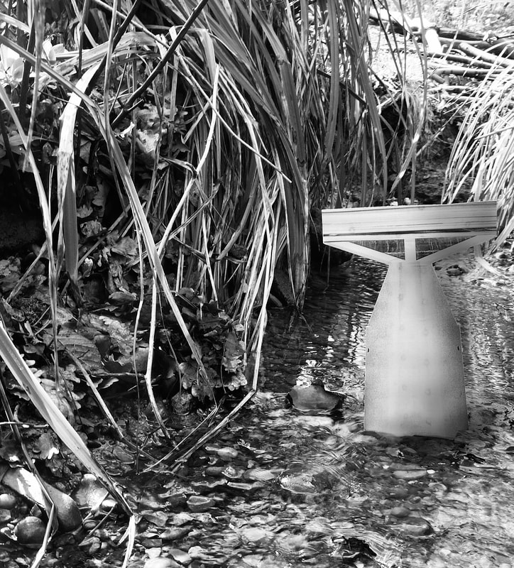
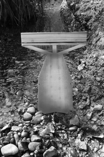
Task 1: Typology
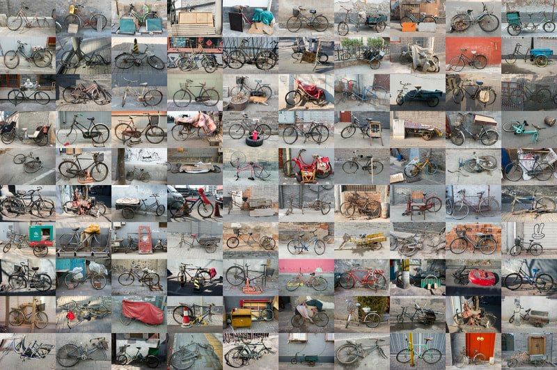
Zhao Xiaomeng: 1987-present
Xiaomeng was born in Beijing, China and is based between Beijing and Toronto. His typology work consists of rusty bikes that have been thrown aside in Beijing, the city that was once known as the "Kingdom of Bicycles". He talks about how "for decades bicycles were... an essential part of Chinese culture" however "car culture has broken into China" and now "cycling has been reduced to a sign of the socially vulnerable groups". Xiaomeng, touched by this change of fashion of transport decided to go looking for these lost bikes that are "witnesses and victims of a major societal transition in China." He uses these bikes as metaphors for the way in which the people of China are coping with the shifts that them and their country are undergoing each day, since even though the bicycle has lost its use and need, we can still find them locked up and perched along the pavements of Beijing.
Xiaomeng was born in Beijing, China and is based between Beijing and Toronto. His typology work consists of rusty bikes that have been thrown aside in Beijing, the city that was once known as the "Kingdom of Bicycles". He talks about how "for decades bicycles were... an essential part of Chinese culture" however "car culture has broken into China" and now "cycling has been reduced to a sign of the socially vulnerable groups". Xiaomeng, touched by this change of fashion of transport decided to go looking for these lost bikes that are "witnesses and victims of a major societal transition in China." He uses these bikes as metaphors for the way in which the people of China are coping with the shifts that them and their country are undergoing each day, since even though the bicycle has lost its use and need, we can still find them locked up and perched along the pavements of Beijing.
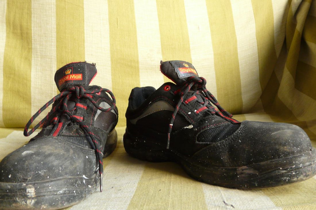
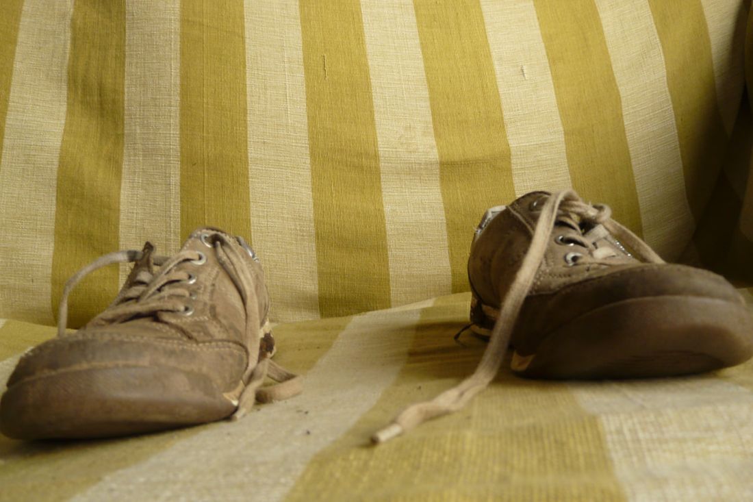
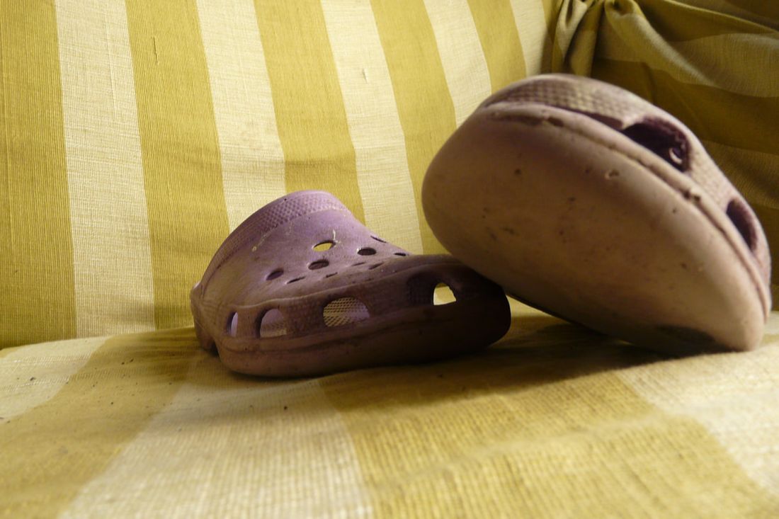
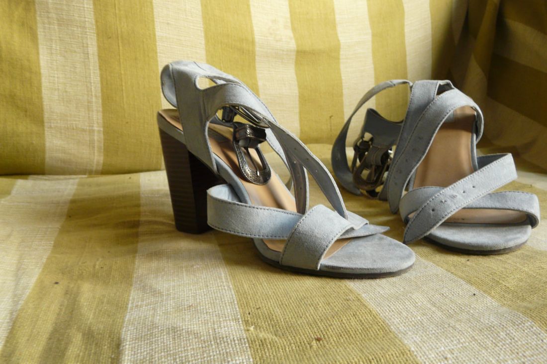
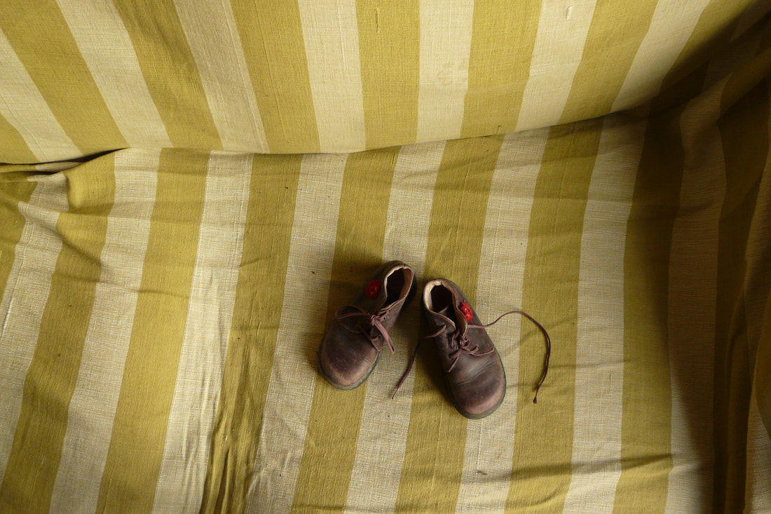
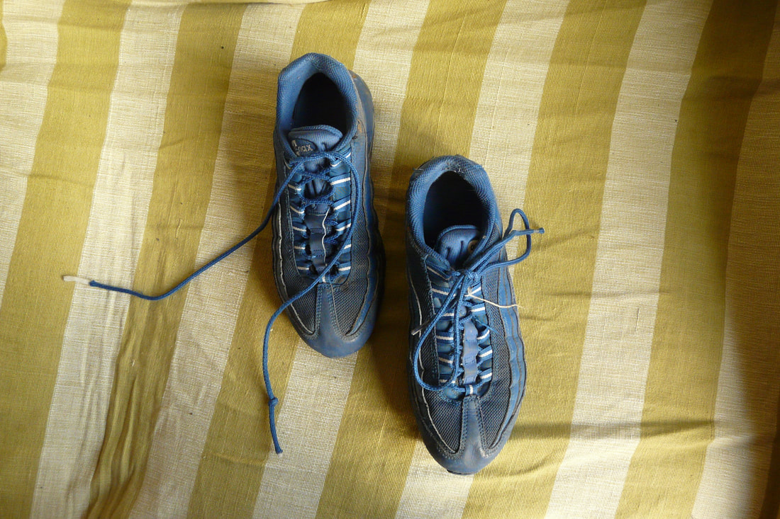
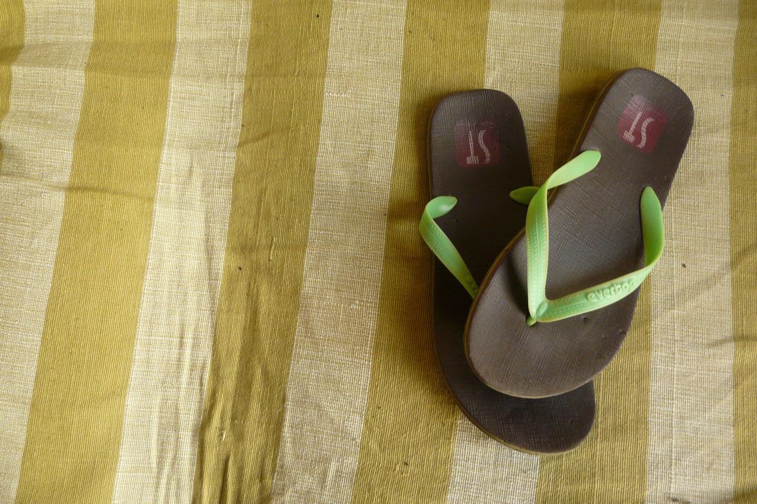
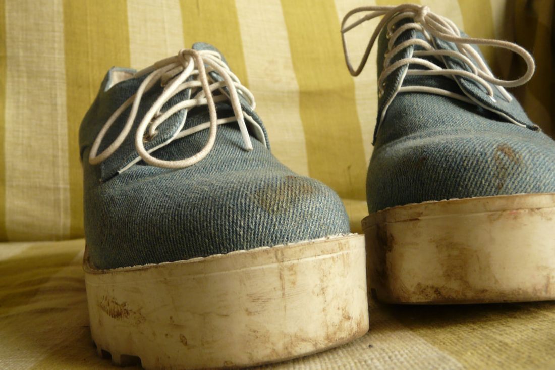
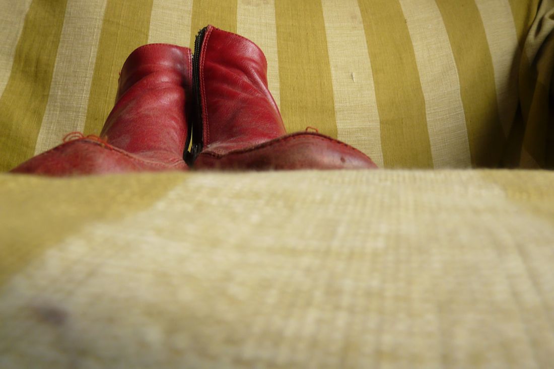
In response to Zhao Xiaomeng's typology of bicycles, I decided to create a typology of the shoes in my house. While photographing these shoes, I wanted to capture each character that they, and their owner, might hold. For example, the working Postman's shoe stands strong, with the toes very close to the camera in the foreground, creating a sense of ownership and pride; the high heels, however, are placed with the left and right shoe swapped over and the toes pointing in, presenting a perhaps bold teenager or young woman who also has an underlying sense of fear. The baby's shoes in the middle are in the same position as the first image, showing their confidence and even naivety, yet it is photographed at a distance to mark how small they are and how little they know about the world so far.
|
|
|
This typology could be improved if there were more images to add to the collection, similarly to Zhao Xiaomeng's work, so that these shoes, with their personalities, can engross the viewer.
Task 2: Focus
|
Ralph Eugene Meatyard: 1925-1972
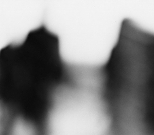
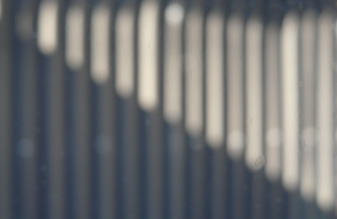
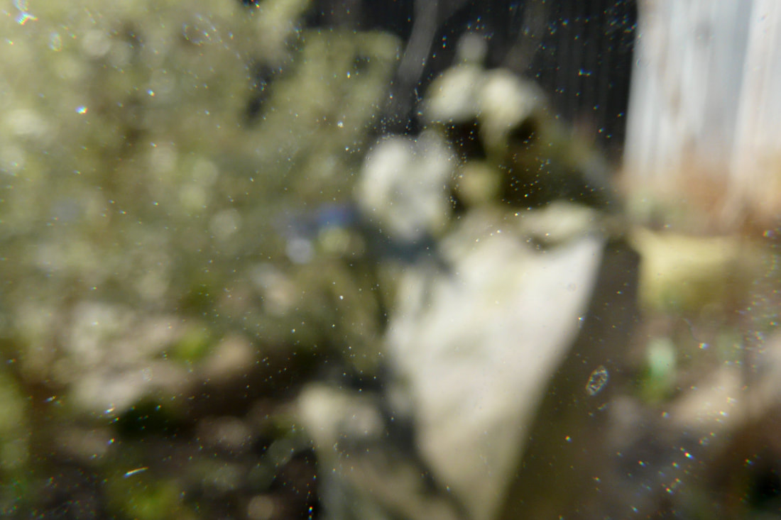
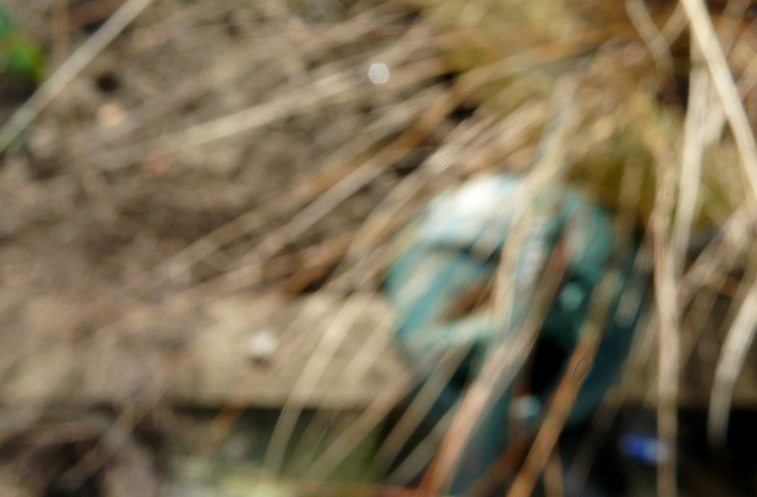
Meatyard was born in Normal, Illinois, US. At age 18 he joined the US Navy but did not serve overseas. He studied dentistry at Williams College but did not get a degree. Later, in 1949, he earned a license to become an optician and so moved to Lexington, Kentucky where he continued this profession. Meatyard bought his first camera when his first child was born so as to capture the fleeting moments of his children growing up. In 1954, he then became a member of Lexington Camera Club and the Photographic Society of America which was where he met Ven Derek Coke- a curator, writer and photographer- who inspired much of is work. He died at age 47 from cancer. One of Meatyard's small series is called 'No-Focus'. We can see that, much like in his other series', the images feature figures that are manipulated and distorted; in 'The Family Album of Lucybelle Crater' he uses creepy masks to cover the faces and identity of the people whereas here he uses the abstract compositions of the strong black and white shapes created through the lens being extremely out of focus. By using this technique, he delves into themes such as ambiguity and obscurity creating an uneasiness within the viewer as we cannot work out what it is we are looking at and the story of the figures which appear to be coming straight towards the camera. In this task I will explore this idea of ambiguity through photographing objects around the garden out of focus. |
|
|
|
Picture 2 presents the theme ambiguity well as it is very difficult to decipher what the object in the image is, fulfilling the intention of the task. Like Meatyard's images, there is also a strong contrast between the light and dark tones such as the dark holes and then where the sunlight hits the side of the object. Unfortunately, because of the change in focus, all the dirt on the lens across the image is visible which distracts from the actual subject of the image. I could have avoided this by cleaning the lens before hand or using the clone stamp tool on Photoshop, however, this technique would have taken a very long time considering how much dirt there is. The dirt also adds another texture and layer to the image making it feel as if we, the viewer, are looking through a screen to see this object, accentuating the fact that the identity of the object is separate and hidden from us.
1
|
2
|
3
|
4
|
5
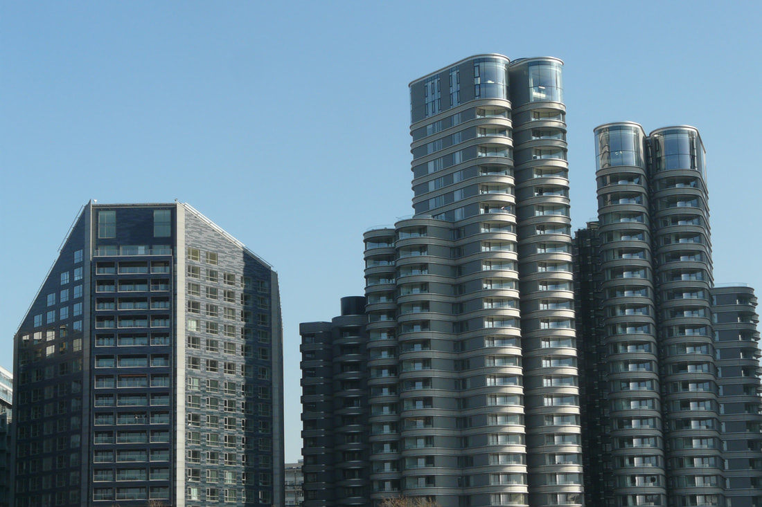
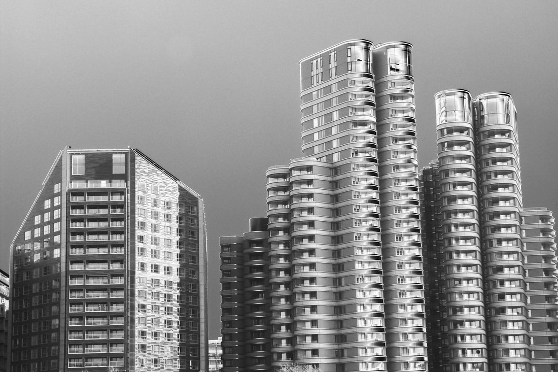
Task 3: City
|
Antony Cairns: 1980-present
Cairns was born in London, where he earned a Ba in Photography at the London College of Printing where he studied from 1999-2002. Cairns is known for his original and unusual depictions of the "city", noting that he doesn't want to capture each city as individuals but rather the "ambience and atmosphere of cities in general". He began this journey in his home town, London, originally photographing some historical buildings including old, neglected and closed-down pubs or vintage shops. Unfortunately, he found that "huge conglomerate mega-complexes" were being built where these places once stood, changing the dynamic of the city. Cairns would attempt to photograph these modern buildings, but since they tend to be owned by property developers, he would be told that he would have to have permission. This pushed him to sneak around at night and use a much smaller electronic camera. The mix of these two elements created more abstract imagery than he had done previously. Cairns then took this approach to cities in other countries where he noticed the same changes being made, such as Tokyo, Osaka, LA and Las Vegas. Cairns has a strange and innovate way of presenting his images. He hacks into the e-readers that he has bought second-hand from eBay, uploads his images and due to a current in the e-readers, the Electronic Ink is stimulated causing it to arrange itself on the image. He then takes the screen off which causes the ink to stay in its position permanently. The cold, metallic effect reflects the unfriendly, and even unsympathetic, attitude of the modern architecture which becomes alienated from the viewer and loses its identity. This is emphasised by the dirt and watermark-like-marks on the surface of the image, forming a division between us and the landscape. The theme 'Variations and Similarities' is portrayed through our different perceptions of the globalisation and industrialisation that has taken over our world- whether it's beneficial or destructive. It is also shown through the use of the abnormal effect that is put on the picture, referring to the alternative ways in which one can present an image. |
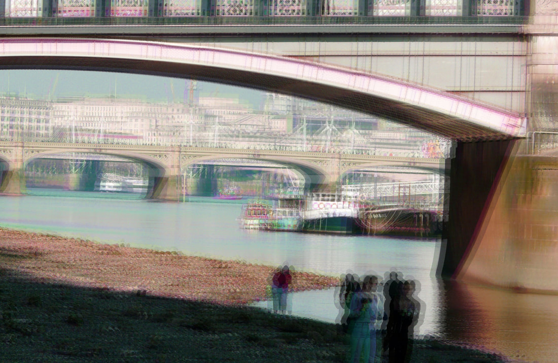
In my response, I walked the streets of Central London to capture a variety structures. Since I do not have the same resources as Cairns, the post-manipulation was difficult. I found it a challenge to replicate the same effects present in Cairns work so I attempted a few alternative ways using Photoshop. At first I duplicated the image several times, slightly changing each copy's position to create an impression of movement, and lowered their opacity to make them more transparent allowing each layer to be visible. I then changed the saturation of each copy which resulted in an interesting mixture of colours.
A different technique I used was to solarise the image by first all making it black and white and then changing the 'curves' so that the tones are reversed. This created something slightly closer to Cairn's. However, I decided to duplicate the original coloured image and lower its opacity so that the solarised image had flickers of colour in it, forming a warmer, more friendly image. |
|
|
|
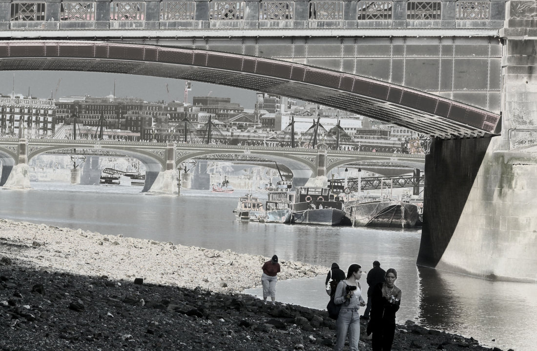
1.1 original
|
1.2 change in saturation
|
1.3 solarised
|
1.4 solarised with colour
|
2.1 original
2.3 solarised
|
2.2 change in saturation
2.4 solarised with colour
|
The solarisation seemed to work best and be the most obvious for 2.3, probably due to the simplicity and minimalism of the image, in contrast to 4.3 where there is too much information to take in all at once. The intense contrast in 2.3 interestingly creates a much flatter image formed by the somewhat geometric shapes of the concrete. The image could be improved through having a more balanced composition since everything seems to be placed on the right, perhaps if the concrete block in the background was placed in the left corner, the picture would feel more comfortable for the eyes.
3.1 original
|
3.2 change in saturation & duplicated
|
4.1 original
4.3 solarised
5.1 original
|
4.2 change in saturation & duplicated
4.4 solarised with colour
5.2 solarised
|
5.3 solarised with colour
Due to the way that I have solarised 5.1 and then added the partially transparent layer of colour, 5.3 has a strange effect on the viewer which contrasts with Cairn's work. This image presents a much softer, delicate side of the high-rise buildings created through the greyish-blue tones that give a relatively smooth transaction between the dark and lights of the photo. The landscape becomes quite inviting unlike 5.2 which has a much sharper quality. The series number 5 might be improved if the whole image was straightened to make it feel neater which would then reflect the symmetry and even a 'perfection' found in modern architecture.
Task 4: Google maps
Paraic McGloughlin: present
McGloughlin, an Ireland-based artist, earned a BA in painting from the University of Fine art, Poznan, Poland.
Although his focus lies in painting portraits, McGloughlin is known for his intense animations that he makes using Google Earth. Interested in the impact that humans leave on the planet: the patterns and shapes we create through our structure, and the change from the natural landscape to the 'architectural systems' of the cityscapes, he focuses on the images that contain flat lines, symmetry and grids for his frames. He begins by already drafting animations of lines which he uses as a base for the Google Earth images, placing them on top of the draft. He then found that the animation started to 'grow' on its own.
Since his brother is a musician, McGloughlin was able to create a piece of music especially to accompany his animations. They made a 'pulsating track' which included snippets of 'random sounds of daily existence' which emphasises the chaotic life on Earth, imposing McGloughlin's intentions through a double media which as a whole engulfs the viewer- "I was hoping to evoke something of the unknown or something of what it is to be alive".
In my own interpretations of the Google Earth animations, I decided to use both (relatively) natural landscapes and cityscapes. 1 begins in the southern Italian country following ploughed engravings in the ground, then it passes over a small 'Saltee island'- a small island off the coast of Ireland, completing the journey following the main river in Antwerp, Belgium. As I have visited all these places, I thought it would be interesting to see them from a different perspective from a bird's eye view. Imitating McGloughlin's technique, each time I screen-grabbed the images I rotated and moved the view point, following a particular mark (such as the river) so as to create the feeling of movement which allows the change in landscape to feel more natural.
Unfortunately, as I don't have access to a musician like McGloughlin does, I was not able to create a soundtrack to fit my animations so I decided to leave it silent. The animations could be more successful if there were more frames making them longer and if I had used more frames per second so that the transitions between each change in movement were smoother and less jumpy.
Unfortunately, as I don't have access to a musician like McGloughlin does, I was not able to create a soundtrack to fit my animations so I decided to leave it silent. The animations could be more successful if there were more frames making them longer and if I had used more frames per second so that the transitions between each change in movement were smoother and less jumpy.
1
2
Task 5: Variations in layers & parts
|
Noémie Goudal: 1984-present
Born in Paris, at the age of 19 Goudal moved to London to study Graphic Design at Central Saint Martins. She then completed her masters in art photography at the Royal College of Art. She photographs parts of buildings from all over the world, recreates a new building of her own design by montaging sections together, and then places them in a new setting such as the seaside with a watery, reflective ground. This creates the illusion that these buildings really do exist and belong in that environment and also takes the attention away from the details of the card 'buildings' and the fact that they are not actually real. Through Photoshop, Goudal manipulates the images to create the impression that they are 3D constructions by adding in lights and darks to emphasise the appearance of shadows. Goudal's inspiration for her work comes from other mediums, in particular Gilles Deleuze's essay 'Desert Islands'. In this essay, Deleuze touches upon 2 types of islands- continental and oceanic- and poetically describes what they show about the sea and the earth; "oceanic islands [serve as a reminder] that the earth is still there, under the sea, gathering its strength to punch through to the surface". Goudal's series Haven Her Body Was, reflects this concept of the seemingly concrete constructions piercing unexpectedly through the sea, becoming an island of its own. |
|
|
|
For my interpretation, I began by photographing sections of the school so as to then create a building out of the interesting formations within the images. At first, I struggled to imagine and create a new building but when I decided to base my construction on a water tower, I found it easier to find the correct shapes and montage them together in a somewhat coherent way. I decided to make the image black and white to try and merge all the parts together smoothly; although there is still a sense that it is made out of different parts just stuck together, the black and white adds to the illusion that it really is one whole image. I also found it difficult to make the construction appear 3D because of the sharp endings where there should be curves which would usually create the appearance that something is spherical in some way. However, the image resembles a water tower well.
|
|
|
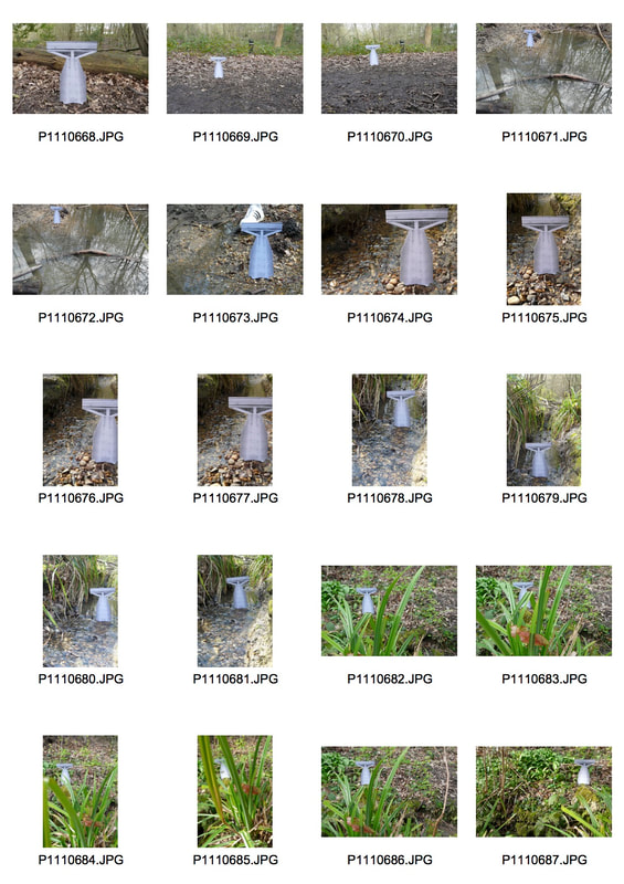
I went to a local wood to photograph my 'water tower' in the environment in an attempt to make the construction more realistic. This still proved to be a challenge as I had to closely consider the point of view and the distance I had to take the picture from so that my water tower didn't look like the cardboard cutout it is. Since the water tower already has its own change in tonality and its own highlights, the shadows don't match the rest of its surroundings so I post-manipulated the image in Photoshop to try to make the water tower 3D and fit the environment. I then made it black & white on Photoshop by going to image>mode>greyscale to remove some of the identity of the cutout.
The water flowing over the stones in the foreground of 1 & 2 create a contrasting texture to the water tower, taking the viewer's attention away from the cardboard cutout. However, overall, the images are unsuccessful since, unlike Goudal's work, the construction doesn't merge into its surroundings which defeats the point of the task.
The water flowing over the stones in the foreground of 1 & 2 create a contrasting texture to the water tower, taking the viewer's attention away from the cardboard cutout. However, overall, the images are unsuccessful since, unlike Goudal's work, the construction doesn't merge into its surroundings which defeats the point of the task.
1
|
2
|
3
|
4
|
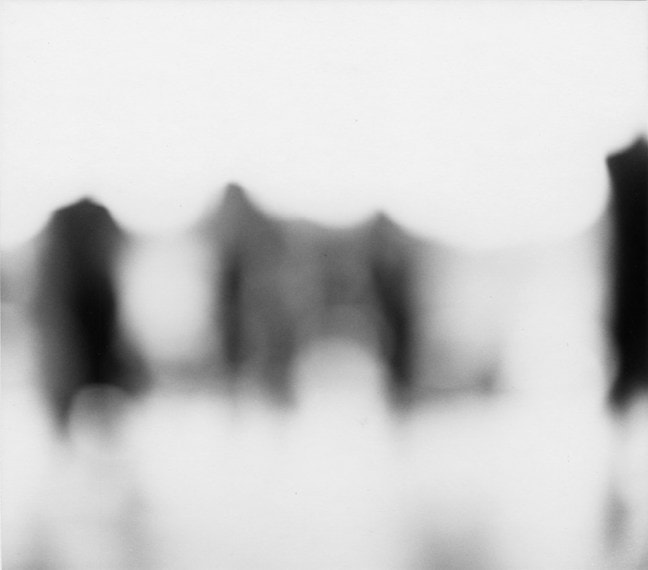
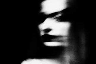
Task 6: Shadow and light portrait
|
Valerie Kabis:
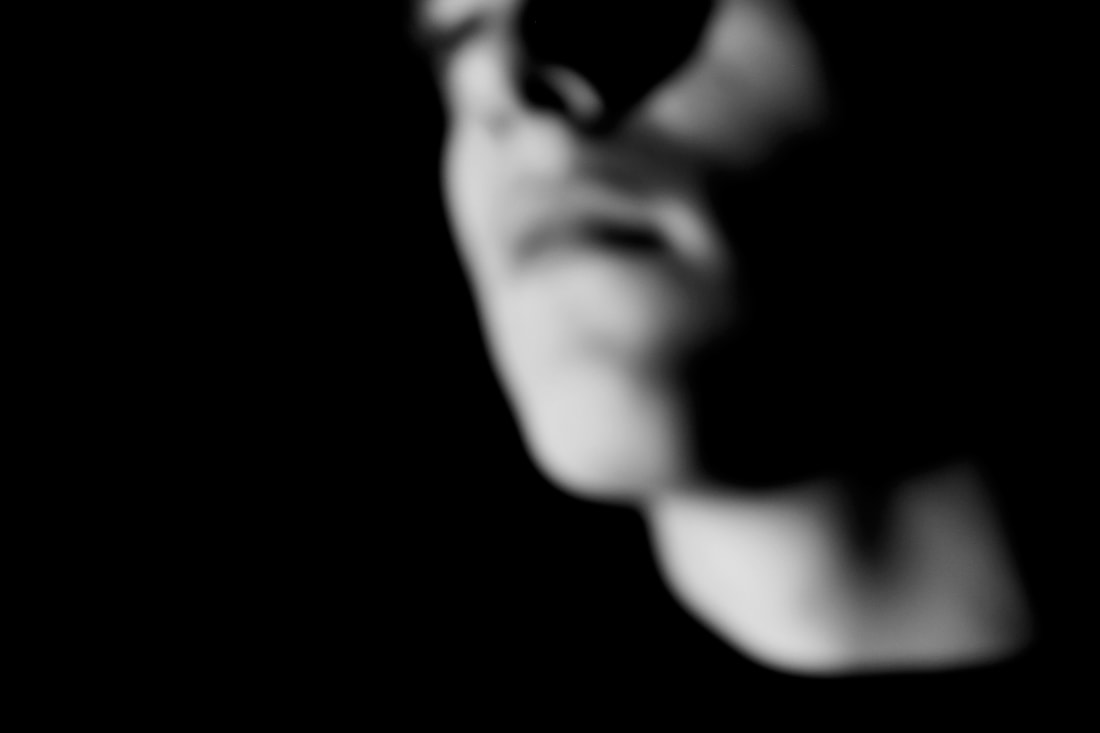
Kabis' works comprise of black and white images of faces, void of any information other than the face in question. Through using an artificial strong white light source, Kabis plays around with how the different lights and shadows fall on to a persons face, accentuating or covering their features. The extreme contrasts create abstract forms within the image, somewhat removing the person's identity. Kabis blurs the photo which adds to the concept of separating recognition from the image we are presented with, striking the viewer with an unsettling feeling. In response to her work, I will photograph a figure in the same light conditions, first in colour and then I will post-manipulate it in Photoshop, changing it to 'greyscale'. To intensify the abstract forms created by the shapes of light, I will blur the image, like Kabis has done, in Photoshop using the "gaussian blur" tool in hope to have more control over the image. |
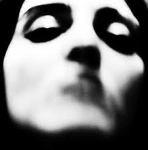
|
1
2
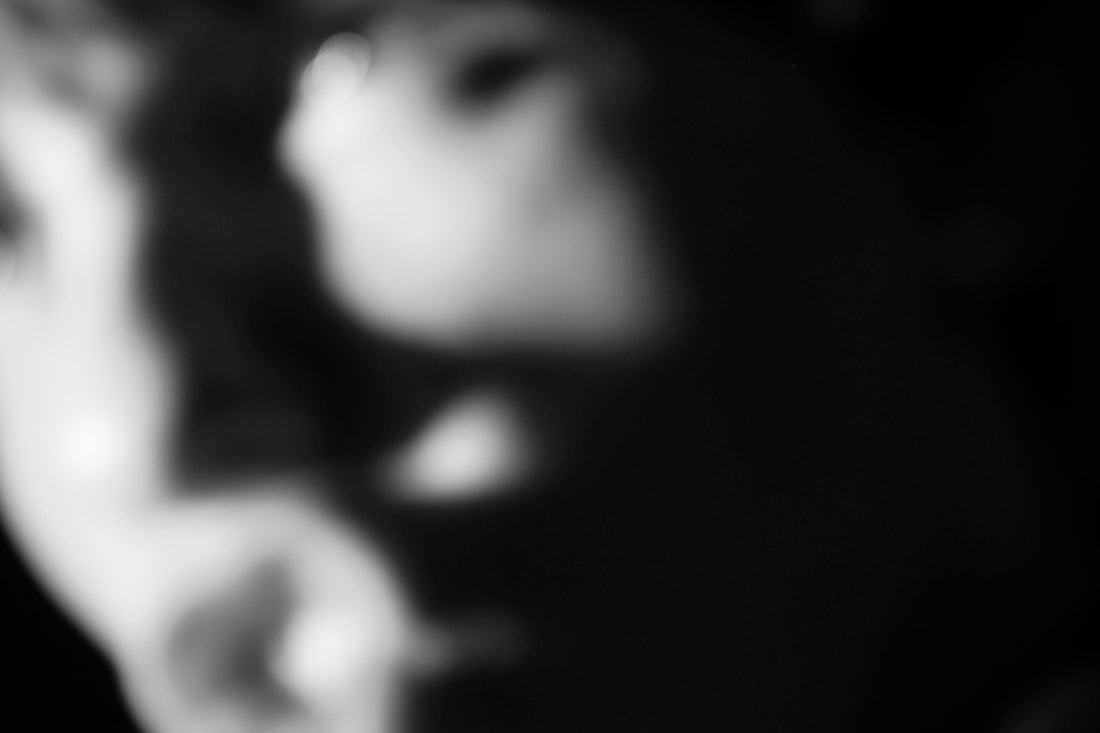
Photo 2 fits my brief for this task since I managed to photograph a face using extreme light conditions and then use gaussian blur to remove certain features, successfully creating quite an abstract form similar to Kabis'. I enhanced the contrast in Photoshop by first going to adjustments>curves and placing the curve into an 'S' shape. I then added to the contrasts appropriately through adjustments>levels. The composition of the frame having a large amount of negative space on the right causes the face to either feel like it is becoming lost to the darkness or it is emerging from it - this creates quite a surreal image, reflecting the chilling 'strangeness' of Kabis' photographs. However, I have overused the contrast and gaussian blur tool on Photoshop causing the product to lose any sense of there really being a person there creating an image that is too abstract for the task.
3
Photo 3 has not successfully met my intentions for this task. I have not created enough contrast or 'gaussian blur' for the image to become sufficiently abstract like Kabis' photographs. Due to the way in which I changed the contrast through adjustments>curves, the negative space is strangely coloured with lines showing the change in tones - this means the photo is bad quality. The composition of the figure in the space, looking down, alongside the quite soft, greyish tones of the image creates a tranquil atmosphere, unlike my other photos for this task, which I would like to recreate later in this unit.
3 Strands:
Strand 1: The Body and Shapes
|
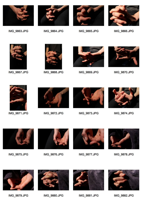
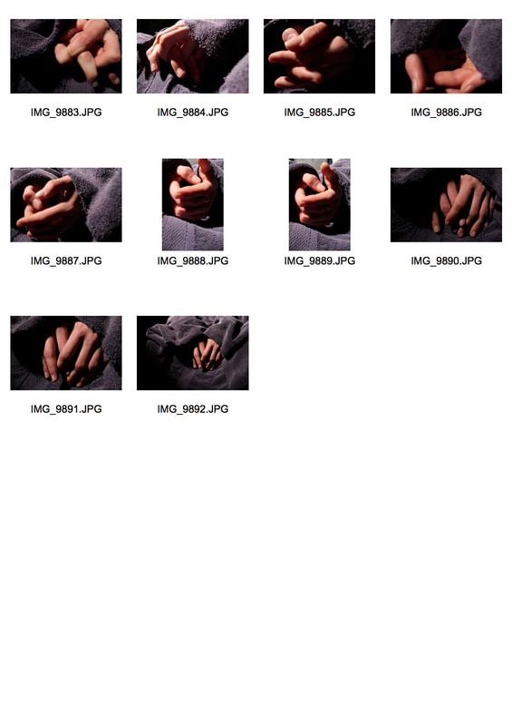
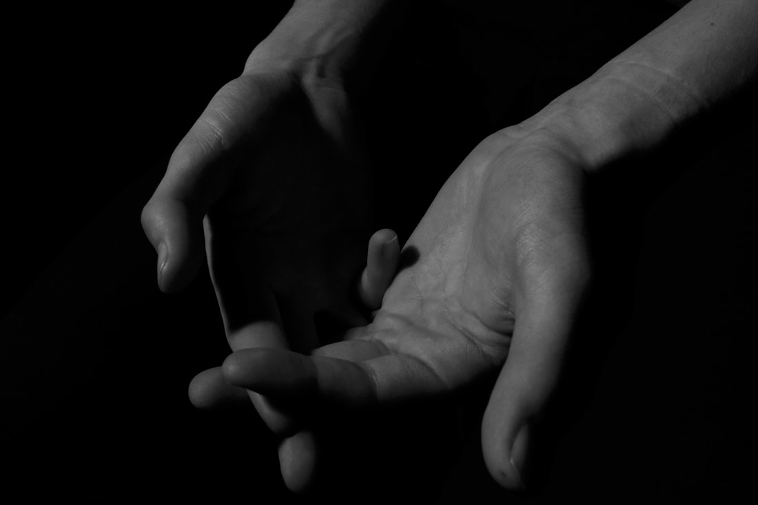
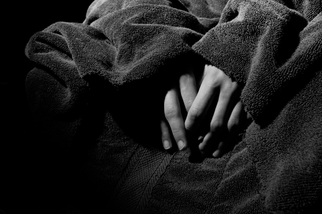
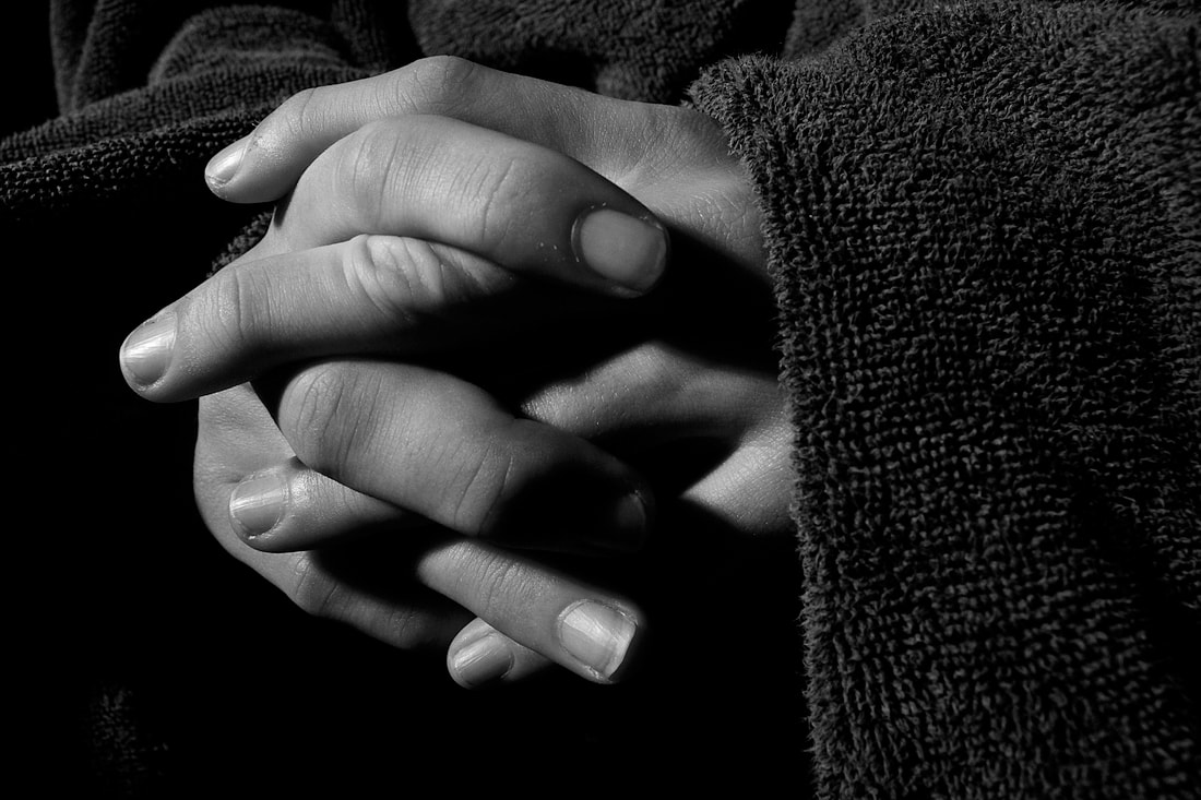
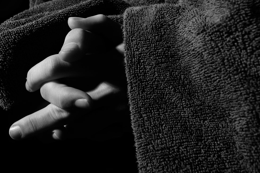
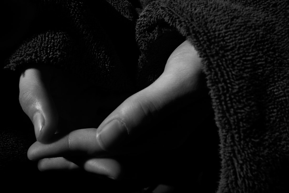
In this strand I want to expand on my last task and explore the way that light and shadow falls on a pair of hands, hopefully creating quite abstract imagery. I am inspired my one image of Don McCullin's, 'Jean's hands', that I saw at the Tate Modern exhibition earlier this year. I want to explore the variations in the grooves of the hands.
McCullin photographed Jean, a woman made homeless from the closing down of a psychiatric hospital in Whitechapel, London. The lighting in this photo creates a great contrast which emphasises the creases and folds of Jean's hands and fingers, revealing the cruel reality of her living conditions. This composition of the hands being right in the centre of the frame causes the viewer to |
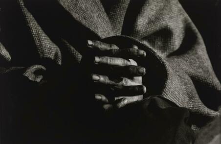
immediately analyse their quality. They then regard the state in which their own hands are in and compare their living situations which in turn highlights the struggle that people like Jean must go through.
|
|
|
1
2
I decided to take these photos in colour and then post-manipulate them in Photoshop giving me more control over the style of black & white I want and the intensity of the contrast. I did this by going to adjustments>mode>greyscale and then adjustments>curves. 2 has successfully achieved my intention for this strand as the strong contrast is present, changing the form of both the hands and the undulating folds of the towel. Unlike McCullin's photograph, however, 2 is quite surreal due to the way the hands appear out of the towel unexpectedly, causing them to take another, quite creature-like, form. The composition is also too similar to 'Jean's hands' and it would have been more interesting to see and explore the hands being placed, or clasped together, in a different way.
3
|
4
|
5
Strand 2: Animation
|
Pes:
Pes is a stop motion animator and director who has created some animations that have been the most widely viewed in the world. On Youtube, his films have been viewed over 450,000,000 times. He has been nominated for and won many awards and honours including an Academy Award nomination for 'Fresh Guacamole'. |
|
Pes grew up in New Jersey. He has has always had a creative drive and a fascination for children's books, so much so he considered becoming a writer or illustrator for them. Although he did not take this specific route, his stop-motion animations have a certain child-like quality as he distorts our perception of the world, using relatively ordinary objects and transforming the role they play.
In 'Fresh Guacamole', a hand picks up a hand grenade, cuts it in half and scoops out its innards as if it were an avocado. He then reaches for a golf ball, which in this scenario is an onion, and dices it which in turn causes the chunks of golf ball to become die. This play on role, using objects that we would generally find in our house and treating them as something very different or giving them life, creates a comical side to the animation, allowing the viewer to indulge in the strange surrealism of it all. The fact that his animations are also quite short, only ever a minute long, means that the viewer can return, re-watch, and enjoy it a few more times.
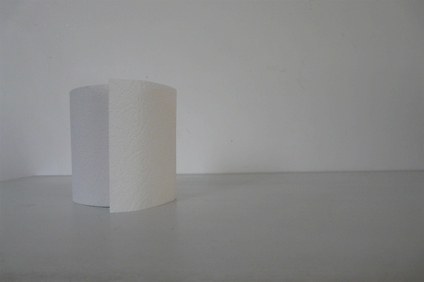
For this strand I want to explore the possibilities of variations through different frames of the same object in stop-motion animation. I want to animate a roll of toilet paper unravelling itself. As I have not created a stop-motion animation before, I will use this strand to experiment with how many frames I will need and how much I can move the toilet roll between each frame. I also envision this animation or gif to have a very simple composition with a minimal amount of colour or tone. This will allow me to focus purely on the movement of the toilet roll.
In 'Fresh Guacamole', a hand picks up a hand grenade, cuts it in half and scoops out its innards as if it were an avocado. He then reaches for a golf ball, which in this scenario is an onion, and dices it which in turn causes the chunks of golf ball to become die. This play on role, using objects that we would generally find in our house and treating them as something very different or giving them life, creates a comical side to the animation, allowing the viewer to indulge in the strange surrealism of it all. The fact that his animations are also quite short, only ever a minute long, means that the viewer can return, re-watch, and enjoy it a few more times.
For this strand I want to explore the possibilities of variations through different frames of the same object in stop-motion animation. I want to animate a roll of toilet paper unravelling itself. As I have not created a stop-motion animation before, I will use this strand to experiment with how many frames I will need and how much I can move the toilet roll between each frame. I also envision this animation or gif to have a very simple composition with a minimal amount of colour or tone. This will allow me to focus purely on the movement of the toilet roll.
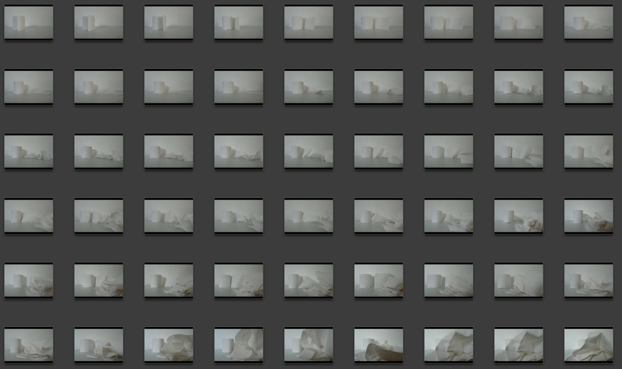
My process:
This gif has around 80 frames in it with no delay between each one giving it a satisfying length and allowing it to not be extremely jumpy. The relative smoothness between each frame was caused by me only moving the roll slightly, however, near the end of the gif when the paper covers up the lens, I found it harder to keep the pace of the moving roll steady since if I did not place the paper in a certain way, it would not have stayed in my ideal composition. This also meant that there is not a long enough time for the viewer to indulge in the paper encapsulating the lens as that part of the animation goes to quickly. This could have been resolved if I had taken more frames of the process of that section.
The somewhat 'plainness' of the gif creates quite a tranquil atmosphere as the viewer watches the toilet roll unravel over and over again, becoming hypnotised by the simple movements. It is also quite exciting when our vision of the scene becomes impaired by the paper covering up our eyes; we are then drawn to the texture and pattern of the paper allowing the viewer to appreciate the finer details of the animation.
- Take sequence of photos whilst moving object in between
- Layer each image as one file on Photoshop
- Correct the layout so that each image is perfectly placed on top of each other
- Windows>animation>make frames from layers
- Save it as a gif through file>save for web and devices
This gif has around 80 frames in it with no delay between each one giving it a satisfying length and allowing it to not be extremely jumpy. The relative smoothness between each frame was caused by me only moving the roll slightly, however, near the end of the gif when the paper covers up the lens, I found it harder to keep the pace of the moving roll steady since if I did not place the paper in a certain way, it would not have stayed in my ideal composition. This also meant that there is not a long enough time for the viewer to indulge in the paper encapsulating the lens as that part of the animation goes to quickly. This could have been resolved if I had taken more frames of the process of that section.
The somewhat 'plainness' of the gif creates quite a tranquil atmosphere as the viewer watches the toilet roll unravel over and over again, becoming hypnotised by the simple movements. It is also quite exciting when our vision of the scene becomes impaired by the paper covering up our eyes; we are then drawn to the texture and pattern of the paper allowing the viewer to appreciate the finer details of the animation.
Strand 3: Nature Morta
laura letinsky: 1962 - present
Born in Winnipeg, Canada, Letinsky went on to study Fine arts at Yale University in 1991 and now lives and works in Chicago.
She is renowned for her photographs of half eaten fruit and vegetables displayed on white cloth with their juices soaking through, alongside dirty, used plates and cutlery. Letinsky notes the association society makes between such food and the home, giving food connotations of femininity. Her desire within the 'still life' is to explore the conflict between these social constructions by showing the food and layout disrupted, without order. Letinsky challenges the illusion of perfection.
Composing her images can take up to several days, especially when Letinsky finds herself waiting for the perfect light conditions. She focuses on the pastel colours and the soft light, presenting the stereotypical side of a caring, nurturing woman which contrasts with the disorder.
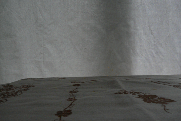
In my Strand I want to try and create a similar composition to Letinsky's, using a white cloth for a background which will make the colours of the subjects more vivid. I want to try and veer away from traditional still lifes and explore a more minimalist approach.
Born in Winnipeg, Canada, Letinsky went on to study Fine arts at Yale University in 1991 and now lives and works in Chicago.
She is renowned for her photographs of half eaten fruit and vegetables displayed on white cloth with their juices soaking through, alongside dirty, used plates and cutlery. Letinsky notes the association society makes between such food and the home, giving food connotations of femininity. Her desire within the 'still life' is to explore the conflict between these social constructions by showing the food and layout disrupted, without order. Letinsky challenges the illusion of perfection.
Composing her images can take up to several days, especially when Letinsky finds herself waiting for the perfect light conditions. She focuses on the pastel colours and the soft light, presenting the stereotypical side of a caring, nurturing woman which contrasts with the disorder.
In my Strand I want to try and create a similar composition to Letinsky's, using a white cloth for a background which will make the colours of the subjects more vivid. I want to try and veer away from traditional still lifes and explore a more minimalist approach.
|
|
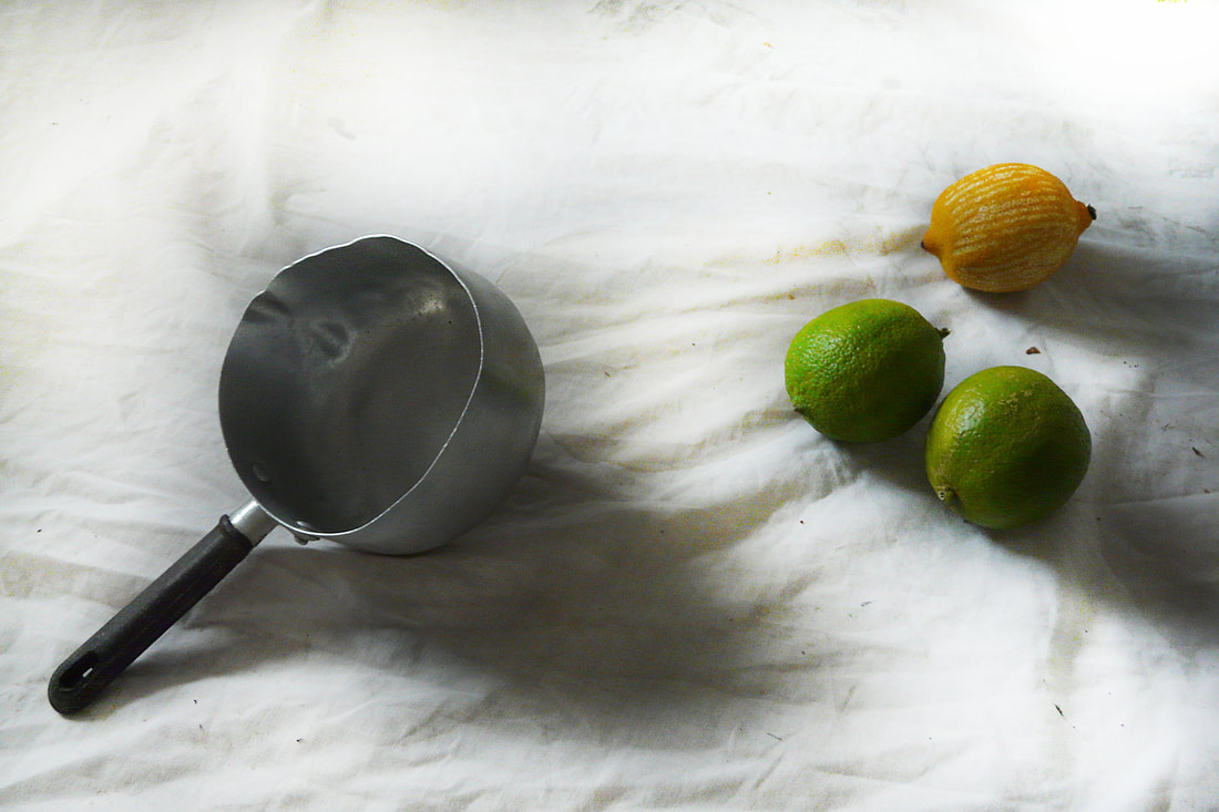
These 4 photos present the variations in light but similarity in content.
1
|
1 edit
|
2
|
2 edit
|
For a large part of my photographs for this strand, I did not achieve the minimalist I initially was searching for due to the abundance of bright, bold colours of the fruits.
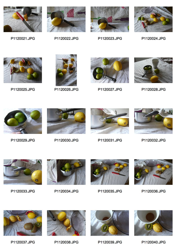
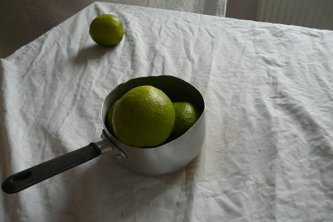
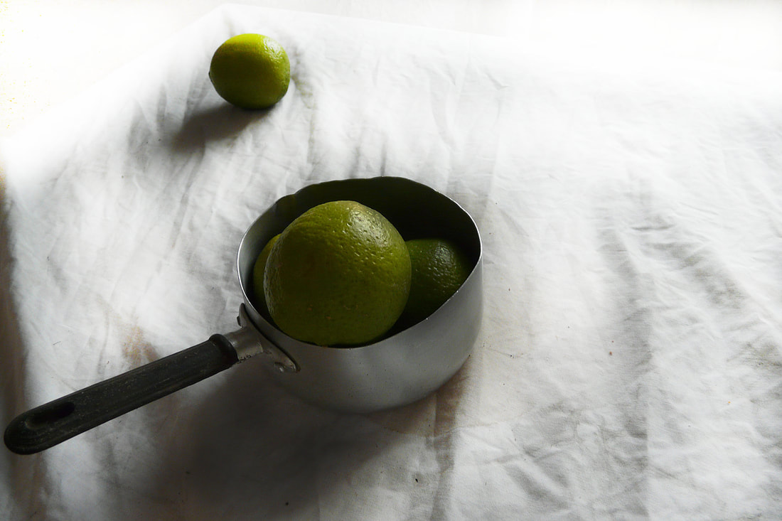
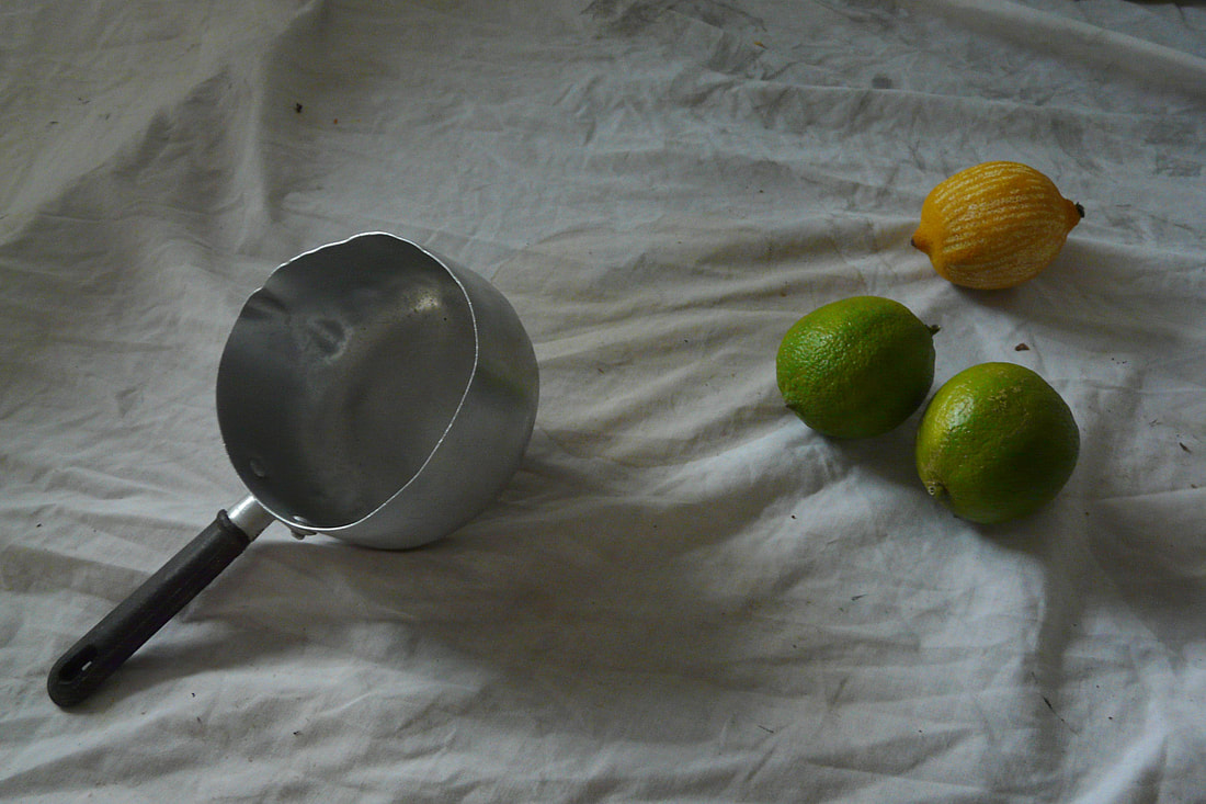
The composition of 1 plays with the way we perceive objects; the fact that the saucepan is so small, the limes placed inside appear to be giant, causing the viewer to observe the photo more closely. The way in which a triangle is created from the lime in the far corner of the table to the saucepan's handle and then finally to the other, curved, side of the saucepan forms an arrow which immediately catches the viewers eyes. In an attempt to create an image more like Letinsky's I decided to post manipulate the image in Photoshop by using the 'dodge' tool. I used it to remove the distracting 'noise' of the radiator's lines and edge of the table and then some of the detail of the cloth. This in turn accentuated the green of the lime in the distance. I then used the 'burn' tool to add some contrast where there already were shadows. Unfortunately this caused the limes in the foreground to be a much duller colour.
This photo could be improved if I removed the large shadow on the left of the frame which distracts the eye from the triangular composition of the image. The use of the 'burn' tool is quite harsh since you can obviously see where it has been used so in order to have a more successful photo, a more delicate use of the tool should be used - perhaps using a lower intensity.
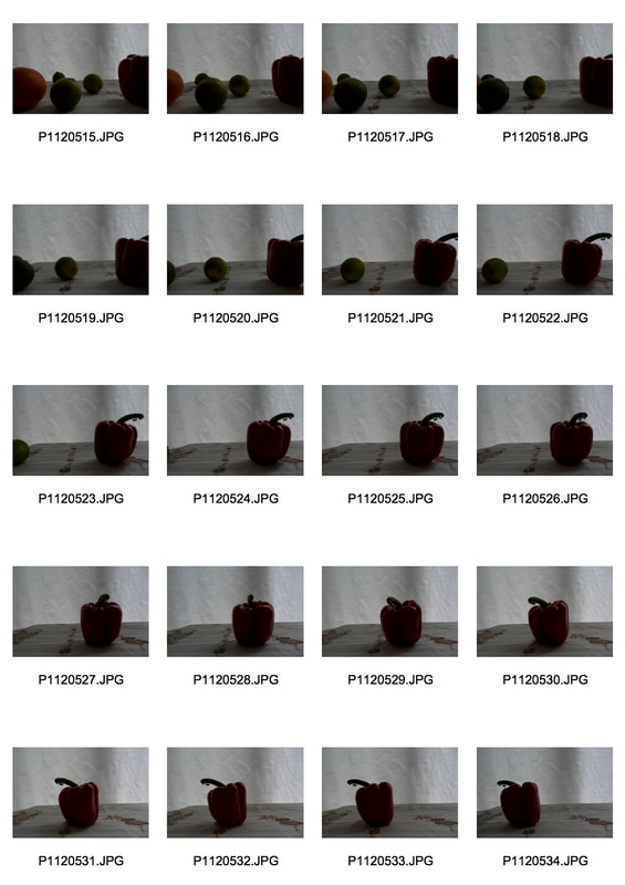
Development 1: Rolling fruit
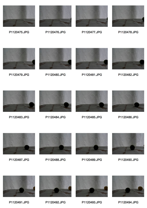
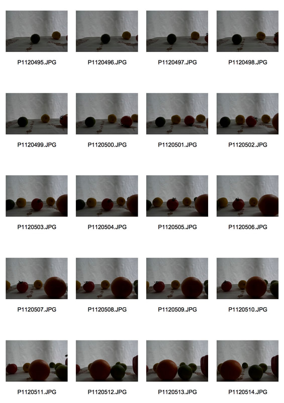
I want to develop both my animation and still life strand by incorporating them together. Like Pes has done, as mentioned previously, I want to explore perhaps the more comedic side of photography, looking at normal, everyday objects and giving them a life of their own. I would like to look at moving fruit or vegetables across the screen, giving the appearance that they are either rolling to something or away from something.
|
|
|
Even though I have succeeded in my intention to create quite a humorous animation of fruit rolling across a table, a large problem in this animation is the lighting conditions. I photographed it in front of a window meaning the light is coming in from behind the objects, causing them to be quite silhouetted and the whole image to be quite dark. I attempted to change the lighting in Photoshop but found this task laborious and unsuccessful since I would have had to change the lighting in each frame causing them all to be slightly different.
In my next development I will take more care over the lighting conditions to prevent this issue.
In my next development I will take more care over the lighting conditions to prevent this issue.
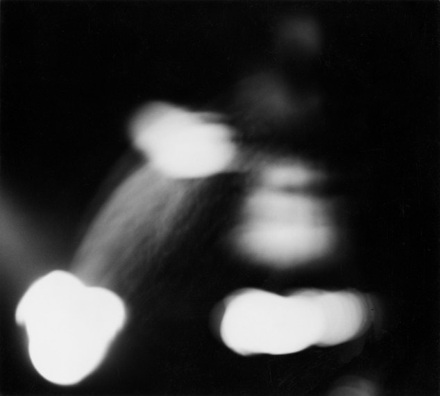
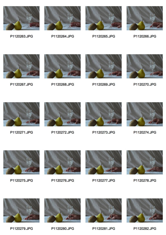
Development 2: Twitching hand
|
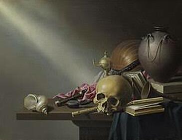
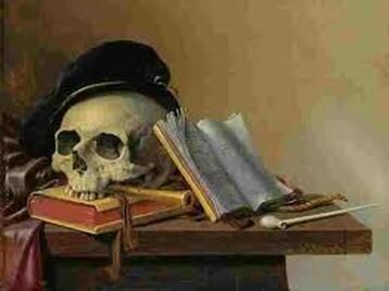
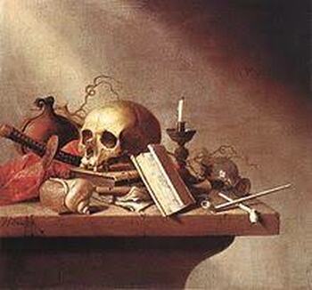
Harmen Steenwijck: 1612 - 1656
Born in Delft, Netherlands, Steenwijck was a still life painter, a vanitas artist. The latin term 'vanitas' means vanity which describes emptiness or worthlessness. Objects such as books, instruments, skulls and wine symbolise mortality, referring to human achievements and reminding the viewer how, in the end, all these worldly pleasures and goods are worthless. Intrigued by the use of skulls within a still life, I would like to incorporate the moving body into my own still lives. My intention is to create a rather tranquil image, perhaps with an animated, moving hand which appears to be yearning for the 'worldly pleasures' laid out in the still life. Like Steenwijck, I will create quite a traditional still life so that it is a surprise to the viewer when the hand moves. |
|
1
These animations do not achieve what I set out to do. Rather than having a tranquil quality they appear creepy and surreal, especially since in 1 & 3, the hand is coming in from the side. They lack warmth and, perhaps emphasised by the lighting conditions, they have quite a chilling air. The viewer cannot relate to the animation because of how surreal it is which creates this unwanted obstruction between them and the work. The fact that only the hand is moving draws all of our attention to it, making it difficult to take in the still life. Even so, the still life is quite a boring composition as everything is practically the same distance away from the lens, giving the image no sense of depth; the moving hand adds a different, more exciting element to the animation. In 1 & 2 the form of the large cloth in the background - which I put in place to remove the sight of unwanted objects - obstructs the viewers focus from the main subjects of the photo.
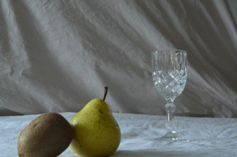
2
I will explore this idea of filling and emptying glasses because although it is quite unusual to see, the rhythm of it moving up and down creates that tranquil air. It becomes quite hypnotising making it difficult to look away.
|
|
|
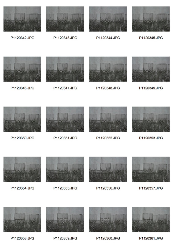
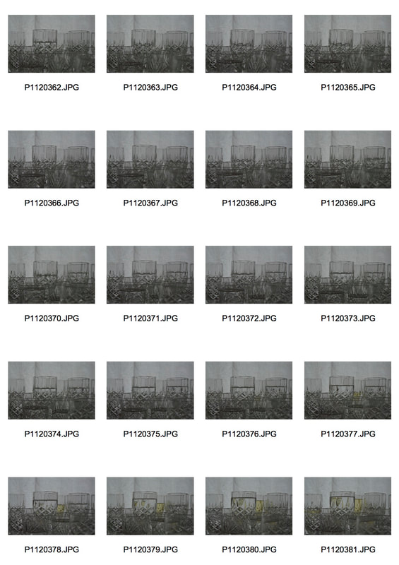
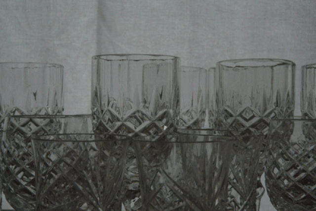
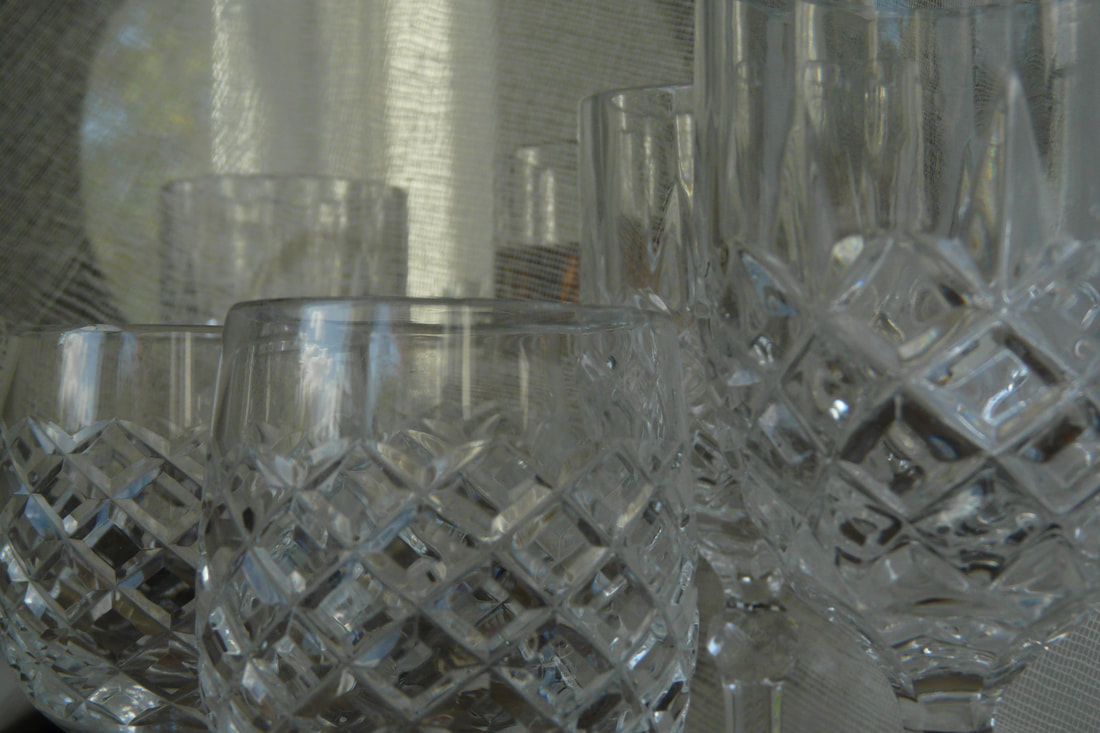
Development 3: Shifting glasses
|
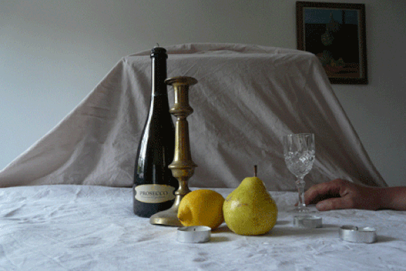
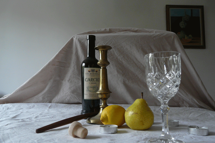
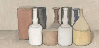
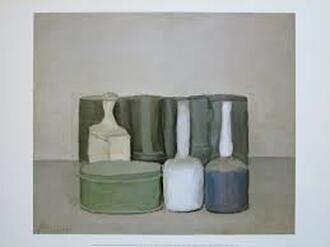
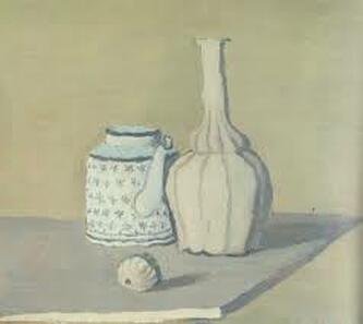
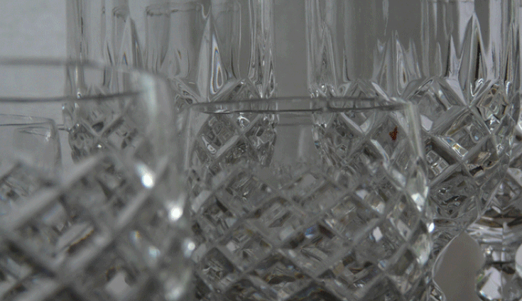
Georgio Morandi: 1890-1964
Morandi was born in Italy. He painted and printed still lives of mainly vases, bottles and bowls that have a very 'quiet', subtle, tonality, often using a muted colour palette. Morandi kept the same objects for his still lives, using them in different arrangements in each picture, relating his paintings and prints together. Morandi studied at the Academy of Fine Arts of Bologna from 1907 to 1913. To the frustration of his tutors, in the last two years of studying at the academy Morandi pushed against the conventions of the school who focused purely on traditional 14th century painting. Through studying books of Rembrandt, he taught himself to etch. Morandi joined the army in 1915 but was soon discharged due to him suffering from a breakdown. This experience impacted his artwork - Morandi's still lives became somewhat more stripped down to their 'purer' form, being composed of fewer components. |
|
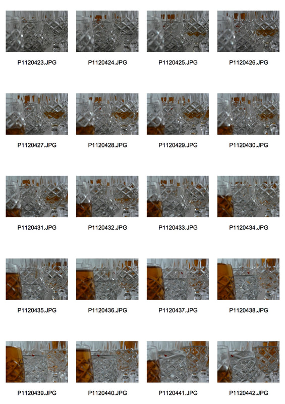
Perhaps to try and get more out of creating an animation, I want to use a much more simple idea. I am not going to incorporate hands within the animation but instead explore the somewhat abstract imagery of glasses moving, filling and emptying on their own accord. I am also going to strip down the colour to neutral tones, with inspiration from Morandi's, quite monotonous in tone, still lives. My envision for this development is to capture a quiet aesthetic beauty of cut glasses.
|
|
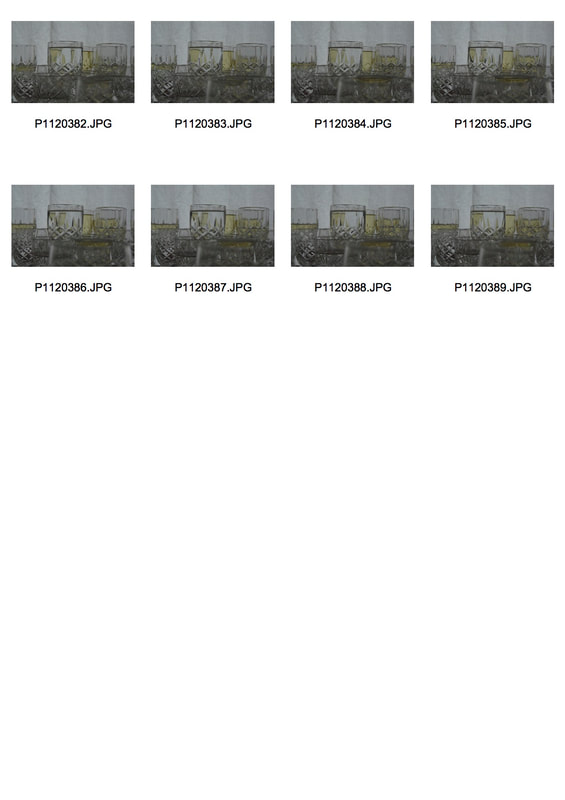
|
I decided to photograph this animation in front of a window again in the hope of creating a tranquil effect from there not being strong, sharp lighting. Although this intention was achieved, it is still too dark and so next time I will need to be conscious of what time of day I'm taking the photos and take them earlier in the day which would mean it would be brighter.
I played around with adding sunflower oil as well as water in the glasses which comes as a pleasant and interesting surprise for the viewer due to the added element of colour; yet still it manages to stay within the theme of subtle changes and, like Morandi's still lives, a 'muted colour scheme'. I also added a glass moving in the foreground in an attempt to immerse the audience by removing the feeling of detachment and distance from the still life which I felt was missing in my previous development but was present in my 2nd strand of the toilet roll.
I played around with adding sunflower oil as well as water in the glasses which comes as a pleasant and interesting surprise for the viewer due to the added element of colour; yet still it manages to stay within the theme of subtle changes and, like Morandi's still lives, a 'muted colour scheme'. I also added a glass moving in the foreground in an attempt to immerse the audience by removing the feeling of detachment and distance from the still life which I felt was missing in my previous development but was present in my 2nd strand of the toilet roll.
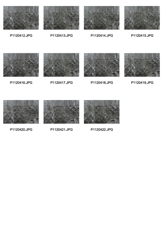
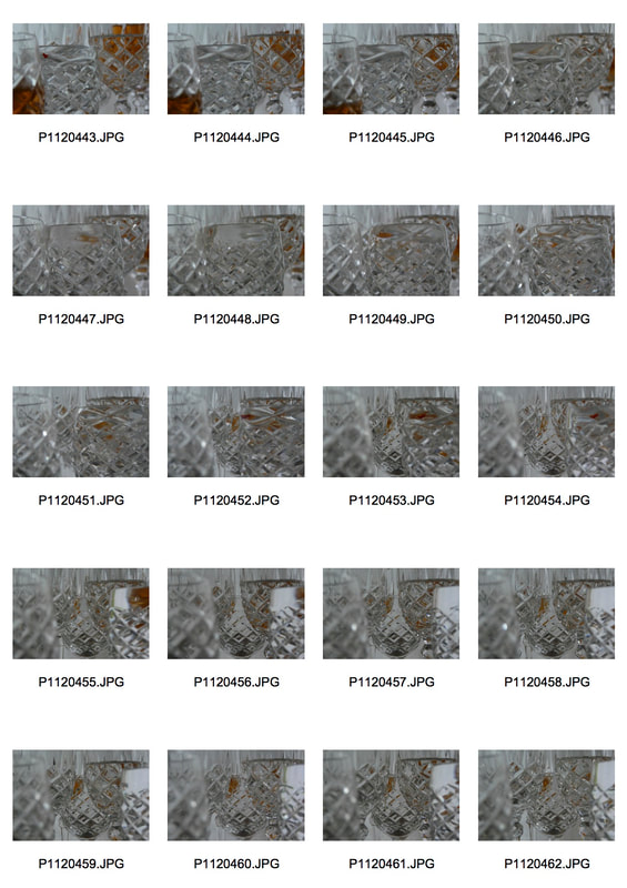
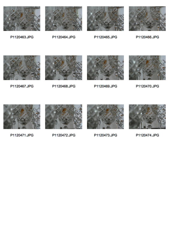
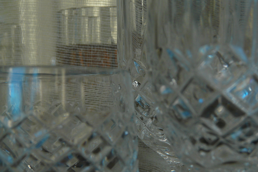
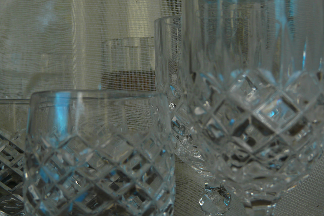
Development 4: Shifting Glasses Cropped In
To develop Shifting Glasses I want to photograph the glasses much closer in to remove some of its identity, allowing for more abstract imagery.
|
|
1
|
|
|
2
2 Cropped in
For 2 I experimented with moving the camera up and down on a tripod as well as moving the glasses to give the animation quite a cinematic feeling and remind the viewer that the camera is acting as their eyes and taking in the stimulus. I could have played with this idea more to truly create that effect in the viewer, perhaps moving the camera horizontally as well as vertically. However, this exposes the stem of the glasses, revealing that they are in fact glasses which removes the abstract quality the animation could have had - this means I did not achieve my intention within this animation.
I decided to crop 2 further for the purpose of taking away the context of the composition.
By considering my previous animations, I photographed this set earlier in the day, again in front of the window, which gives the images a brighter, crisper quality and allows the viewer to more readily notice the reflected light bouncing off of each glass. I also used a darker liquid of red food colouring in water. This bold colour emphasises the reflections and refractions created by the cuts and grooves of the glasses.
Unlike my other animations of glasses, I decided to leave one glass still throughout the animation to present a clear contrast between movement and stillness - the variations of motion.
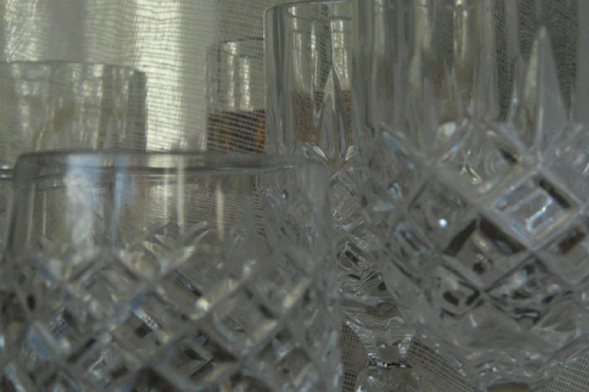
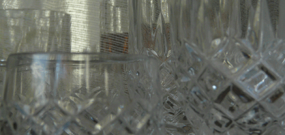
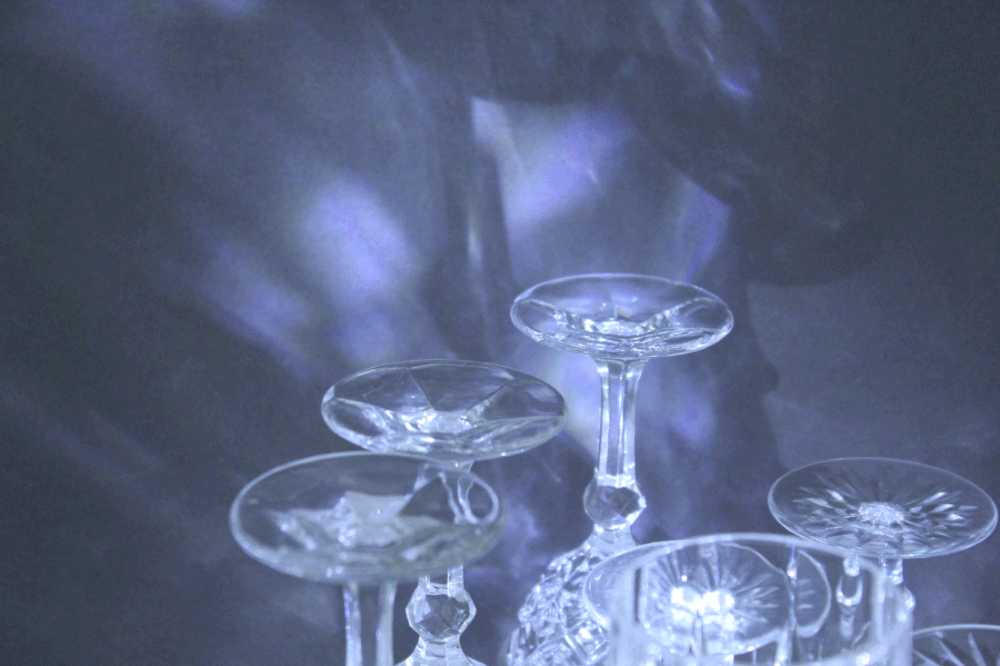
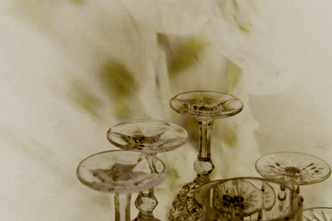
Development 5: Shifting glasses with reflected colour
|
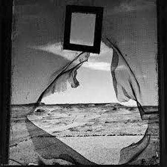
For my next development I am inspired by Lee Miller's Portrait Of Space, Egypt, 1937 which uses a gauze-like material to create a screen, separating us and the sand dunes of Cairo beyond. The layer emphasises the vast distance of the Egyptian deserts and causes us to feel disconnected and even envious. By having a hole through which we look out onto the landscape, or 'portrait' as Miller calls it, we are given a taster of what it's like beyond. The fact that the layer is quite transparent adds to the sensation of something being so close but so far away. The texture of the fabric where it folds creates a different element and even becomes an important focal point for the eye as this is the only section of the image that appears to so obviously have other dimensions and not be flat, especially since it is in the foreground.
|
|
|
For my development I want to explore the use of transparent layers, having glasses both in front and behind. I want to do this primarily to add another texture to the animation as it would be interesting to see the effect of having a different medium within the animation.
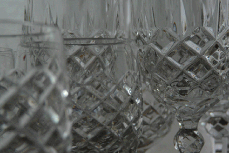
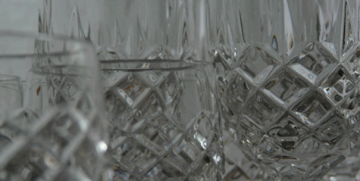
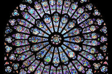
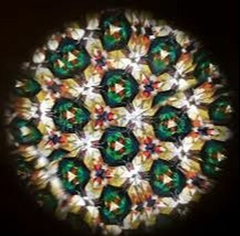
I would also like to add the element of colour more intensely in an attempt to create an effect similar to a kaleidoscope or even The Rose Window of Notre Dame. My hope is that the colour will reflect and refract, ricocheting across the animation; using a mirror within the animation (like in a kaleidoscope) should allow for more 'bouncing's' of light and the illusion that there are so many more glasses. |
Below are 3 photos which show my thought processes when deciding upon the composition of the animation. Unlike in my other developments, these photographs are taken with light coming from behind the camera. I decided to do this to compare how this change in angle of light effects the animation - I've come to the conclusion that since the objects are glasses, it does not make a huge difference as either way the light passes through or bounces off into the camera etc. and so no silhouette is formed.
I was conscious of using a mirror and not wanting the camera to appear in the photo. Unfortunately I do not think the mirror has succeeded in my intention since, due to the angle, it does not reflect the glasses in a way that creates the illusion that there are many more glasses. Instead it reflects the scenery behind the camera. Even so, this gives the impression that the mirror is a window to a space beyond, similar to Portrait of Space.
I was conscious of using a mirror and not wanting the camera to appear in the photo. Unfortunately I do not think the mirror has succeeded in my intention since, due to the angle, it does not reflect the glasses in a way that creates the illusion that there are many more glasses. Instead it reflects the scenery behind the camera. Even so, this gives the impression that the mirror is a window to a space beyond, similar to Portrait of Space.
|
|
|
1
1 cropped
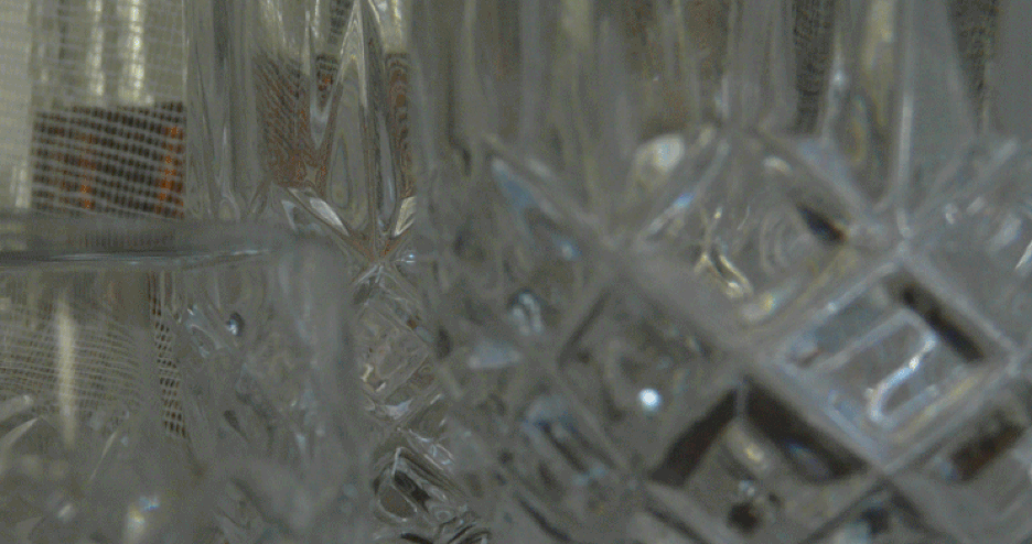
1 cropped even further
I used different coloured acrylics and placed them in front of the light source (window) to create the colour effect. In Photoshop I decided to crop into the image to home in on the grooves and light reflections in order to capture that 'kaleidoscope impression'. Unfortunately this effect has not come across; it could be improved if I had the whole frame filled with glasses rather than have that gap to the left.
The gauze layer does not add anything valuable to the animation when it is so clearly visible but it works a lot better when it's refracted through the glasses as this presents my intention. However, due to the way it goes in and out of focus while a glass behind is filling and refilling, it appears as if the layer is moving up and down. Overall the layer works better when out of focus because it does not draw the eye's attention but becomes a blur and change in texture in the background.
The gauze layer does not add anything valuable to the animation when it is so clearly visible but it works a lot better when it's refracted through the glasses as this presents my intention. However, due to the way it goes in and out of focus while a glass behind is filling and refilling, it appears as if the layer is moving up and down. Overall the layer works better when out of focus because it does not draw the eye's attention but becomes a blur and change in texture in the background.
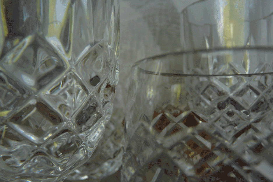
2
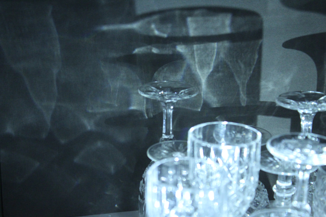
Development 6: Glasses and shadows
For this development I want to change the lighting and now look at the shadows of the glasses. I will take the photos at night and use the light of a torch to create the shadows.
|
|
1
|
1 inverted
|
2
|
2 inverted
|
3
|
3 inverted
|
I decided to invert the animations to play with the colouration of the GIFs and how now the shadow is reflecting off the glasses. 2, 2 inverted, 3 and 3 inverted work well together since they are all very short and repetitive with the same quality of changing tones. It would be interesting to see just the shadows of the glasses because that is what I want the focus of the animations to be rather than the glasses themselves. By having the glasses so prominent in the frame, they become the centre of attention.
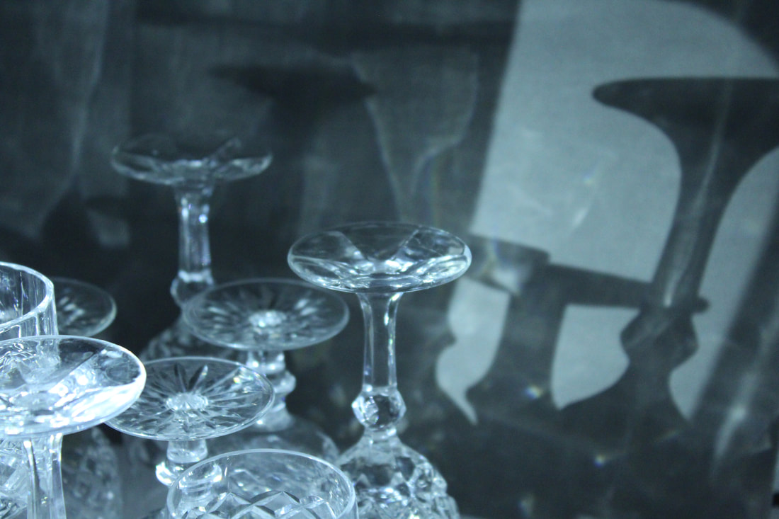
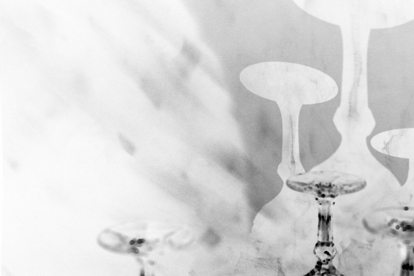
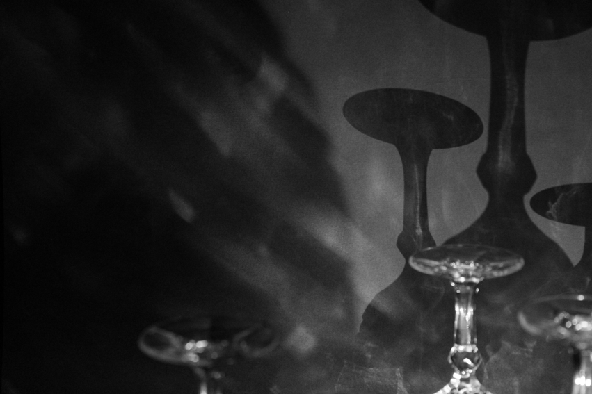
Development 7: Shadow Glasses
I want to continue this idea of using the shadows of glasses but add tracing paper or tissue paper in front of the lens with the glasses behind so that it creates quite a flat (not particularly 3 dimensional) but theatrical animation. I will also continue to invert them and make them black and white to see what colour best suits the imagery.
1
1 inverted
1 black and white
2
2 inverted
2 black and white
For the above gifs, inverting the images did not work as well as I had intentioned due to the different light conditions. These ones were photographed in a much darker conditions which meant the inverted ones are too washed out.
To view the animations presented through Youtube as a loop: right click and choose the option loop.
As I had the light source facing the camera, behind the material, the light conditions are brighter allowing the inverted animations to be less washed out. The way that they are flatter when they are inverted matches my intention of having an animation similar to shadow puppets. These last few animations are successful.
Development 8: More Shadow Glasses
I want to create animations following the same idea to materialise my final piece. I want to make them longer so that the viewer can enjoy them for longer rather than feel rushed. I want to expand on a previous animation (Shadow Glasses 1) in development 7 where the glass is projected very largely on to the tracing paper and, when inverted, has similar imagery to an animation of paint strokes onto a canvas which I find aesthetically pleasing. I also want to expand on Shadow Glasses 4.
Final Piece Montage:
For my final piece I have montaged the animations from my last development using iMovie which I will project into a dark room. I have then created an installation with hanging pieces of plastic which I will project the animation through to create an immersive experience in which the light reflects around the room.
