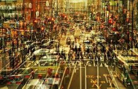
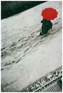
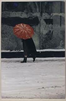
Gallery exhibition- London Nights at the Museum of London
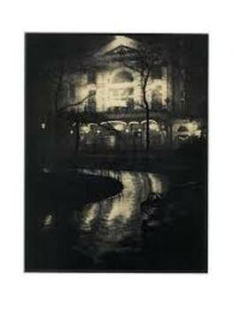
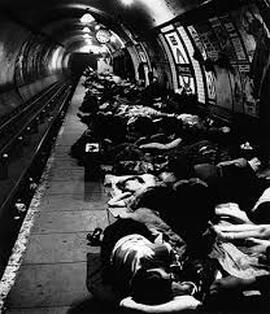
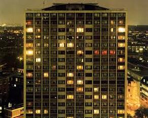
The Museum of London exhibited 200 photographs (and film), both contemporary and historic works, from the 19th century to the present, giving an insight into the city after dark. It was split into 3 sections: London Illuminated, Dark Matters and Switch On...Switch Off...
London Illuminated was a depiction of London under limited natural and artificial light rather than day time. Dark Matters explored the "darker side of the city"- presenting ideas of discomfort, the strange and mystery through photographs of night-walking, the Blitz blackout, isolation, threat and vulnerability. Switch On...Switch Off... was an illustration of commuters on their way home, the workers having a night out or workers starting their night shifts.
London Illuminated was a depiction of London under limited natural and artificial light rather than day time. Dark Matters explored the "darker side of the city"- presenting ideas of discomfort, the strange and mystery through photographs of night-walking, the Blitz blackout, isolation, threat and vulnerability. Switch On...Switch Off... was an illustration of commuters on their way home, the workers having a night out or workers starting their night shifts.
|
|
|
Brief:
Task:
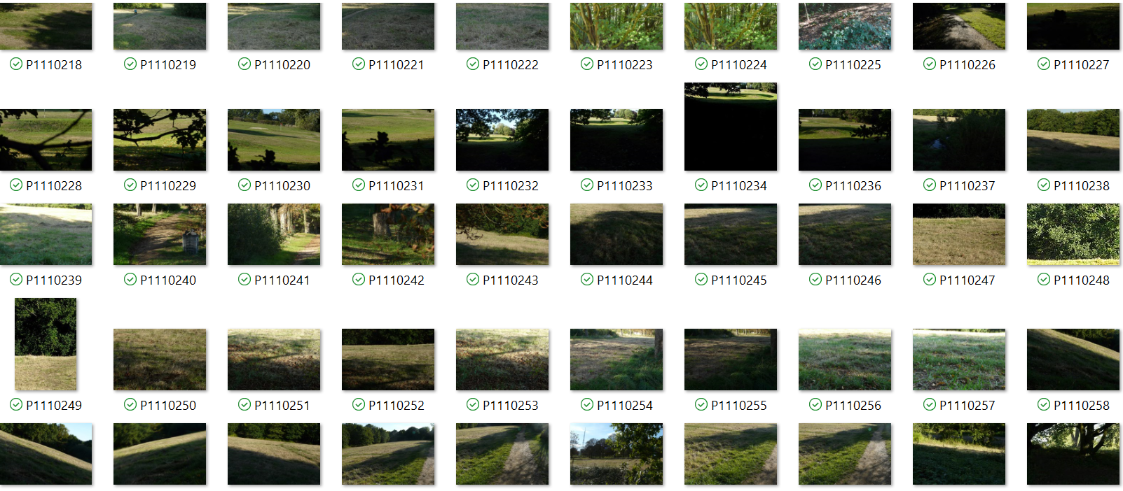
To set out and see through eye of camera a variety of landscape settings taking inspiration from other artists
Method;
Use a range of cameras
To set out and see through eye of camera a variety of landscape settings taking inspiration from other artists
Method;
Use a range of cameras
- digital
- Single reflex lens 35mm
- pinhole camera
Response 1:
|
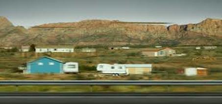
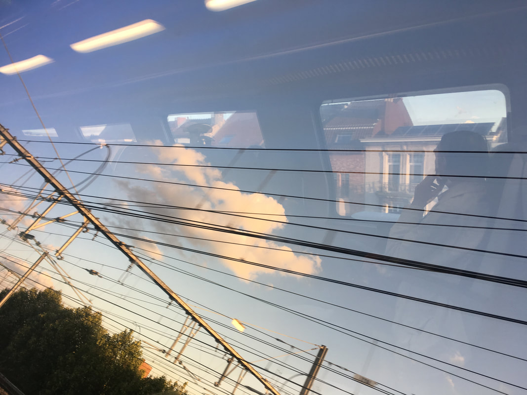
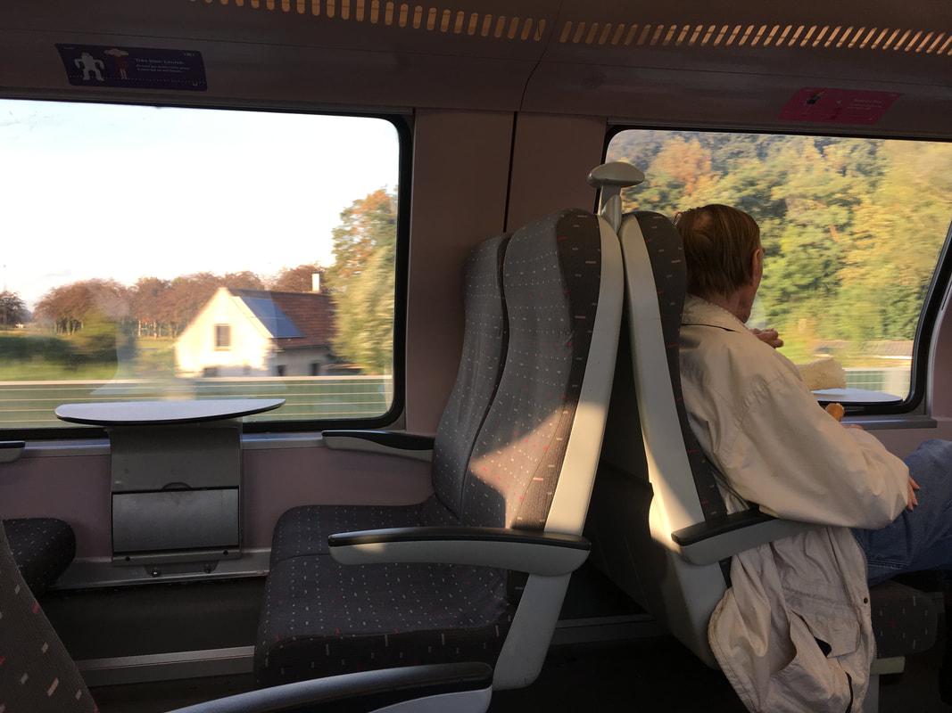
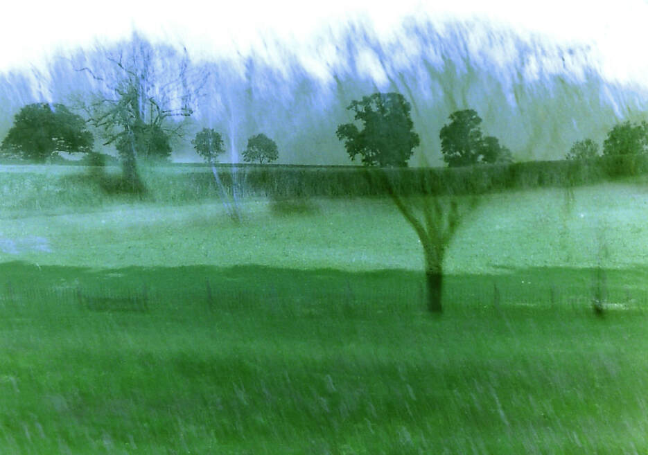
For my first strand, as a response to Andreas Gursky's "Utah", I wanted to present the landscape in a passive way, in the background, by capturing it on a train that I was travelling on in Belgium.
Andreas Gursky: 1955-present Born in Leipzig, Germany, Gursky and his family fled East Germany to seek sanctuary in the West, where he grew up. He spent his childhood in his parents commercial photography studio searching for "anything that looked like it might be fun to play with" - starting his journey with photography off. From 1977- 1980 Gursky Studied Visual Communication or photojournalism at Folkwang University of the Arts, Essen, Germany whilst working as a taxi driver. Then from 1980- 1987 he studied at Düsseldorf Art Academy under the instruction of Bernd and Hilla Becher, He started his career in film photography then immersed himself in digital photography with which he is able to print massive colour prints, sometimes from 1828 x 3048 mm. ‘Tokyo, 2017’ was inspired by a photo Gursky took from a window of a high-speed train travelling through Tokyo. He returned and travelled on that train forty times taking different images of the neighbourhood which he then assembled together as a montage. Gursky has decided to, unlike the majority of his works, blur out the foreground and some sections in the middle of the photo rather than have everything in complete and utter focus. |
Tokyo- Andreas Gursky
Utah, Andreas Gursky
This is interesting because it completely contrasts his other work and forces us to take another look and re-evaluate what we saw. Gursky comments that ‘You look out of the window and get an impression, but when you write it down it will be what you imagine’.
What I want to take away from Gursky's images from a train is the idea of capturing a landscape in an unfamiliar and even outlandish way that we are not used to in traditional art. In 'Utah' there is a sense of movement, exploration and nostalgia that is created from the blurry scene rushing by and nothing being clear or in focus. The use of this technique makes the photo connect with the audience since this feeling is recognised in themselves. (digital) |

|

|
|
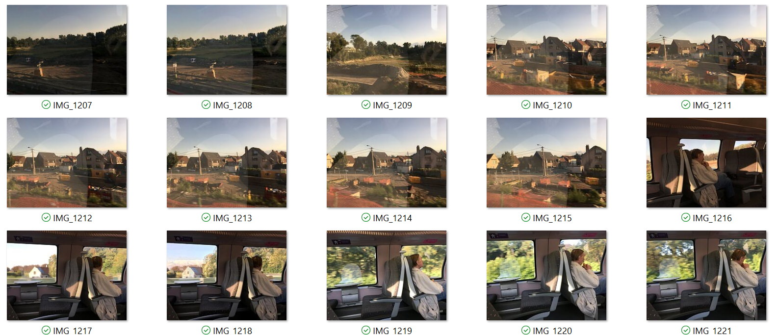
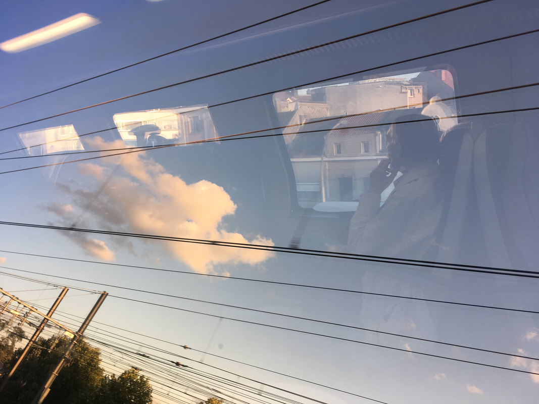
The focus of these images is the commotion in the foreground- the man eating a sandwich- but the essence of the image, and what I am most interested in, is the relationship this figure has with its surroundings.
Photos 1 and 2 were created by the strong sunlight reflecting off a man who was sitting on the opposite side of the carriage and the scenery from his window, onto the curved window of the double-decker train on my side. What intrigued me when taking these photos was the different layers I had to go through to reach the man's side of the landscape: my window, to his window, to the outside world. The use of the train wires creates structure in the image, cutting through at different points and, for photo 1, it boxes in the figure, drawing our eye to him. Due to the wires slowly getting closer to each other as they near the left of this image, a sense of movement is created. The centre of the photos are blurry because of the train movement which could have been more in focus if I used a faster shutter speed, however, I find this movement to be key in the image and was what I originally noticed and found intriguing in Gursky's images. |
1
2
These photos could be improved by removing distractions and obstructions such as the trees in the bottom left hand corner and the light reflections in the top left corner. Photo 2 would be a lot more successful if the train wires didn't cut straight through the figure but were used in a way to draw the eye to it, like surrounding him.
|
3
'Artist and Me'

Andreas Gursky
|

Me
|
Response 2:
|
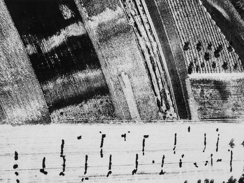
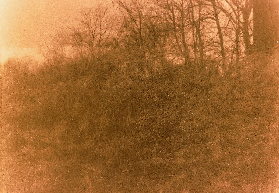
Mario Giacomelli: 1925-2000
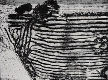
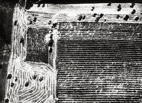
Giacomelli was born in Senigallia. At the age of 13 he decided to be a printer after being mesmerised when he passed the windows of a printing shop. “A printer’s job is truly the best in the world”. He became an apprentice in typography. He began noticing marks and wires on the walls which he thought were beautiful and so he photographed them. In 1953 Giuseppe Cavalli moved to Senigallia to form a group of photographers called the Misa club. Giacomelli joined it and became its treasurer. He brought his first camera in 1954 which began his self-taught photography career. Giacomelli was inspired by neo-realist cinematography of directors such as Vittorio DeSica and Roberto Rossellini to photograph the post-World War II countryside of Senigallia and Puglia, in Italy. He started by photographing the furrows in the land on ground level, as the farmer sees it and then began taking pictures of a birds eye view from a plane looking down at the fields. He would ask the farmers to dig furrows for him in a certain way to create interesting patterns. Giacomelli died in Senigallia in 2000. I had a vision of encapsulating the rawness of the landscape in a style much like Mario Giacomelli- an abstract form of landscape, simply presenting the varying texture, colours, lines and tones of the scenery.
|
|
|
|
(digital)
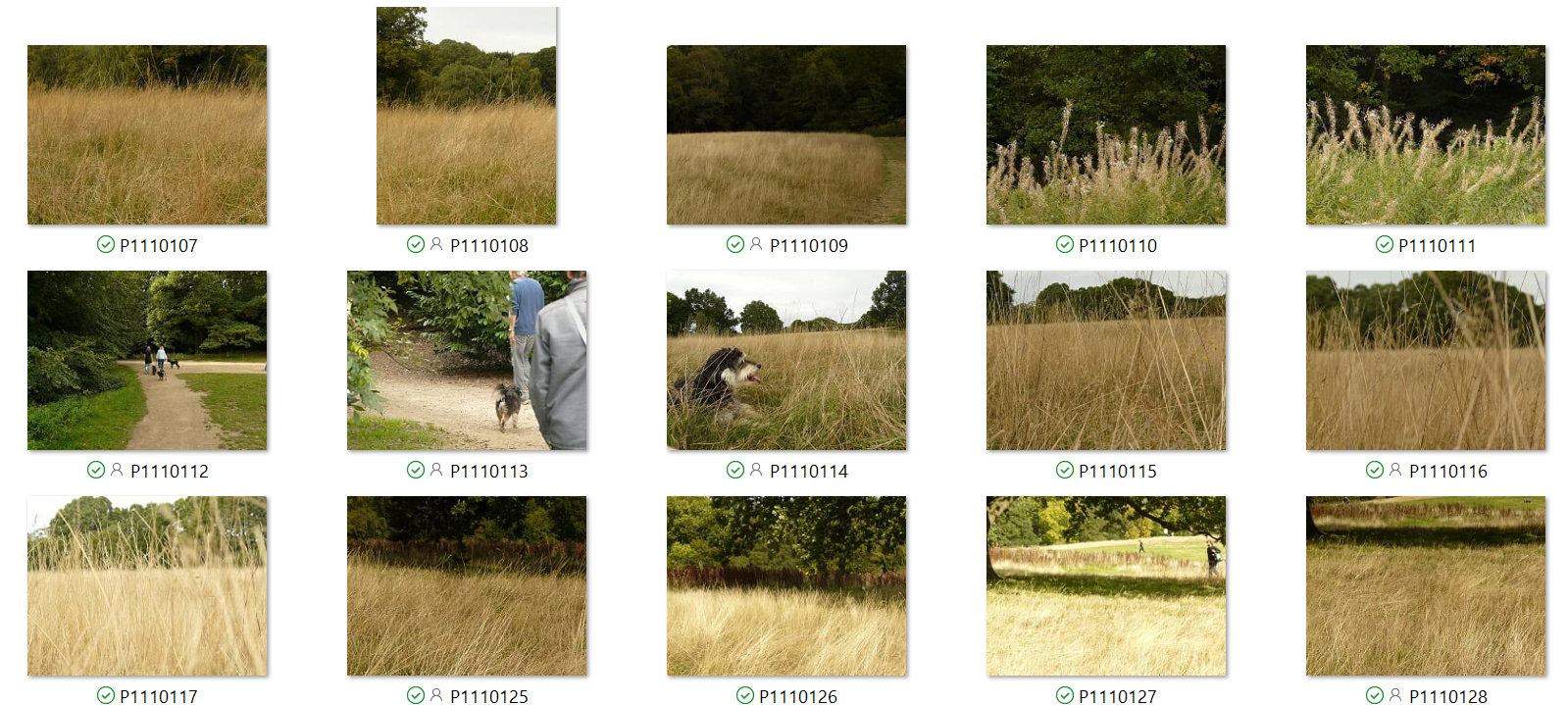
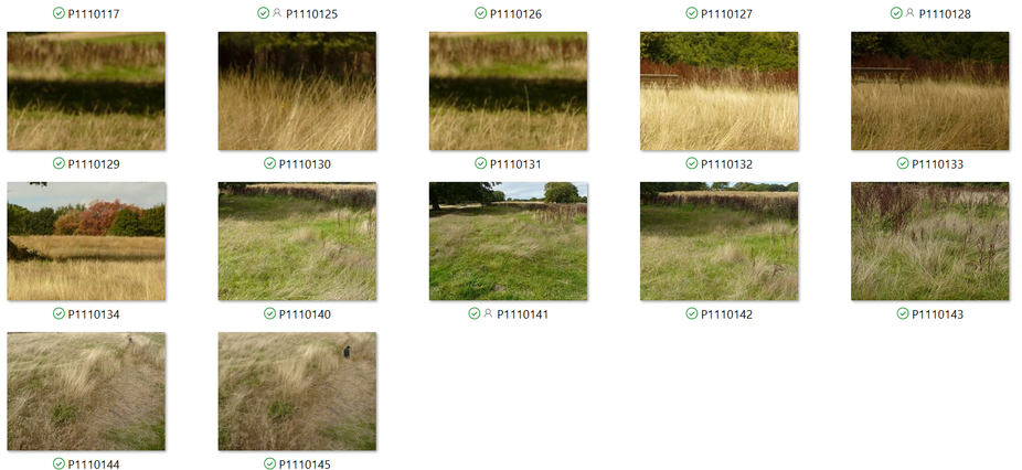
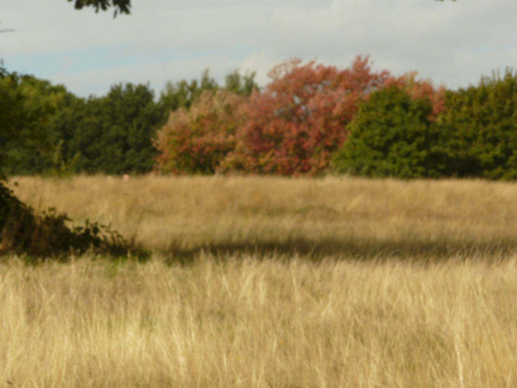
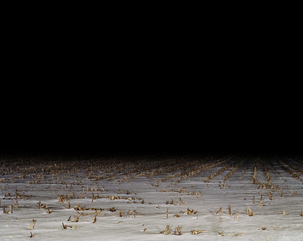
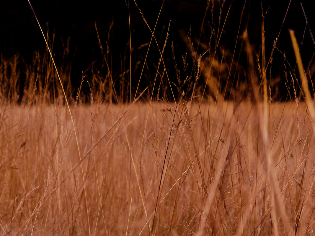
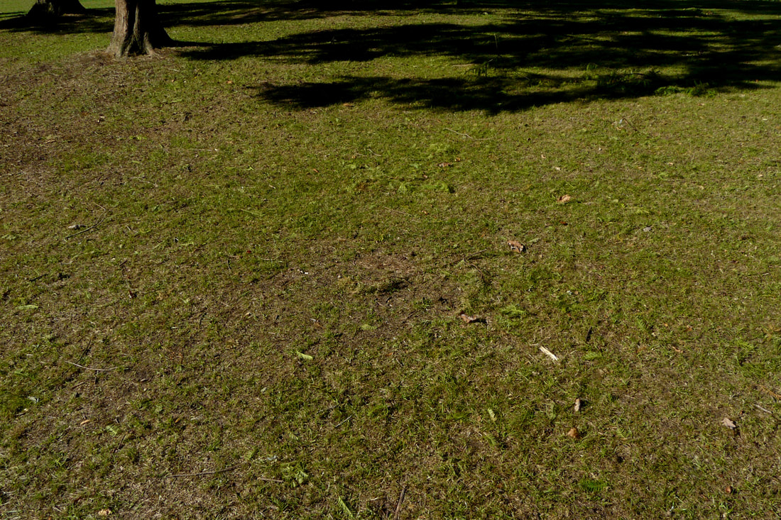
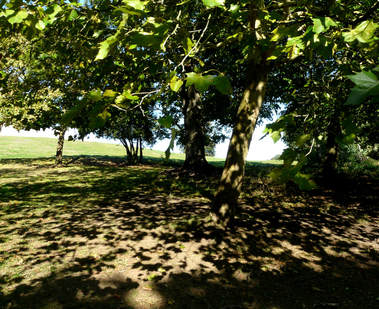
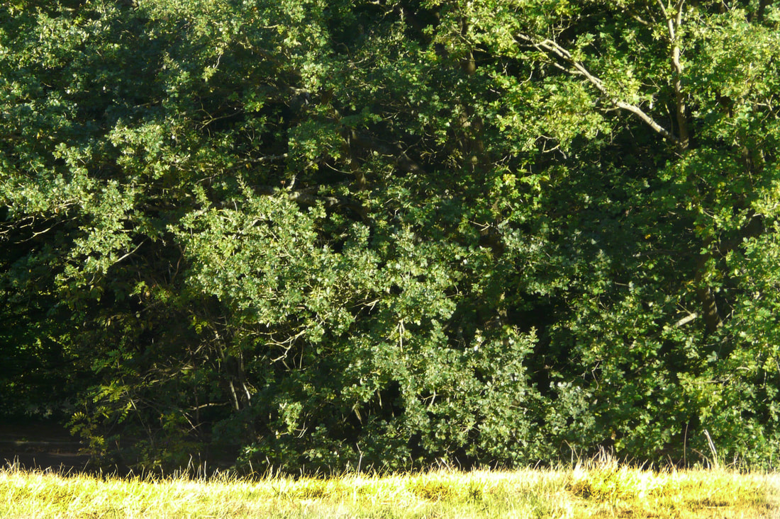
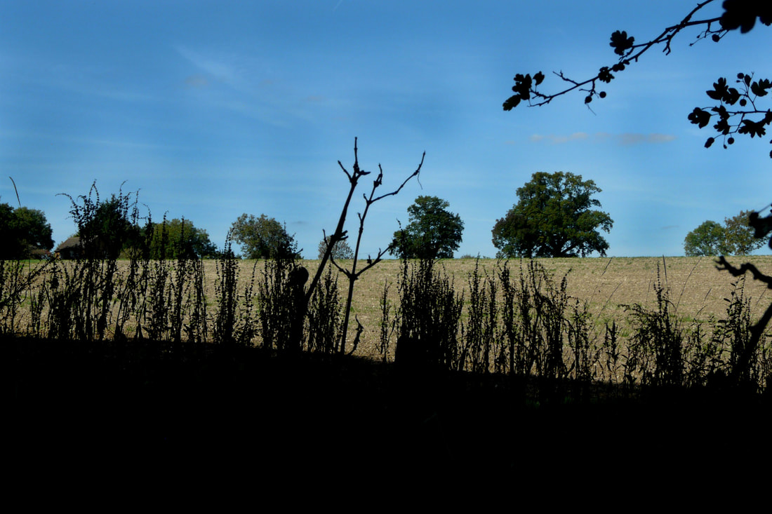
Remembering the long, warm tan coloured grass of Hamstead Heath, and the soothing effect this has on me, I figured that I should attempt to capture the impression this landscape leaves on me. The separating of reality and what the camera sees and then the truth of the moment for me and what I see proved to be very difficult.
1
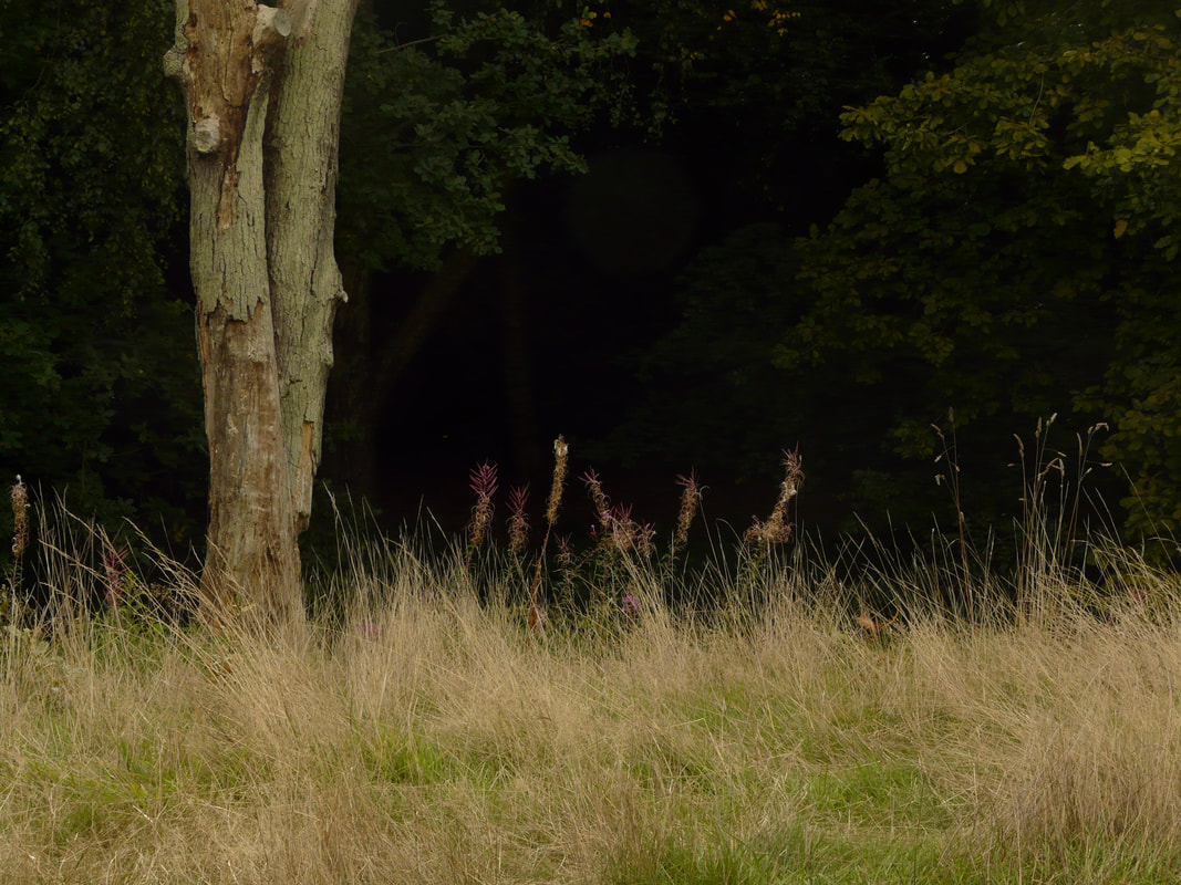
I modified image 1 on Photoshop by using the 'burn tool' and burning in the trees in the background to create more depth in the photo and remove unwanted information. By making the background darker, this highlights the foreground and makes it stand out more. This is a successful image as there is a sense of mystery created by the dark void in the background pushing the viewer to wonder what lies beyond. The known and the unknown cross paths in this photo presenting the barriers between them.
2
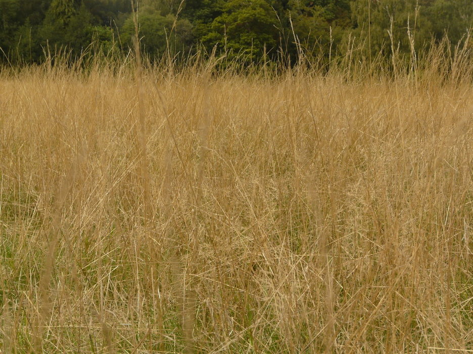
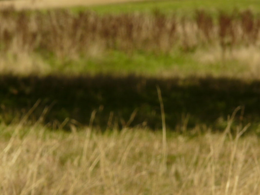
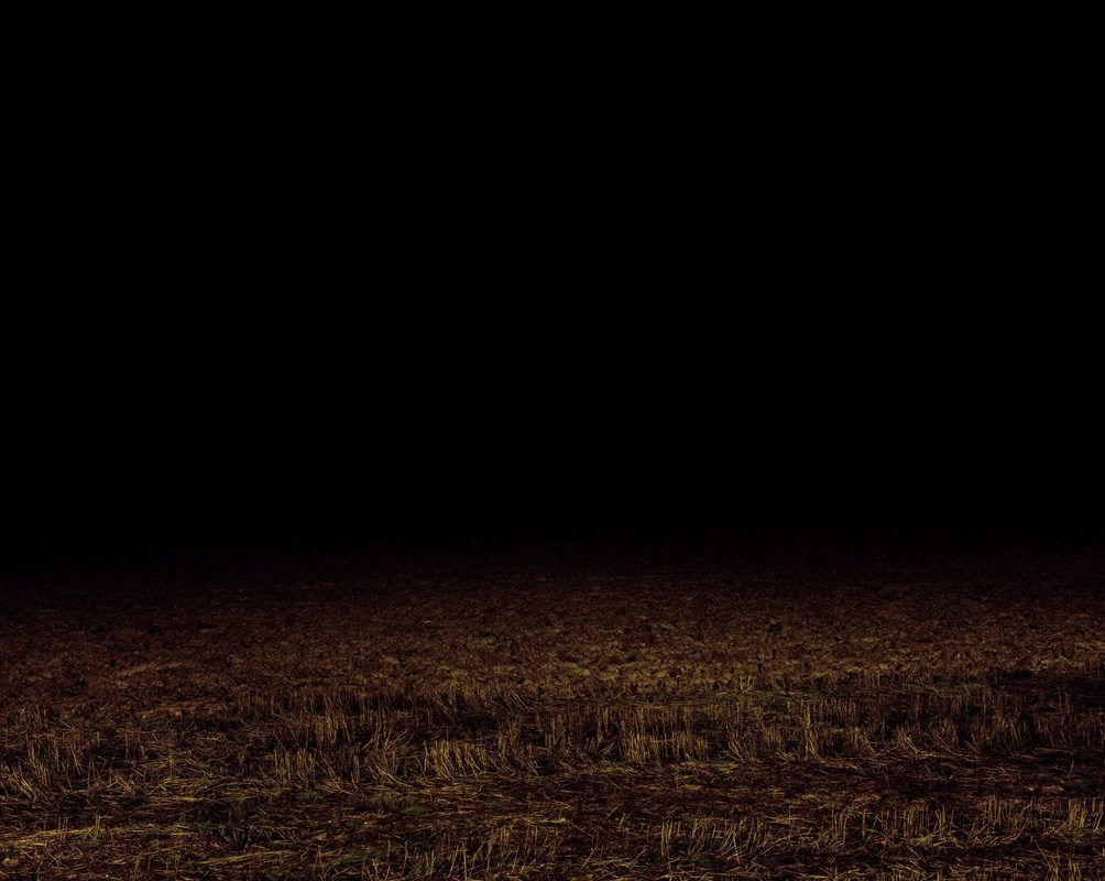
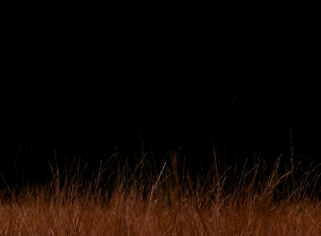
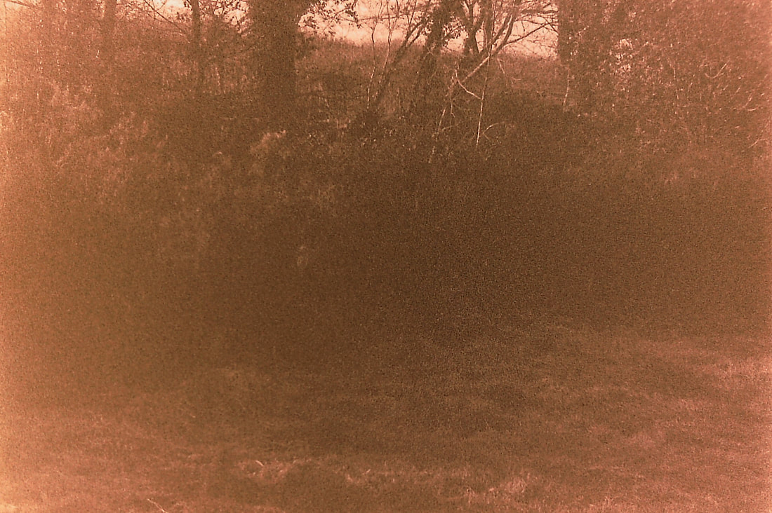
For photos 3, 4, 5 and 6 I decided to not focus the camera so as to remove the detail of the grass and shadows which I thought would create a sensory effect for the viewer rather than an analytic view of what the image is. Unfortunately this vision didn't come off quite as I wanted it to as they have quite big pixels and still look like a landscape. Photo 3 could also be improved by removing the leaves in the top left corner to create 5 clean layers in the image: the grass in the foreground, the shadow, the grass beyond the shadow, the trees and the sky. These layers would then reflect the abstract work of Giacomelli and would allow the viewer to look at it not simply as a landscape.
3
|
4
|
5
|
6
|
Development 1:
|
Nadav Kander: 1961-present
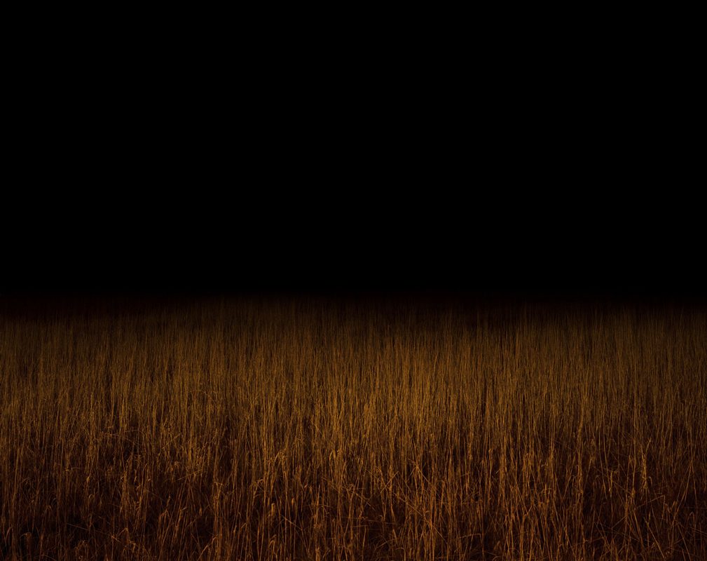
Kander was born in Tel Aviv in Israel but at the age of 3 his family moved to South Africa where he spent his days until he was 21. When he was younger they would drive down to the coast with his father photographing transparency film with which he would create a slideshow that his whole family would watch back in Johannesburg. These were Kander's first experience of the world of photography. At age 13 he started taking his own photographs. His inspiration within photography at that time included those of Paul Strand, Stieglitz, Weston and Atget. As part of coming 'of age' in South Africa, Kander had to partake in National Service and so found himself in the Air force where he managed to take many aerial photos. Once he had left the force he worked for Harry de Zitter, a world renowned photographer. Then after his 21st birthday, he moved to England where he has stayed ever since. Nadav Kander's series "Colour Fields" contrasts the concept of photography being a single "decisive moment" by presenting nature as it can't truly exist naturally. It is with unnatural man-made lighting that these fields gradate and disappear into blackness creating a sense of mystery. Kander's intention was to create images that are 'sensuous and expressive'. |
|
1
|
2
|
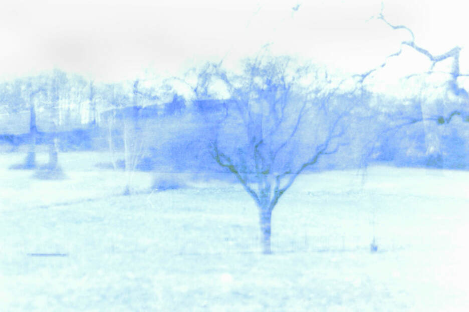
For this strand I continued the idea of having a dark hidden background creating that sense of mystery and the unknown. I did this by cropping a few of the photos from development 2 and then used the 'burn tool' on Photoshop with a high exposure to darken the background. I then changed the colour and tone of the image by using the 'filter tool' and changing the images to have more yellow or red in them.
The colour filters made the grassland stand out much more and gave the images a more non-realistic, impressionistic effect. The fact that I formed these photos using Photoshop reflects within the pictures. There is no gradual change in light- the background immediately grows dark- whereas if I did it in real life, like Kander did, there would be a much slower change, emphasising the idea of uncertainty and secrecy.
The colour filters made the grassland stand out much more and gave the images a more non-realistic, impressionistic effect. The fact that I formed these photos using Photoshop reflects within the pictures. There is no gradual change in light- the background immediately grows dark- whereas if I did it in real life, like Kander did, there would be a much slower change, emphasising the idea of uncertainty and secrecy.
Development 2:
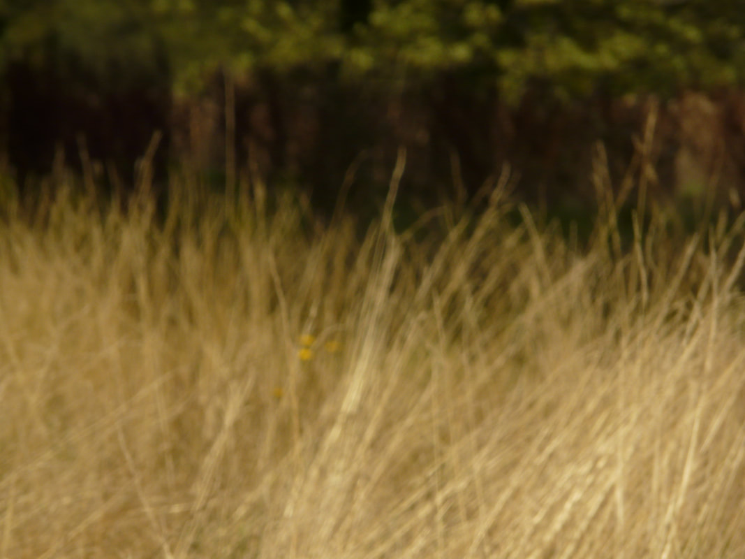
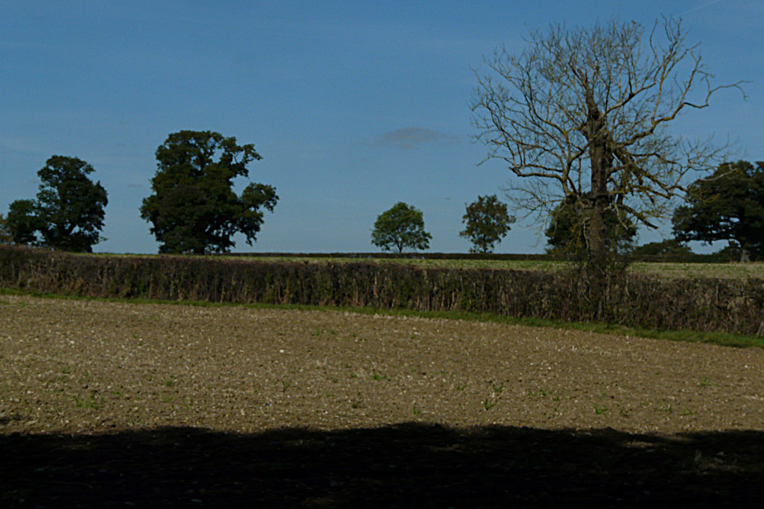
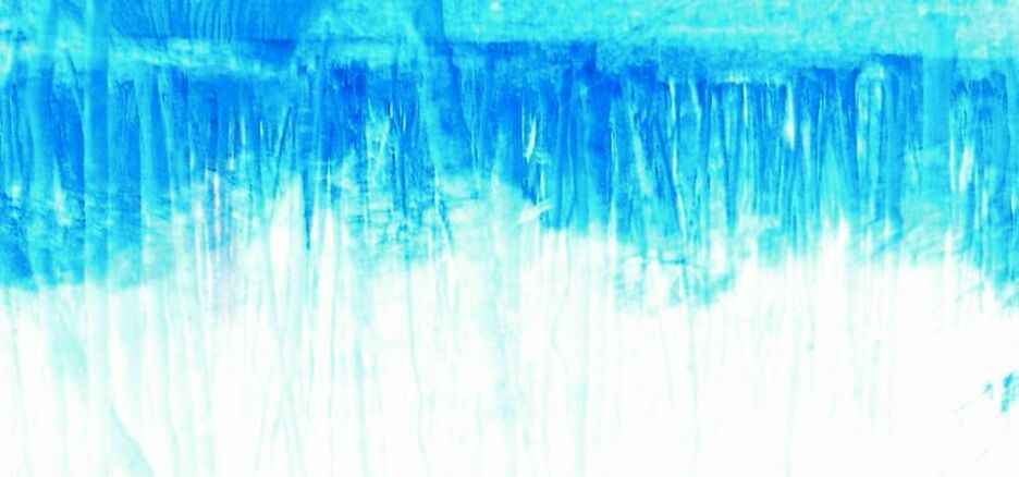
For this response I decided to change my direction and go back to looking at the landscape during the day. One idea that I wanted to continue and explore further in depth is that of how I can take a photo in an extreme, unusual way. Something that I had done unintentionally previously was to create strange divisions in the image where perhaps the foreground, such as the grass, takes up the majority of the picture. In photos like 6, 7 and 8, this allows the viewer to experience and delve into the texture of the landscape rather than just what it 'looks like'.
(digital)
(digital)
|
|
1
|
2
|
3
|
4
|
 5
5
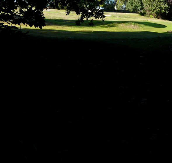
Photo 5 succeeds in reaching this extreme of having over 2 thirds of the image pitch black with only the top section in light. I created this by post manipulating the photo and burning in the foreground with a high exposure on Photoshop. I also created a lot more contrast in Photoshop by changing the contrast levels- darkening the darks and highlighting the highlights.
Photo 5 could be improved by reducing the brightness of the top section because it comes across a bit too strong. This could be done by slightly burning it in using a low exposure or just re-changing the contrast levels. It could also be more interesting without the silhouetted leaves in the corner leaving the image to be clean lines and so more abstract. There is a white golf pole in the background which would add to the picture more if it was in focus.
Photo 5 could be improved by reducing the brightness of the top section because it comes across a bit too strong. This could be done by slightly burning it in using a low exposure or just re-changing the contrast levels. It could also be more interesting without the silhouetted leaves in the corner leaving the image to be clean lines and so more abstract. There is a white golf pole in the background which would add to the picture more if it was in focus.
6
|
7
|
8
|
Development 3:
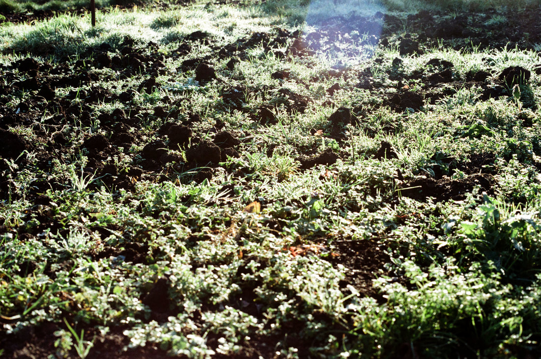
In this response I wanted to continue to capture relatively vast landscapes of worked farmland. I particularly wanted to reproduce the textures of what I could see, such as the trough marks in the soil.
(digital and 200 colour film)
(digital and 200 colour film)
|
|
|
|
1
|
2
|
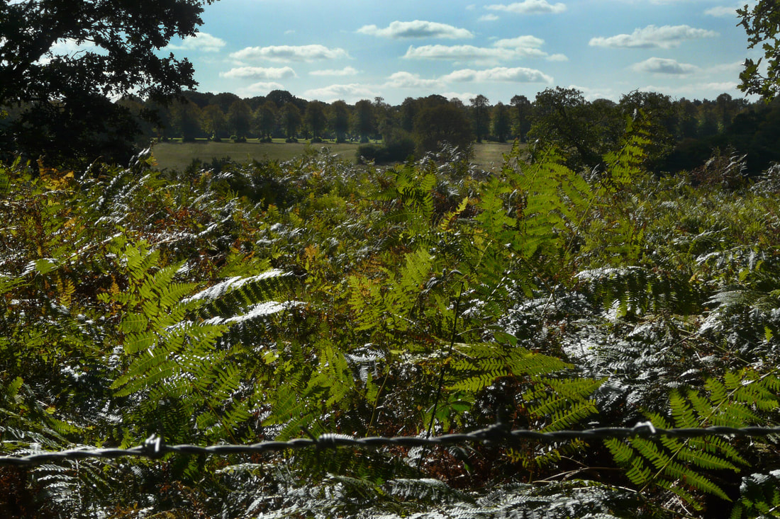
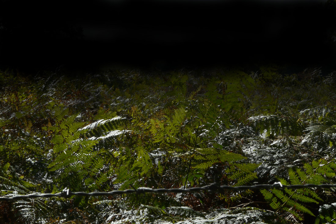
Photos 1 and 2 are both quite interesting. I believe they are individually successful in the way they encapsulate the texture of the fern leaves in the foreground. Photo 1 is the original image; what went well in this was not only the intense quality and feel of the fern but how it draws you in to look at the landscape beyond. The photo appears as if it's representing the Mesozoic era, creating a story behind the photograph and causing us to feel that around the corner lies a creature like a dinosaur. This was not, however, my initial intention.
Photo 2 is meant to be an improvement of 1 because I felt the picture was too busy. There are so many different layers in photo 1 that the eye finds it difficult to settle on any one thing. I wanted the attention to be solely on the quality of the fern so I removed all the noise of the background by using the 'burn tool' on Photoshop on a medium exposure and slowly working that into the image so as to create a soft gradual change. This created a similar effect to the pictures in Response 3, making the audience believe that the ferns went on into the dark distance forever, allowing for that sense of mystery to grow.
Photo 2 is meant to be an improvement of 1 because I felt the picture was too busy. There are so many different layers in photo 1 that the eye finds it difficult to settle on any one thing. I wanted the attention to be solely on the quality of the fern so I removed all the noise of the background by using the 'burn tool' on Photoshop on a medium exposure and slowly working that into the image so as to create a soft gradual change. This created a similar effect to the pictures in Response 3, making the audience believe that the ferns went on into the dark distance forever, allowing for that sense of mystery to grow.
3
|
4
|
Development 4:
|
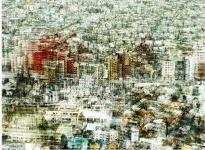
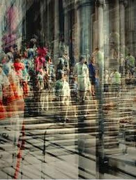
Stephanie Jung: 1989-present
Jung was born in South-West Germany and now lives and works in Berlin. She completed her studies in Visual Communications in 2010 where she met Sabine Wenzel, a photographer who very much inspired Jung. Jung works as a freelance photographer, exploring 'experimental photography'. Her signature style involves taking multiple exposures of the same urban scene and layering them on top of each other, moving them around so that the same object may be in a different place within the final image. Her technique causes the landscape to feel chaotic, busy and full of life, presenting the hectic atmosphere of New York City. Although her artworks are all still moments, it feels as if there is movement in the image, causing the viewer to have the sensation that they are watching a clip rather than looking at a photo. This project began in November 2014 when Jung was wandering around New York fascinated by the energy of the city which she felt she had to capture. Her photographs happens very spontaneously when she walks around a city and sees moments that she likes. Stephanie Jung comments that her work is about "time and caducity". Her intention is to show the movement of time rather than just a single moment. |
|
As a response to Stephanie Jung's photography, I wanted to look at layering different exposures over each other, but with the natural landscape. I did this by using a negative scanner connected to the computer, which allowed me to place 2 negatives together to create a completely new, somewhat abstract, image. I then used Photoshop to play around with the colour scheme, saturation or tone, using effects such as sepia or a 'cooler tone' giving each image a different effect on the viewer.
(200 colour and black and white film)
(200 colour and black and white film)
1
3
|
2
4
|
5
6
Image 6 was made by putting one negative on the other but upside down which meant that the clouds are across the bottom of the photo. This creates quite a fantastical, almost surreal, feeling within the photograph, as if we were walking on clouds. What is encompassing about 6, unlike 5, is the depth to the image created by the clouds appearing to be on the foreground and then the classic landscape in the background. In 5, the foreground covers a wide area of the picture reducing the amount of depth created. This depth in 6 is enjoyable because it feels as if we can step into the scene itself, however, the bizarreness of the clouds being on the bottom causes the viewer to take a second look and re-evaluate.
The image could be more successful if the composition of the branches and the trees in the background were different. I find the position of the long branch in the centre quite obstructive and it would please the eye a lot more if it was placed in a gap between the trees .
The image could be more successful if the composition of the branches and the trees in the background were different. I find the position of the long branch in the centre quite obstructive and it would please the eye a lot more if it was placed in a gap between the trees .
7
|
8
|
Development 5:
In this development I decided to continue with the idea of layering exposures using the negative scanner.
(200 colour film)
(200 colour film)
|
|
1
|
2
|
3
|
4
|
Photo 3 is interesting because the layering of 2 classical photographs merge to become a very abstract image in which it is difficult to identify what is actually going on. The viewer must take a closer look to attempt to organise the image into what they can recognise. The contrasting texture of the grass layered onto the woods breaks up the vertical pattern of the trees. However, this image only has texture and no main subject for the eye to rest on so it is kept wandering across the picture. This is rather strenuous and so photo 3 could be improved by having a much more obvious main subject but then this would take away some of its abstract quality.
Although photo 4 isn't a successful image because there is not a lot going on and is just quite boring, I am intrigued by the idea of incorporating people into the natural landscape giving the image a stronger subject to focus on. I would like to develop this idea further.
Although photo 4 isn't a successful image because there is not a lot going on and is just quite boring, I am intrigued by the idea of incorporating people into the natural landscape giving the image a stronger subject to focus on. I would like to develop this idea further.
5
Development 6:
|
Saul Leiter: 1923-2013
Leiter was born in Pittsburgh, Pensilvania, US. At the age of 23, he moved to New York City, to practice painting, from Cleveland, where he was studying at a theological college to become a rabbi. In New York he met Richard Pousette-Dart, an abstract expressionist painter who experimented a lot with photography, introducing the art medium to Leiter. During the 1940s, he started to explore colour photography and often used film past its use-by date. For 20 years he worked as a fashion photographer, publishing for magazines like Elle and British Vogue. His images tend to focus on figures, often New Yorkers going about their daily life, so the viewer gets an insight into the city. |
|
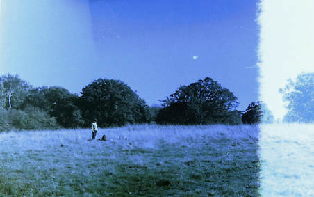
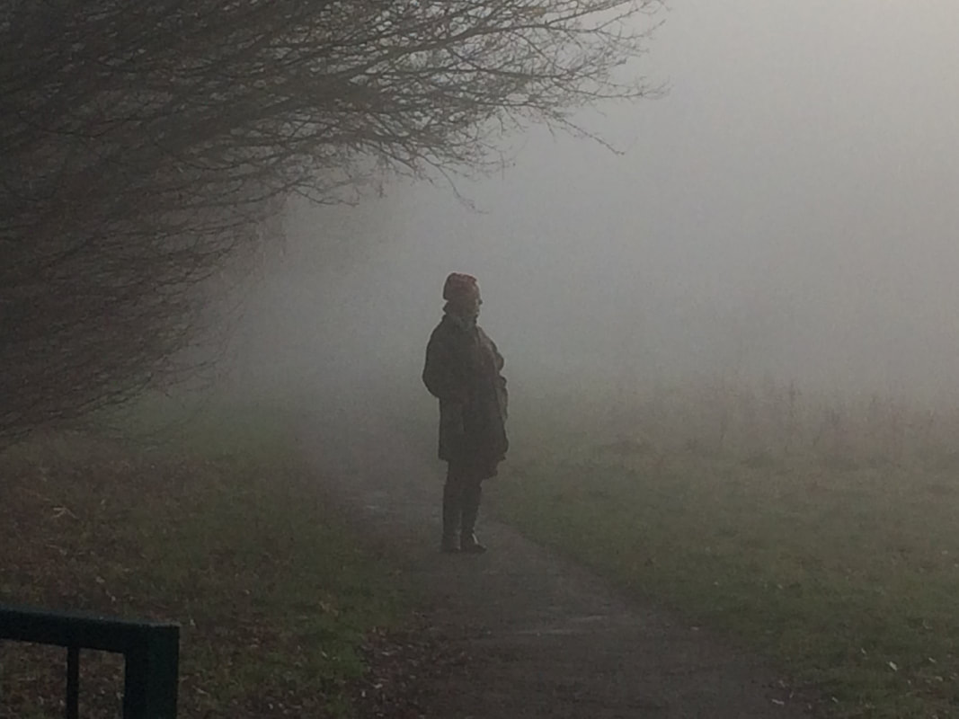
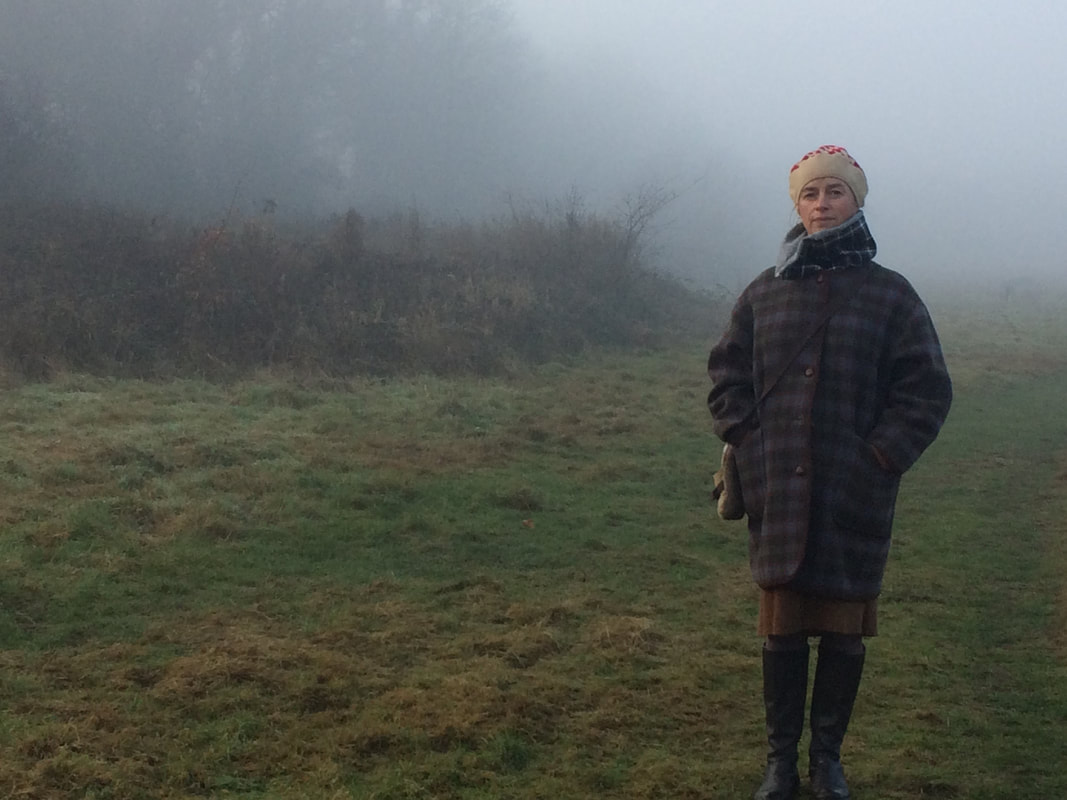
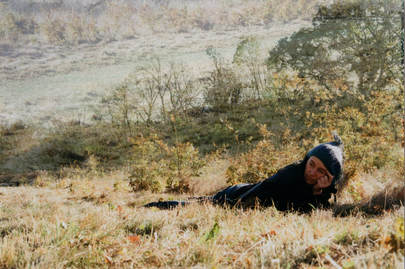
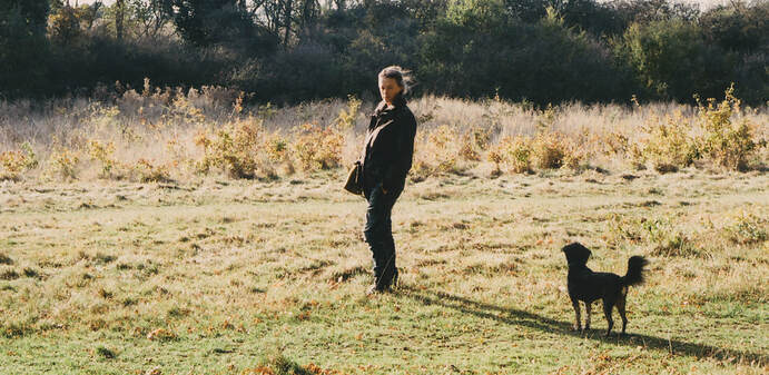
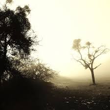
Although Saul Leiter was a street photographer, viewing figures in their surroundings and daily environment outside intrigues me so I decided to incorporate figures into the landscape. This also meant that I could have a more prominent subject to the image. I photographed my mum in a local park that we occasionally walk our dog in, so I captured her in this environment where she 'belongs'.
(digital)
(digital)
1
|
2
|
3
|
4
|
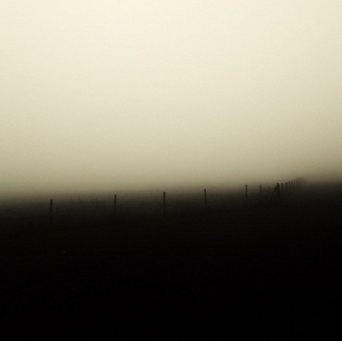
The fog submerges the figure, leaving it as a dark silhouette; this division formed between us and her accentuates a feeling of isolation. In photo 3, the fog also becomes part of the landscape, atmospherically removing certain unnecessary details of the background and so heightening the features of the trees on the left. This haze also creates a starker contrast in the tones of dark and light making the photos more successful.
Unfortunately, the composition of the photos removes the intrigue and mystery. In 4, the figure is too close to the camera and is the only thing in focus, meaning we can see too much detail of her. If the the figure was further in the background of the photo, there would be a greater sense of ambiguity which perhaps could even lead to a narrative, drawing the viewer in to look and examine the image closer.
Unfortunately, the composition of the photos removes the intrigue and mystery. In 4, the figure is too close to the camera and is the only thing in focus, meaning we can see too much detail of her. If the the figure was further in the background of the photo, there would be a greater sense of ambiguity which perhaps could even lead to a narrative, drawing the viewer in to look and examine the image closer.
Development 7:
In this development, I wanted to continue with the idea of inserting a figure into the landscape. Unfortunately, the day I went to the park, there was no fog like the last development, so I did not get the atmosphere I had initially wanted. Also, the compositions of the image look more like fashion photography rather than the authentic experience I wanted to create with the figure in their 'normal' surroundings.
(200 colour film)
(200 colour film)
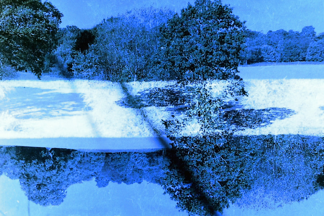
In an attempt to improve the images and make them more interesting, I decided to use Photoshop to 'double expose' them. This seemed to work for photo 2 as, along with the pensive position of the figure, having grass and shrubs where the sky is meant to be creates quite a dreamy impression. This 'double exposure' also removes the gaping white hole of the sky which would usually cause the viewer to look through and beyond rather than at the rest of the image.
1
|
2
|
3
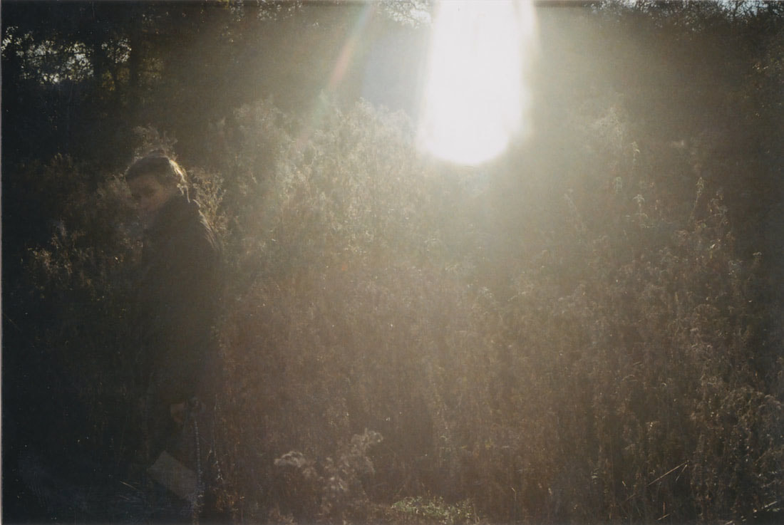
Photo 3, for me is the most successful out of this development. This is because of the drama created by the very dark image as a whole with a slither of light causing a glare. By having the figure appear to be walking out of the frame, looking straight into the camera, a sense of mystery is created and the onlooker wants to follow her. This is emphasised by the way the majority of her is drenched in black with only one side of her lit up by the sun.
4
|
5
|
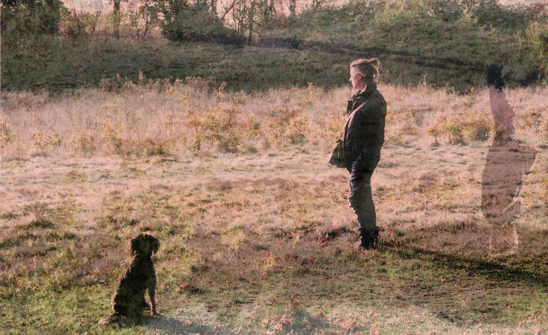
Photo 4 is quite surreal in the sense that it is abnormal to have 2 of the same person next to each other with one that is upside down and flipped. Although the composition of having the dog and the person in the satisfying positions in the frame which follow the Rule of Thirds, this image is not successful. The reflection of the figure attracts the viewer's attention away from the landscape, which is meant to be the main 'subject' of the image. Photo 4 might be more successful if I kept the 'double exposure' but, using the 'clone tool' on Photoshop, I removed the additional figure on the right. This would keep the soft texture of the land and recreate that dreamy feeling like in photo 2.
 6
6
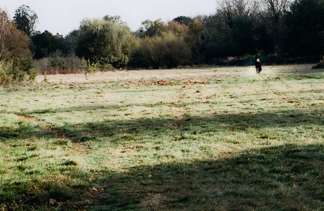
The composition in this image is really boring due to the figure being bang in the centre of the frame. It would have been more successful if she was slightly more to the right.
Development 8:
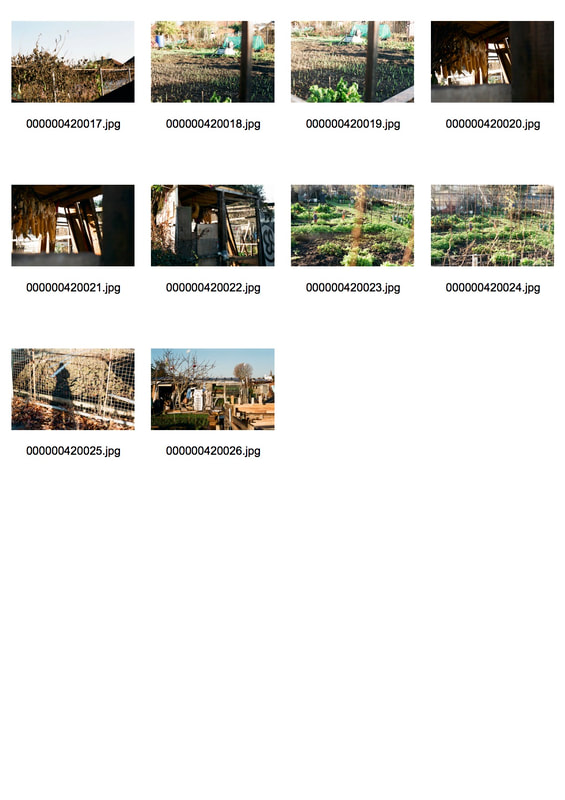
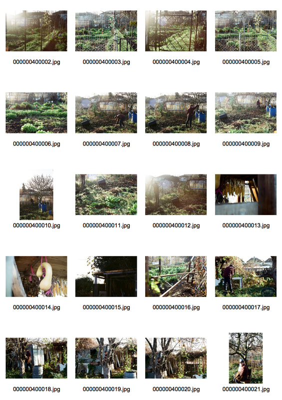
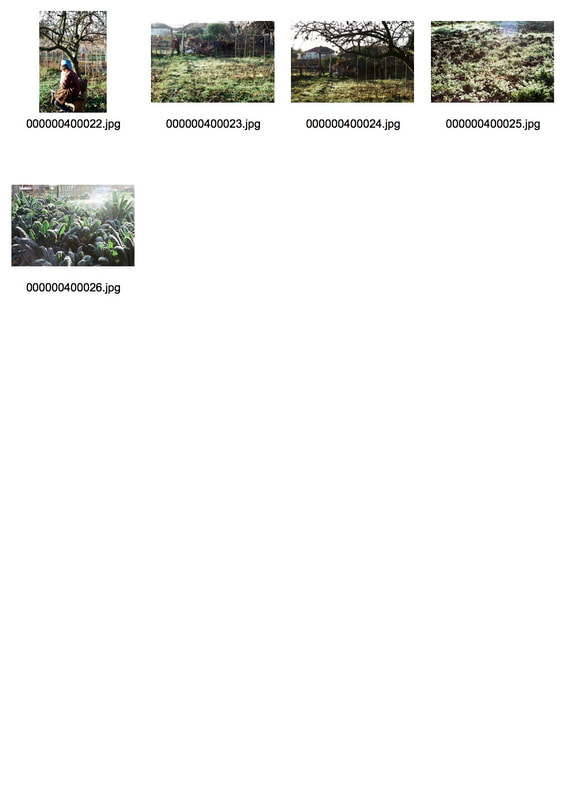
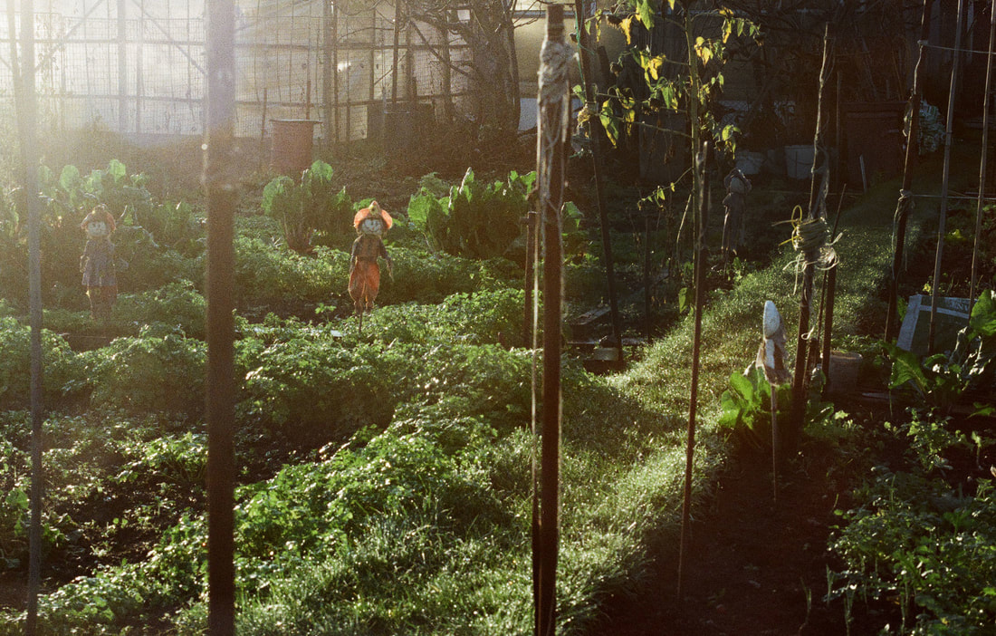
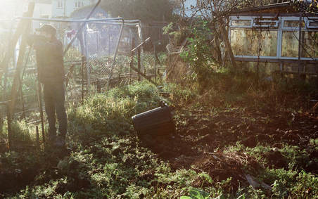
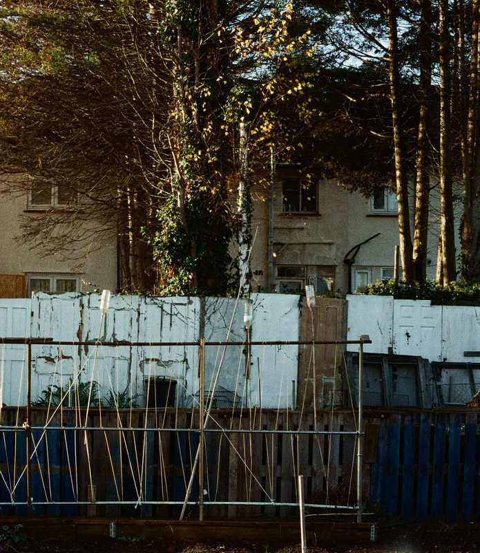
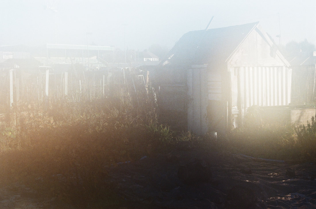
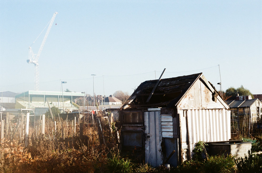
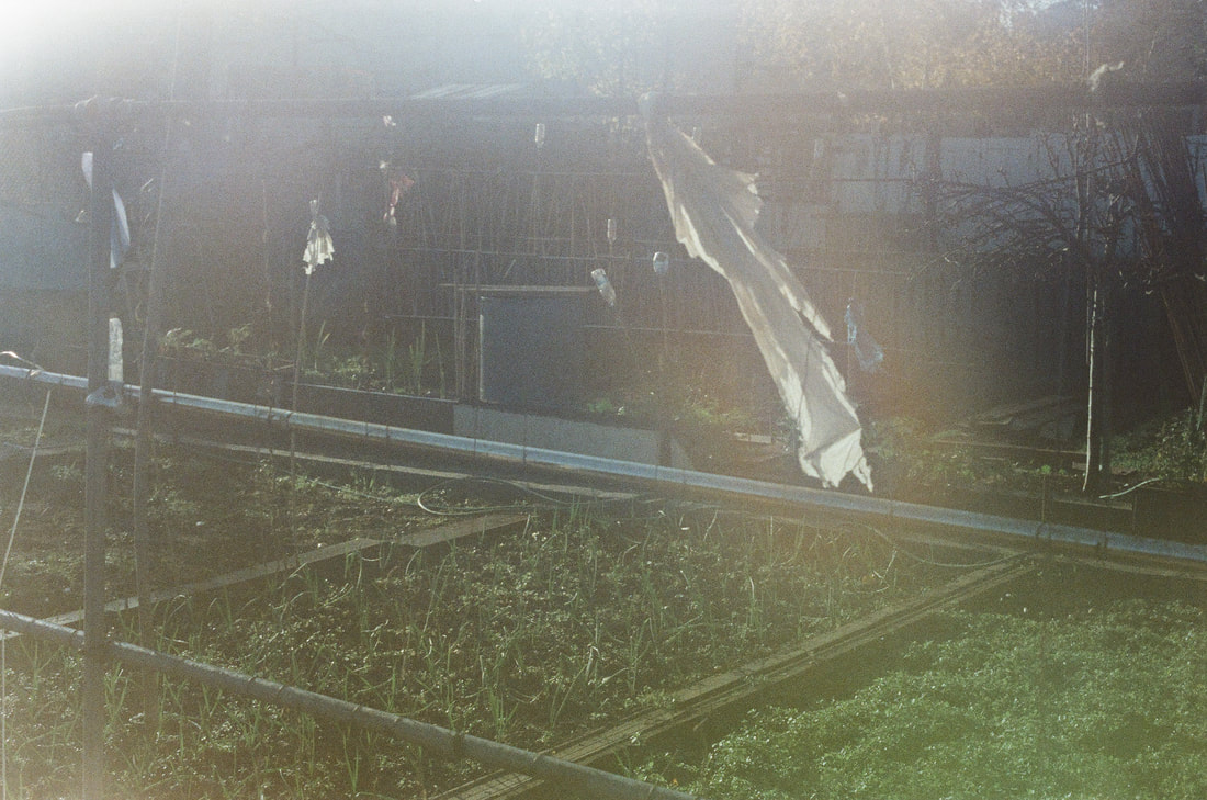
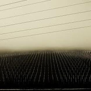
In this development I wanted to explore a different type of landscape with much more structure created through the lines and construction of the human 'foot print' within the land. For this I photographed a local allotment. In some of the photos I then tried to replicate the fog from development 6 by breathing on the lens.
(200 colour film)
(200 colour film)
|
|
|
|
|
|
1
|
2
|
3
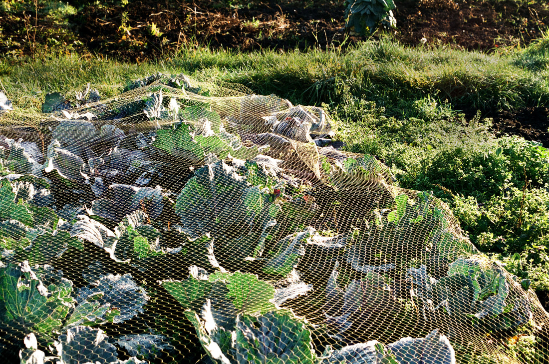
The lines created by the support sticks for the plants in photo 3 dissect the image, giving the photo different sections for the viewer to indulge in, creating a sense of structure. The scarecrows function as people, adding another dimension of a narrative within the image, however, since the viewer understands that the scarecrows are lifeless (or at least meant to be), there is a feeling of an otherworldly, perhaps even creepy, presence. This is emphasised by the composition of the scarecrows staring into the camera as if they are watching us look at them. A dreamy quality is then formed by the glare of the sunlight in the camera, coming from the top left corner, which partly covers details of the scarecrow on the left and creates a silhouette. The left scarecrow appears to have quite an angelic attribute due to this glare, as if, once again, it is coming from another world. I might like to play around with using narrative through objects similar to scarecrows in my later developments.
To try and make the image 'cleaner' and less busy so that the eye is not distracted, I used the 'burn in' tool on Photoshop in the right section, darkening the soil and the jumble of objects in the top right corner. This works in not directly attracting the viewer's eye as they will be more focused on the brighter parts of the Photo. Unfortunately the image is still busy, which is a lot for the audience to take in.
To try and make the image 'cleaner' and less busy so that the eye is not distracted, I used the 'burn in' tool on Photoshop in the right section, darkening the soil and the jumble of objects in the top right corner. This works in not directly attracting the viewer's eye as they will be more focused on the brighter parts of the Photo. Unfortunately the image is still busy, which is a lot for the audience to take in.
4
|
5
|
Similarly to photo 3 in development 7, photo 4 uses a nearly silhouetted figure, created by the glare of the sunlight. The way in which the figure is composed is as if we are passing him in his natural state of contemplating his garden patch, or maybe he is daydreaming of something completely different; either way the viewer is drawn into the narrative of the figure, questioning his thoughts and his background. We are also intrigued as to where he is looking and we want to follow his gaze which passes the frame of the image so is not possible, creating a sense of mystery. I would like to further interrogate this concept of 'what is beyond the frame' in my further developments.
This picture would be much more successful if there were no metal fences and flats behind the figure, in the background, as it reminds us that it is set in a 21st century city, removing the possibility of the story being timeless. This is also emphasised by the modern clothing that the figure is wearing.
This picture would be much more successful if there were no metal fences and flats behind the figure, in the background, as it reminds us that it is set in a 21st century city, removing the possibility of the story being timeless. This is also emphasised by the modern clothing that the figure is wearing.
6
7
|
8
|
9
Development 9:
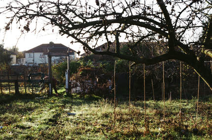
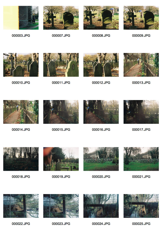
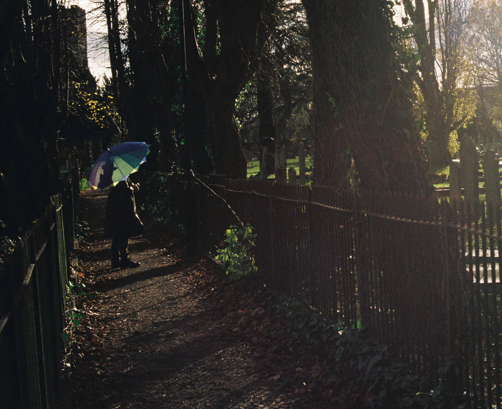
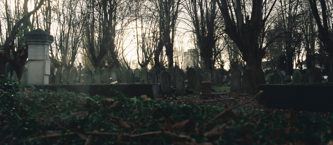
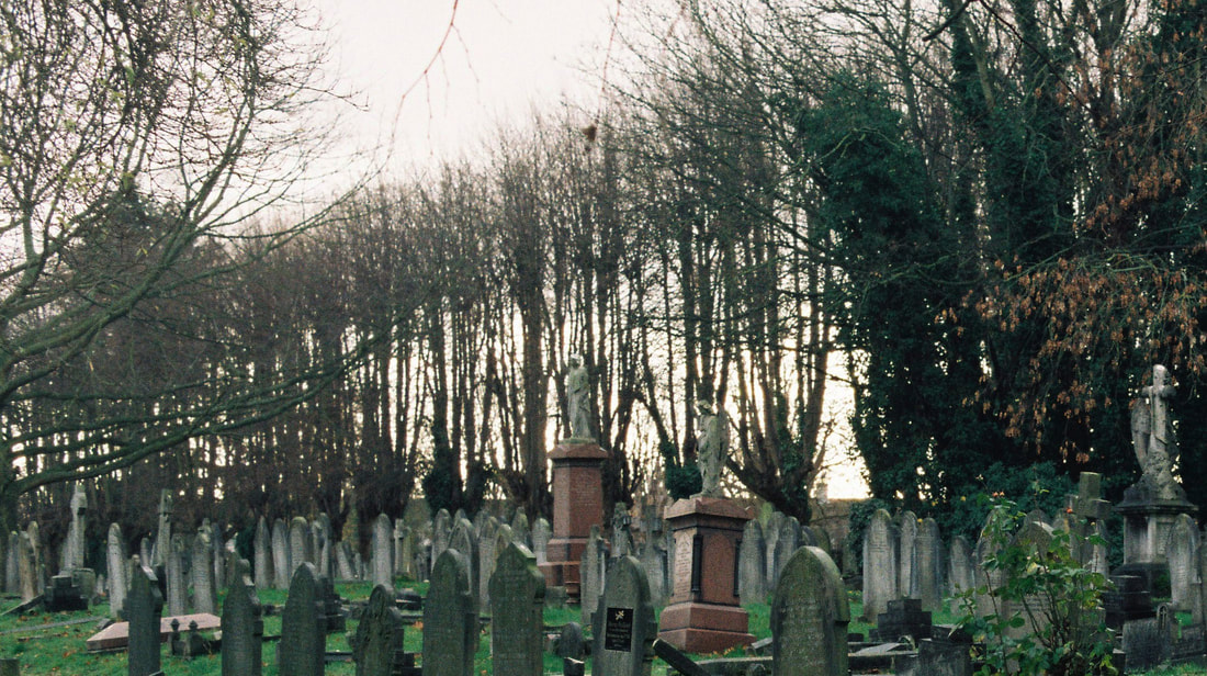
In this development I wanted to continue with exploring man-made constructions within the landscape, so I ventured to a local cemetery where I found that the strong lines of the gravestones and the bridge created structure in the image well. I also wanted to continue with a slightly creepy, ghost-like atmosphere created in photo 9 , development 8. In terms of the figure, I wanted to create a feeling of 'timelessness' so that it was difficult for the observer to place what era the photograph is set in. To do this I took more time in planning what the figure is wearing, and decided upon a hat and a trench coat.
(200 colour film)
(200 colour film)
|
|
1
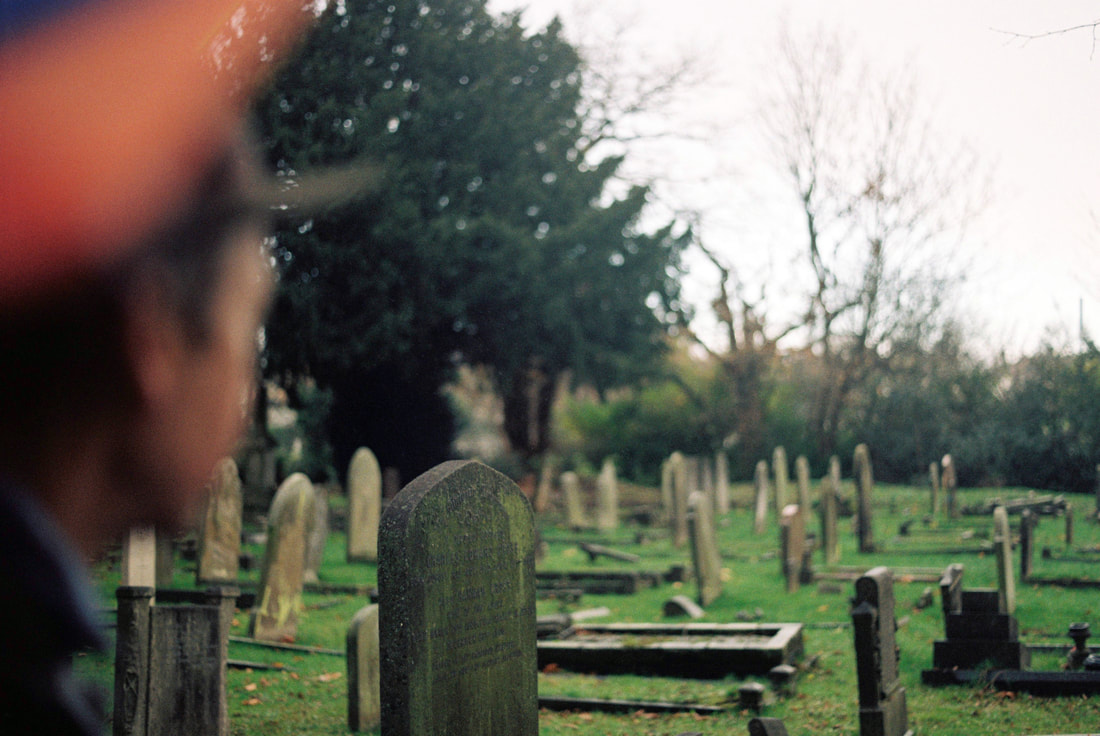
This photo captures the essence of the cold , gloomy atmosphere that I initially aimed to convey. The use of the wide aperture which puts only one headstone in the foreground in focus and everything else out of focus makes it feel as if there is a mist preventing us from seeing all the details of the scene. By having the figure so close to the camera and facing the direction we are, looking at what we're looking at, creates a sense that we are there at the cemetery with them, causing the viewer to possibly engage more with the image as they do not feel like an outsider.
This image could be improved by removing the large orange smudge in the top left corner which is a distraction as it is so big and difficult to identify but not what I want the viewer to focus on. The photo, with the seemingly endless and irregular distribution of headstones is also a little too cliché and 'cheesy' to make an impact on the audience.
This image could be improved by removing the large orange smudge in the top left corner which is a distraction as it is so big and difficult to identify but not what I want the viewer to focus on. The photo, with the seemingly endless and irregular distribution of headstones is also a little too cliché and 'cheesy' to make an impact on the audience.
2
3
4
Development 10:
I was unsatisfied with where my developments were heading and so I wanted to return to the concept of layering and 'double exposing' the landscapes from developments 4 and 5 to create a new, and more interesting, landscape of my own. I photographed new images on an old role of film which meant that it was difficult to get the right exposure so all of the images came out over-exposed making layering the negatives hard. This meant that I was only able to layer one image from the film with an old image that I took so that something showed up. The effect of this were high contrasted, partly over-exposed images.
(old 200 colour film)
(old 200 colour film)
1
|
2
|
3
4
Although 4 is very over exposed, and there is not a lot of depth to the darker tones, I find this image the most successful in terms of what I am looking for in my photographs. It is not obviously made of 2 images and it looks like that that was how the landscape initially was. The texture of the smudged areas in the trees created by the film being old adds a sense that it is a wind, winter day, transporting the viewer to their memory of such a place.
The image would be more successful if it wasn't so over exposed and if there was more depth to the darker tones which would give the image a greater impact on the audience.
The image would be more successful if it wasn't so over exposed and if there was more depth to the darker tones which would give the image a greater impact on the audience.
5
Development 11:
|
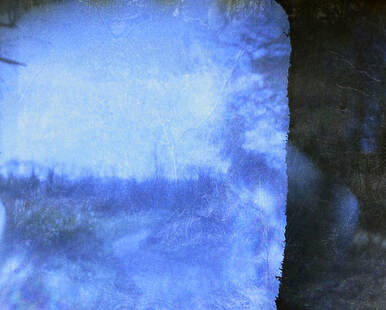
Matthias Heiderich: 1982-present
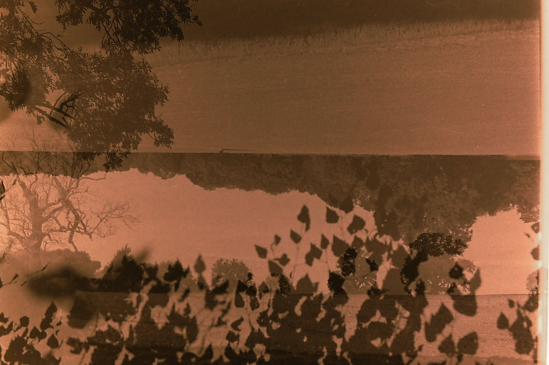
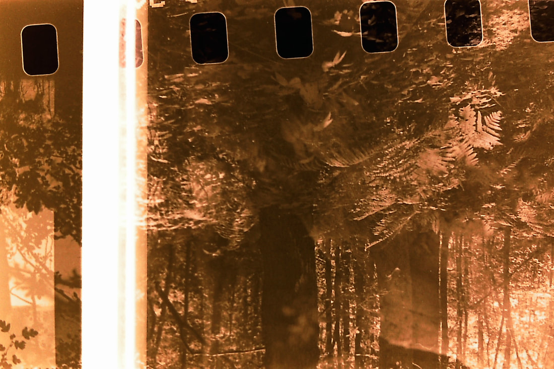
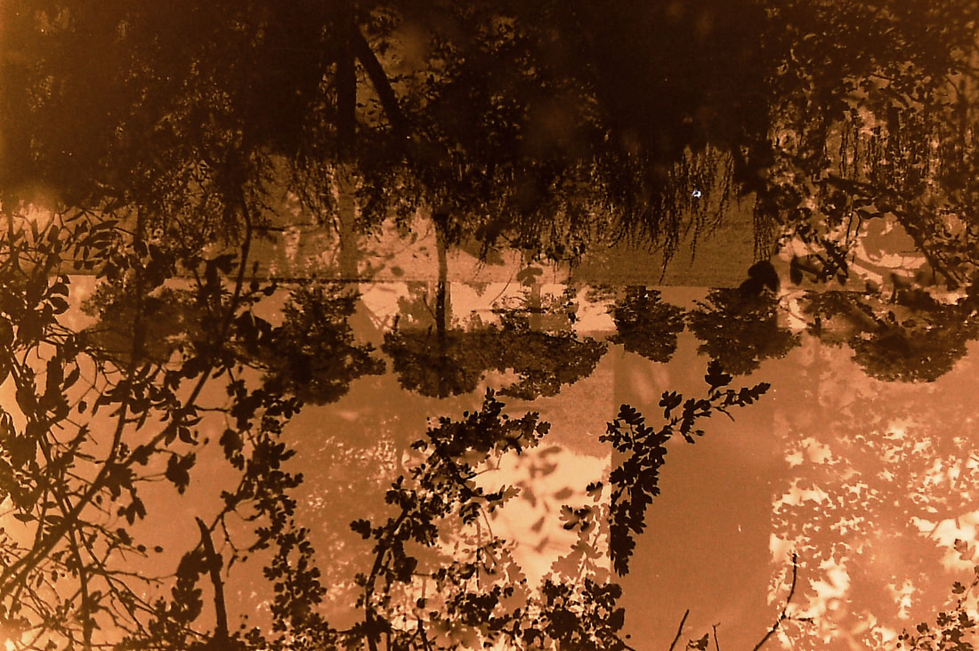
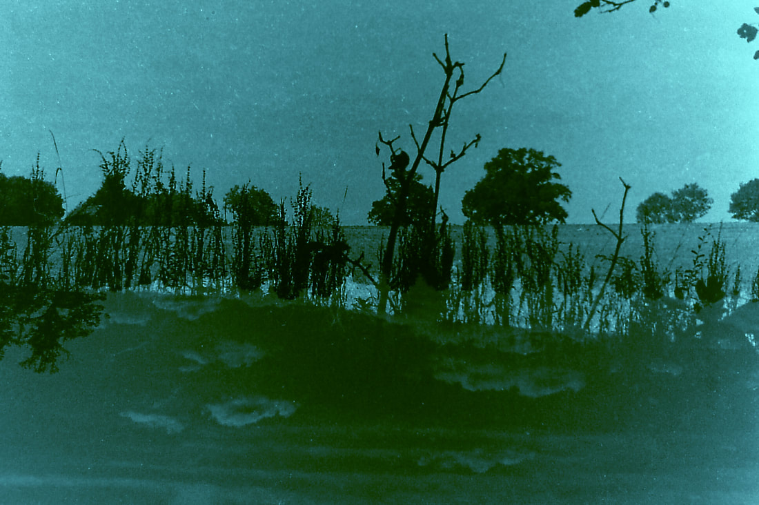
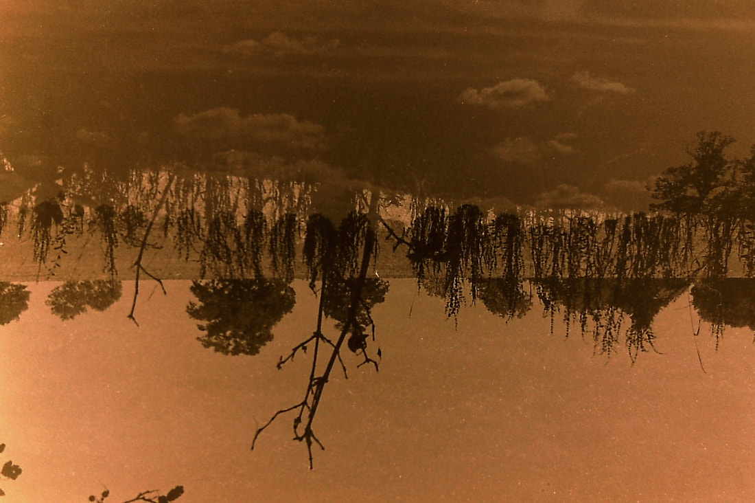
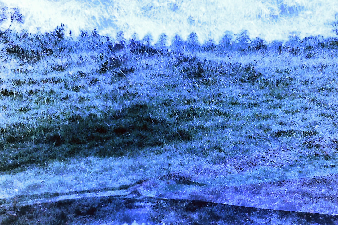
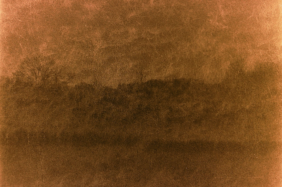
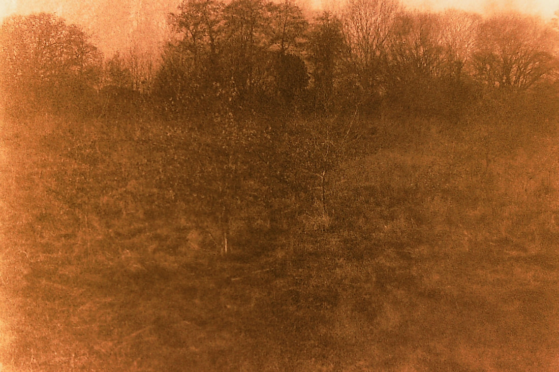
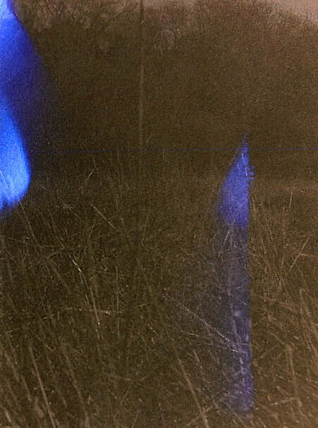
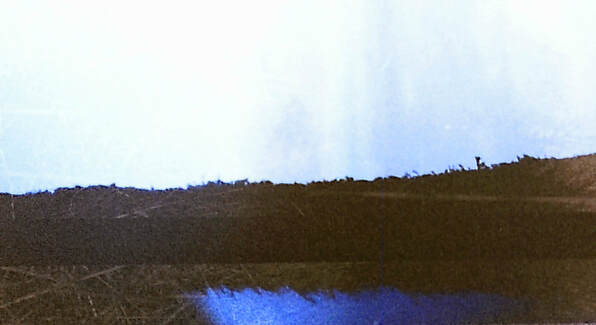
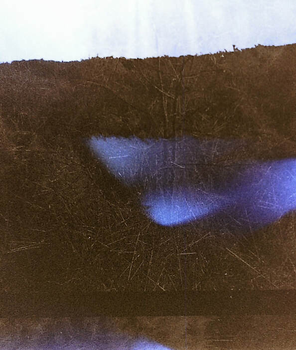
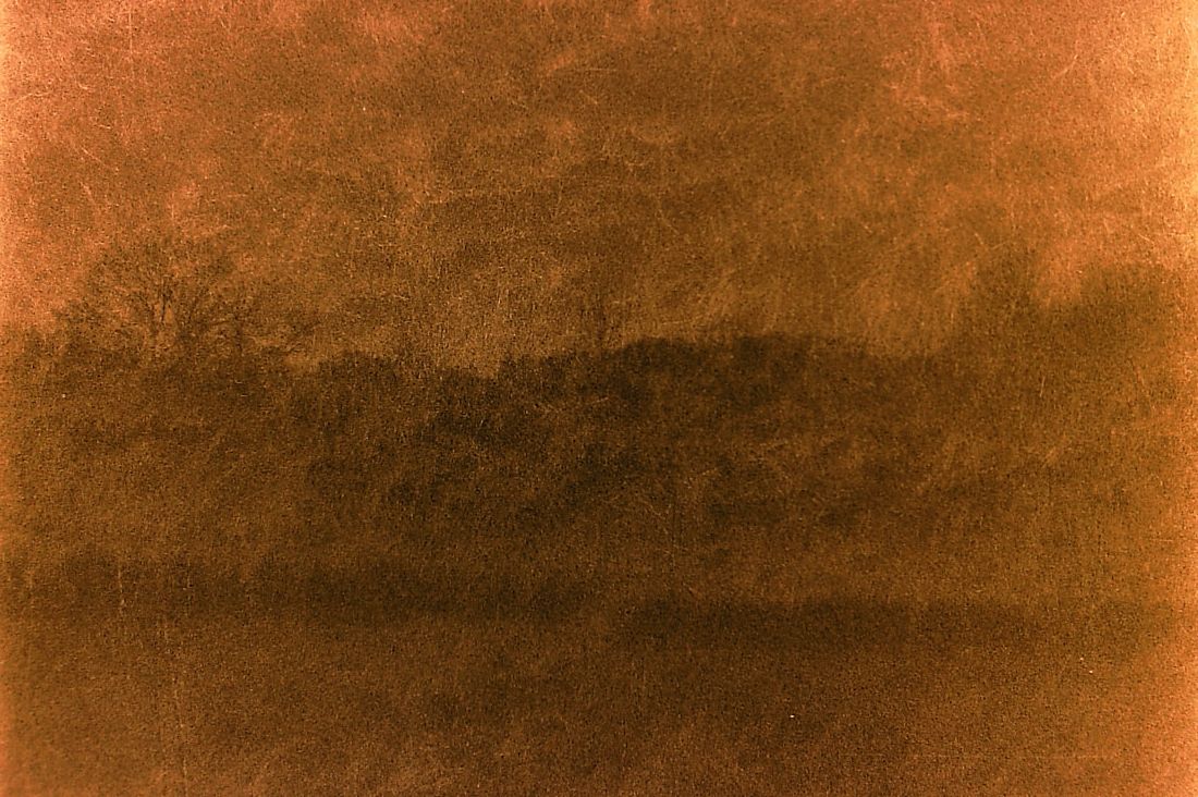
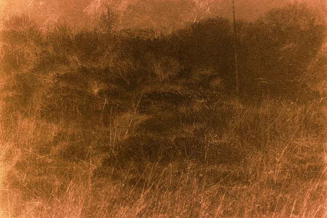
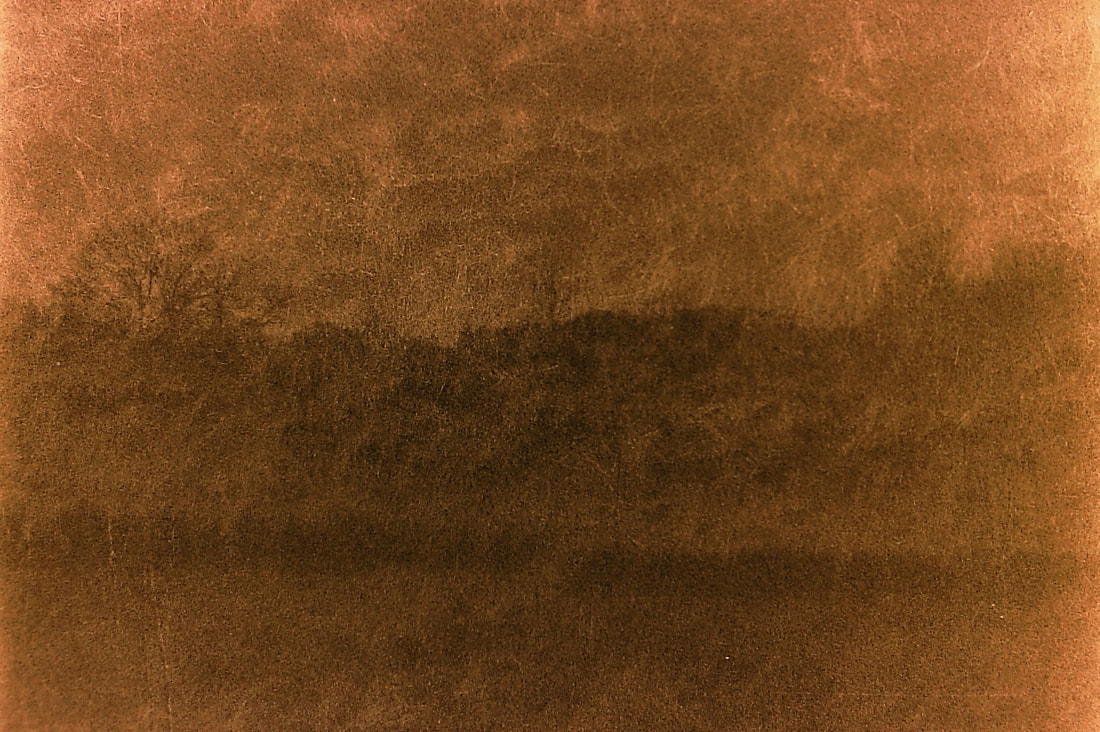
Born in Munich, he bought is first camera in 2008. Heiderich is a self-taught photographer who is inspired by "music, vinyl covers, other photographers, [and] good graphic design'. Photographers that influence him include Joseph Schultz, Christoph Morlinghaus, Mark Weaver, Tim Hecker and Monolake. Unlike the majority of his work, the series 'White noise I' explores black and white images of fog in the natural landscape without the bright, bold primary colours of the strong, industrial architecture of Berlin, where he now lives. When he goes out he usually searches for patterns, lines and colours in the landscape which is not something that is clear in White noise I. Since he is a relatively new, upcoming photographer there is not a lot of information about him and why he decided to, for one series, explore black and white imagery of natural landscapes. In his book, he mentions the concept of isolation and how everyone will end up alone, which is reflected in White noise I with the use of the endless empty negative space and the dark, murky tones. I would like to continue with the idea of layering negatives over each other to create a new landscape, however, I would also like to insert this idea of a gloomy, murky scenery, adding a different atmosphere to the images, perhaps even of the isolation that Heiderich touches upon. (3200 black and white film, 200 colour film- pinhole camera) |
|
1

2
The fluctuating texture of the grass in photo 2 creates a dynamic with a feeling of movement, perhaps from wind blowing, giving the photo a story or background- the way that the grass creeps 'up' the photo changes the original landscape (my initial intention) and even looks like the sand dunes that one would need to climb up before reaching the beach- adding that sense of adrenaline and excitement. Of course, this is what I see in the image but since the photo has an abstract quality to it, what the actual scenery is is up to interpretation for each viewer, giving it a sense of sentimentality and nostalgia. This is emphasised by the sepia tonality.
This image would be better if there wasn't light coming in from both left and right, removing the depth of where there should be darker tones. This may be from the light being exposed to the film in the camera or it may be because the film I used was out of date. The fact that the grass is also visible in the 'sky' makes it more obvious that the final image was created by 2 pictures layered over each other and so eliminates the possibility of it being a landscape of its own. However, the grass adds texture to the 'sky', making it more compelling.
This image would be better if there wasn't light coming in from both left and right, removing the depth of where there should be darker tones. This may be from the light being exposed to the film in the camera or it may be because the film I used was out of date. The fact that the grass is also visible in the 'sky' makes it more obvious that the final image was created by 2 pictures layered over each other and so eliminates the possibility of it being a landscape of its own. However, the grass adds texture to the 'sky', making it more compelling.
3
4
5
6
7
8
9
10

11
12
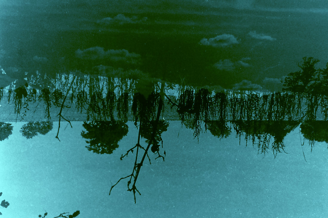
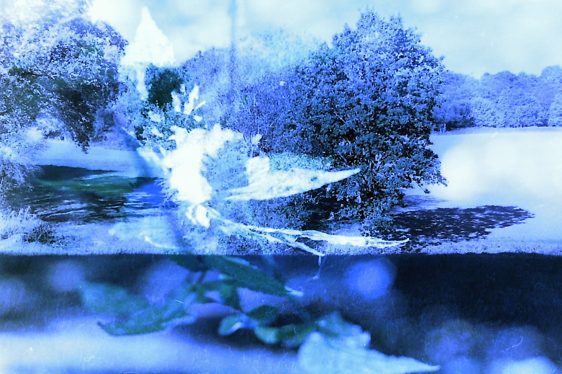
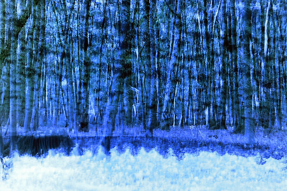
11 and 12 were created with a pinhole camera made from a small matchstick box with a role of film inside that you turn like a normal film camera. Because of the style of camera, I was able to roll on the film but not completely as I would not know how far to roll it, meaning that when I next exposed the image, it partly double exposed the 1st image. Something quite unusual about them is that they have also even been 'triple exposed' which is clear through the intricate detail of a few trees dotted around the frame- I am not quite sure how this happened but I believe it adds another texture to the images. The way that there is a division going vertically through 12 and the different ground levels from each side of the division disorientates the viewer making it difficult to understand the image which was also my intention.
'Artist and Me'
Matthias Heiderich
|
Me
|
Final Piece(s):
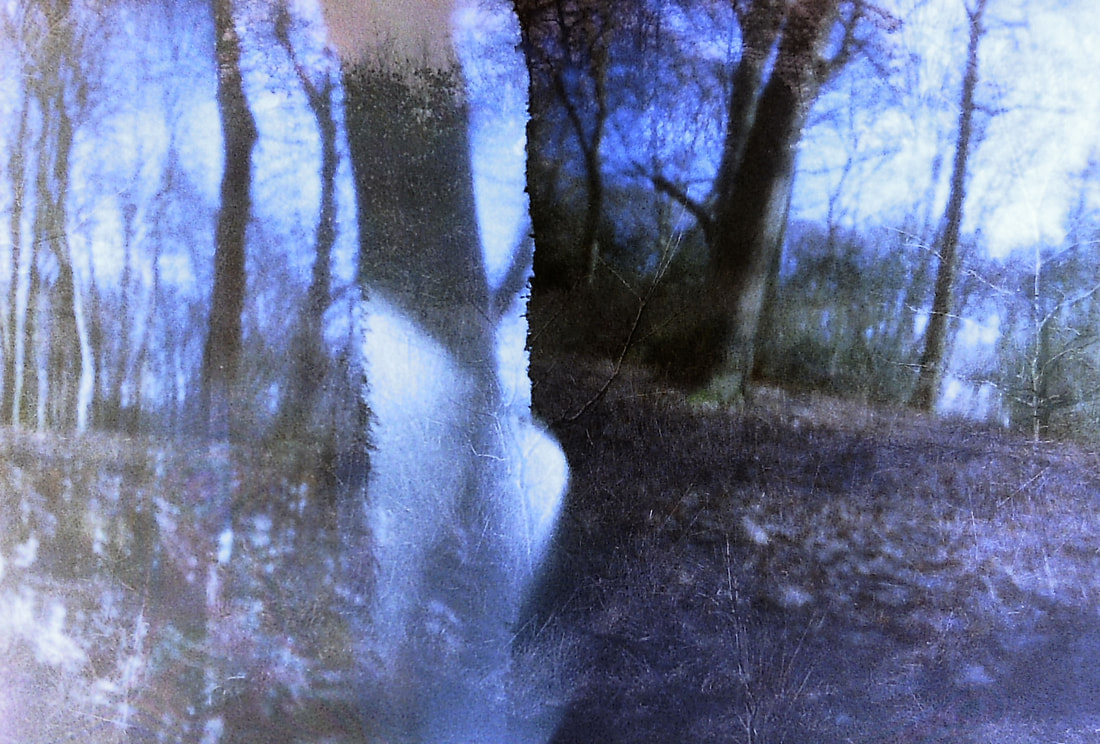
My final piece comprises of 4 images from development 11. I find that these are my most successful photos that all relate to my intention of recreating a landscape. There are 2 sets of the 'recreating landscape' pieces- the 1st set are obscure and subtle in how they are 2 different landscapes whereas the 2nd are more obvious, having artificial divisions through the frame. These completely contrast each other with the 2nd set having a bolder blue colour unlike the 1st set which are sepia toned (and originally were black and white). I want to have the 2 sets to present the distinct ways that a landscape could be recreated- in a more surreal way (set 2) or more realistically (set 1).

|
|
