Task 1: The Conversation
Introduce the task and link it to the exam theme
|
Paul.M.Smith: 1969- present
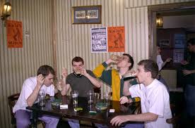
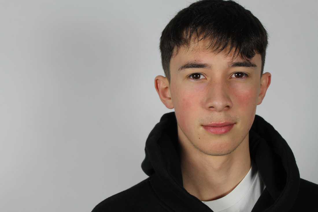
Paul M Smith's work involves taking a series of photos where he or another person, such as Robbie Williams, poses in one setting but as different characters. He then uses Photoshop to put all the images together creating a group photo of the same person. Smith's intention for the 'Make My Night' series is to recreate a lads' night out in which he presents the theme masculinity. This is shown through the characters addressing that the camera is there, and even performing for it, but some may be completely oblivious. His work is inspired by his time as a combat engineer in the army where he had to "embrace the lads' culture" otherwise, as he notes, he would have been "ostracised". The idea that the protagonist is all of the characters, that they are all one person, emphasises Smith's intention- highlighting how this culture of masculinity and being part of the army forces everyone to be the same and conform to the rules and regulations set out, whether that be a uniform or simply how you're expected to act. |
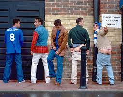
This links to the theme of codes and conventions as you're expected to adhere to the underlying stereotypes of your role within society. The word masculinity immediately has connotations of strong, brave and heroic which is portrayed in all of Smith's photos in this series.
|
My Interpretation:
|
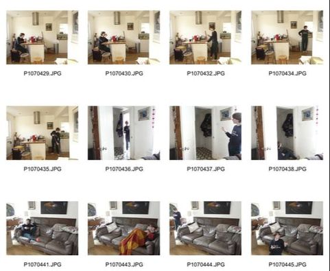
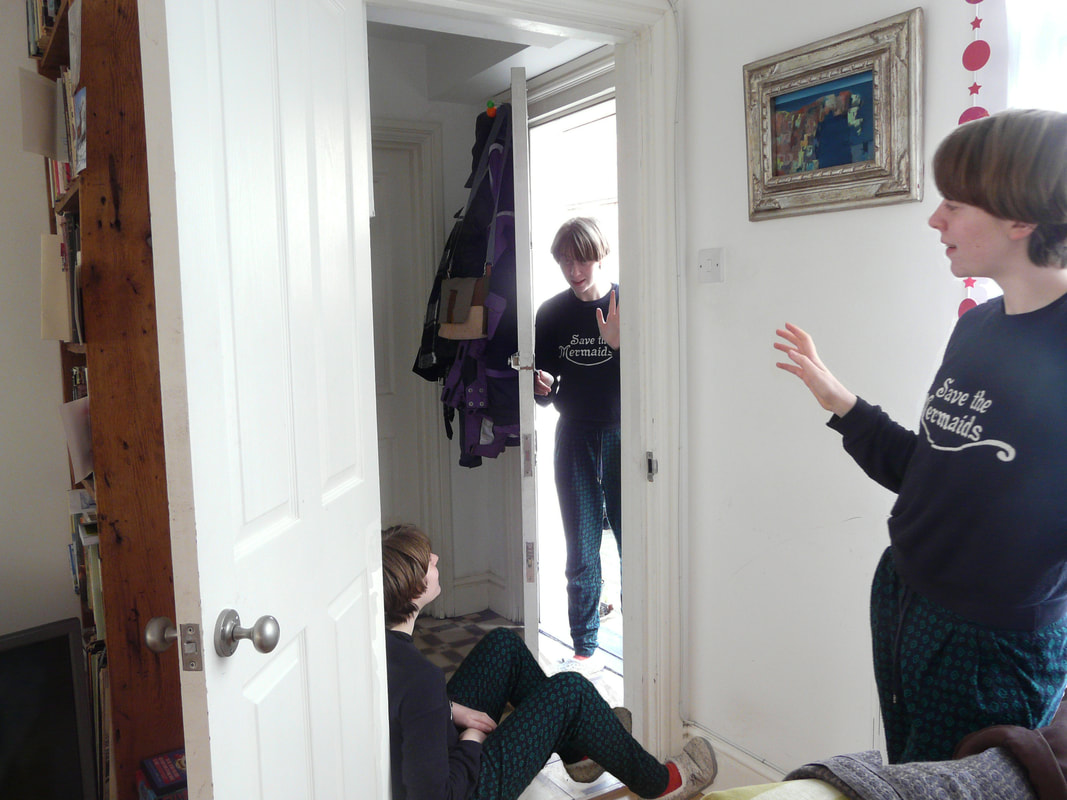
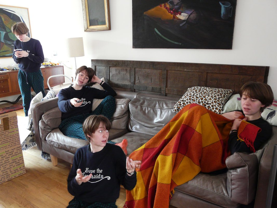
Using Paul Smith's work as inspiration, I photographed myself- by using the timer on the camera- in different positions as different characters. This links to the theme of Secrets, Codes and Conventions as it is to do with the 'protocols' within the household, which is clearly shown in photo 3 with everyone getting together to watch a family film on television. Unlike Smith's work, mine explores the idea of the system in the household and family, whereas his is focused on the codes and conventions within the male community.
Since I wasn't in control of the camera whilst it was taking the photos, it proved difficult to get the lighting correct. I attempted to adjust this using photoshop but as it was already so harsh, it didn't work out how I intended it to. In photos 2 and 3 the lighting is very cold which makes the images harder to the eye, causing the viewer to find it laborious and demanding to look at them. A more successful image is photo 1. This is because not only is the composition more interesting ( perhaps from a triangle being created by all the heads), it has a much more of a softer quality due to the warmer lighting. I also had a difficulty in Photoshop-ping the person sitting on the floor in photo 2, which is evident by the feet looking very 'pasted on'. This is due to when taking that shot, I had the door closed meaning the foot which the light hits doesn't have a shadow, making it obviously look 'cut out'. To avoid this mistake, I should've left the door open. The composition of photo 3 is also quite intriguing because of how there is so much happening; there's a conversation occurring in the foreground in which the figure on the floor is quite animated, and in the background someone is carrying a cup of tea and seems very focused on not spilling it. |
1
2
3
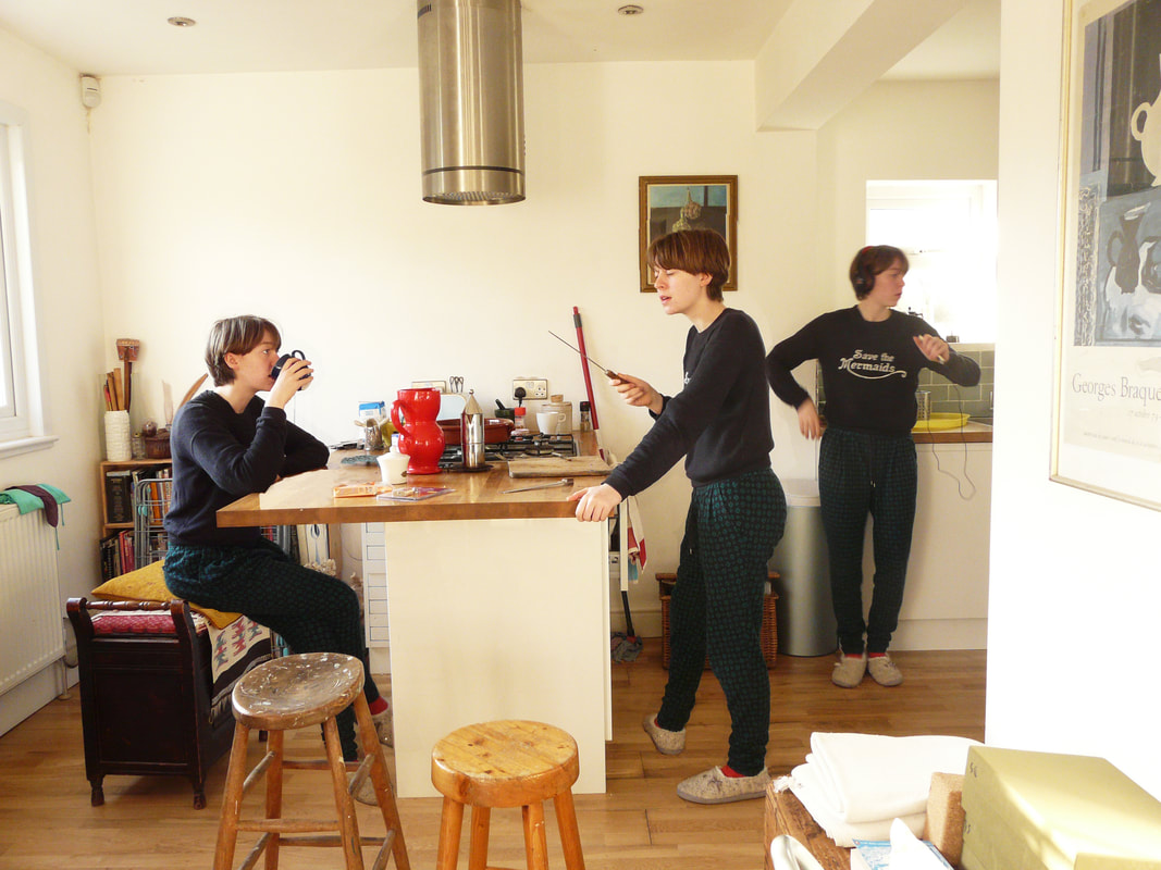
This all makes the image slightly more realistic as it appears as if it was meant to just be a photo of the people on the sofa, but there is another person 'photo-bombing'- this often happens when taking a family photo.
|
Exhibition Visit to the Hayward Gallery- Andreas Gursky
|
Born in 1955 in Leipzig, Germany, Andreas Gursky and his family fled East Germany to seek sanctuary in the West, where he grew up. He spent his childhood in his parents commercial photography studio searching for "anything that looked like it might be fun to play with" - starting his journey with photography off. He started his career in film photography then immersed himself in digital photography in which he was able to edit and modify the images, like removing a factory and dog walkers in the landscape photo to the right.
|
|
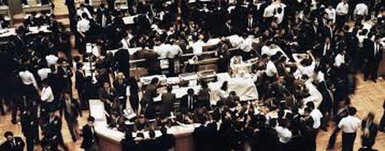
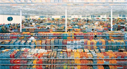 99 Cent
99 Cent presents one of Gursky's prominent techniques in which he took multiple photos of the same scene but with different perspectives, allowing him to keep everything in the photo in focus; this creates quite a "supernatural" effect and, as written in the exhibition guide, "it results in an odd, suspended and bodiless perspective". The reason he chose to do this was because he believed that through manipulating the image, it brought us "closer to the truth". He used this technique to reveal to the audience certain views he had on society. In this photo, Gursky is making a point about consumerism and global capitalism. With the masses of bright, colourful products- which have also been manipulated to reflect in the extremely glossy ceiling- we feel overwhelmed and even claustrophobic. This feeling is emphasised by the uniformity of the rows and rows of discounted items but also the sheer scale of it at 81 1/2 in. x 132 1/2 in. The size of the image not only reflects the size of this industry, but also how we, as consumers, always feel the need to have more, and the fact that 99 Cent causes us to feel negative towards this shows that Gursky has, in a way, succeeded.
By forcing the viewer to take in the whole image at a distance and then zoom in to study the details, Gursky invites us to spend more time analysing his work and therefore retrieving his 'meaning' of it.
By forcing the viewer to take in the whole image at a distance and then zoom in to study the details, Gursky invites us to spend more time analysing his work and therefore retrieving his 'meaning' of it.
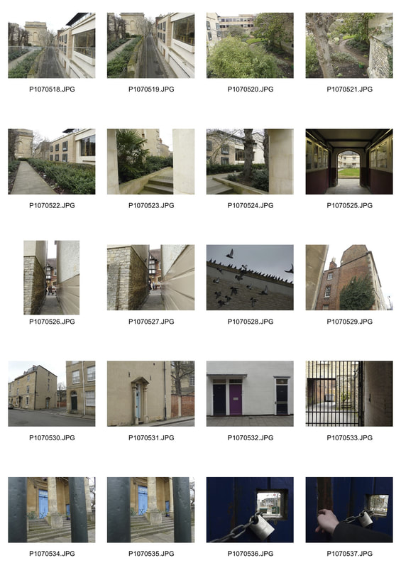
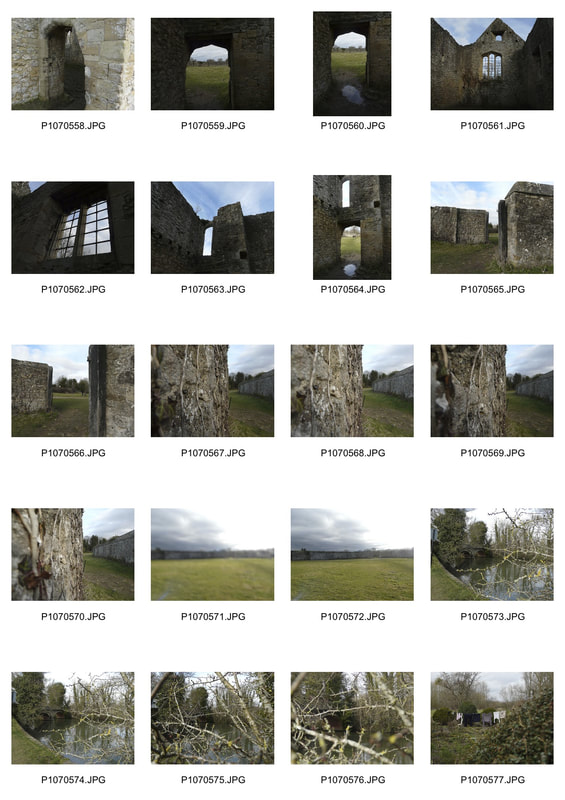
Task 2: Hidden Locations
In this task, although I did not take photos at night with a bright light, I used Coulon's idea of secrets and hidden places to capture some 'out of sight' spots. I roamed the streets of Oxford (where I ventured to for the day) keeping my eyes peeled for anything which would create a sense of mystery in my photos...
|
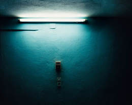
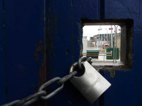
Gilles Coulon: 1966- present
Coulon is a French photographer, born in Nogent-sur-Marne. He started his photography career by working for Libération, a french newspaper, in which he captured the different 'faces' within the french society- ranging from the themes of suburbia, insecurity and immigration. He then travelled to Mali which expanded his photography experience- shooting not only the beautiful landscapes that he encountered, but also the people and their livestock in which he documented part of their life in the series Transhumance. The series White Night, as shown to the left, is something, for Coulon, completely different. His inspiration came from a bright neon light that he walked upon in a night market in Niamey. This began his obsession in which he placed neon lights in normal everyday settings such as restaurants, streets and allotments, creating a mysterious and dark effect. Because it is at night, in a way it is already 'forbidden' from sight, and with this light, only part of the landscape is revealed causing there to be murky, hidden corners and shadows where we daren't look. This reflects the idea of secrets as there is so much that is concealed and unseen at night. |
|
|
|
|
 1
1
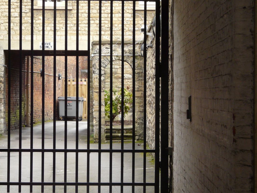
Photo 1 is an interesting composition which has succeeded in my intention of capturing secret places. The fact that there is a wall and key preventing the onlooker from fully viewing what is on the other side creates that effect of mystery as there is something which someone does not want us to see. The use of a wide aperture and a lower depth of field has meant that what is through the window is more in focus than the foreground of the lock and door. This immediately pulls the viewer's eyes to the restrained scene. When taking the photo, I decided to include the lock and chain because it adds to the idea of something preventing our eyes from seeing beyond and so preventing us from learning. By putting the window to the slight left of the image rather than the centre, it has allowed us to note the quality of the door and the rust on the lock, and therefore, perhaps, how little attention they gain, inferring that people rarely visit this sight. This emphasises the concept of the place being derelict and lost, like many secrets.
This photo could be improved by widening the aperture so that the background has a much more of a crisp quality, which then would mean the foreground is a lot blurrier. By doing this, it would accentuate the effect of drawing in the audience to look through that window however, it may mean that we wouldn't get the same texture of the blue door. The image could also be brighter, causing it be more vibrant and so have a greater impact on the viewer.
This photo could be improved by widening the aperture so that the background has a much more of a crisp quality, which then would mean the foreground is a lot blurrier. By doing this, it would accentuate the effect of drawing in the audience to look through that window however, it may mean that we wouldn't get the same texture of the blue door. The image could also be brighter, causing it be more vibrant and so have a greater impact on the viewer.
2
3
4
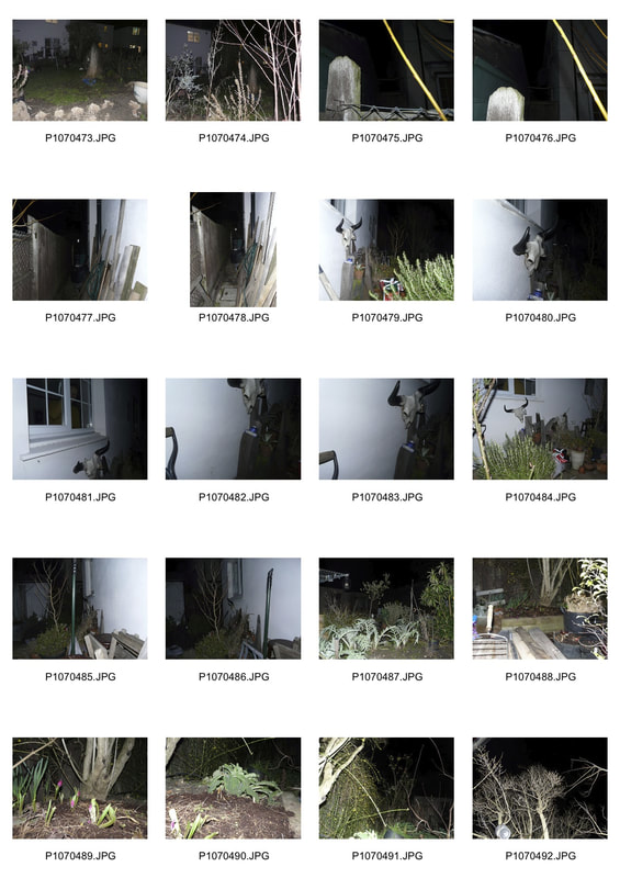
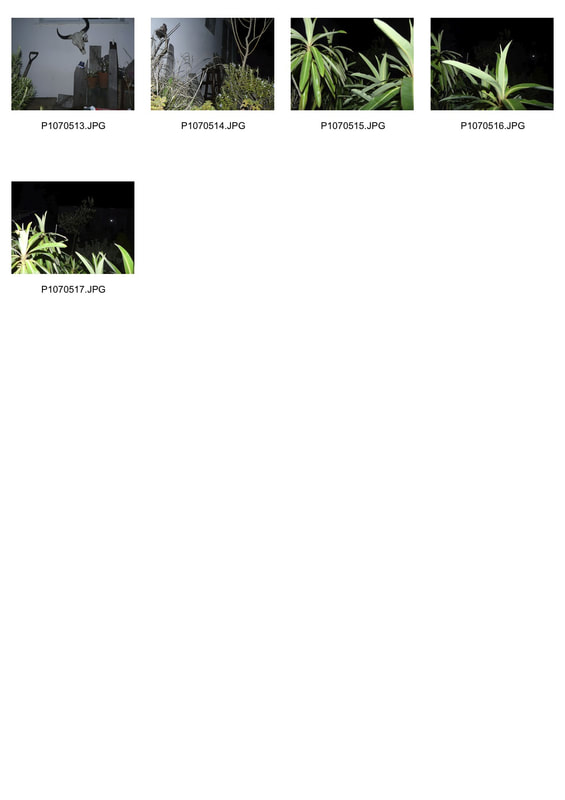
Task 3: The World at Night
|
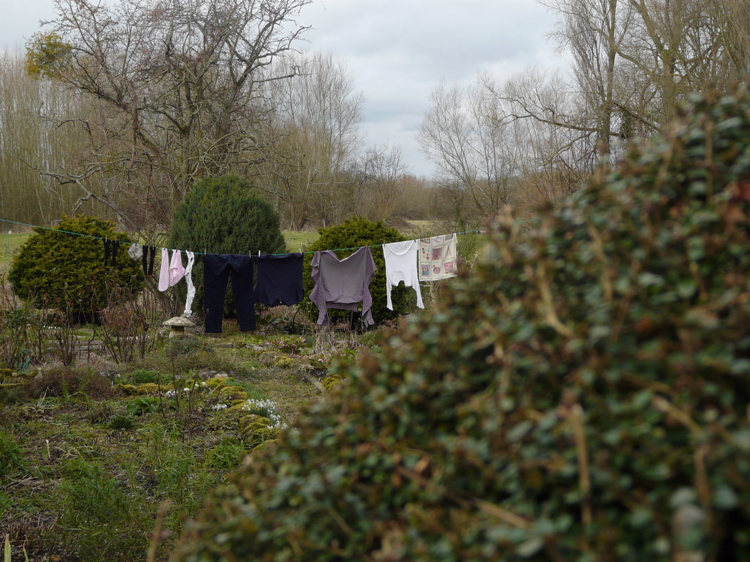
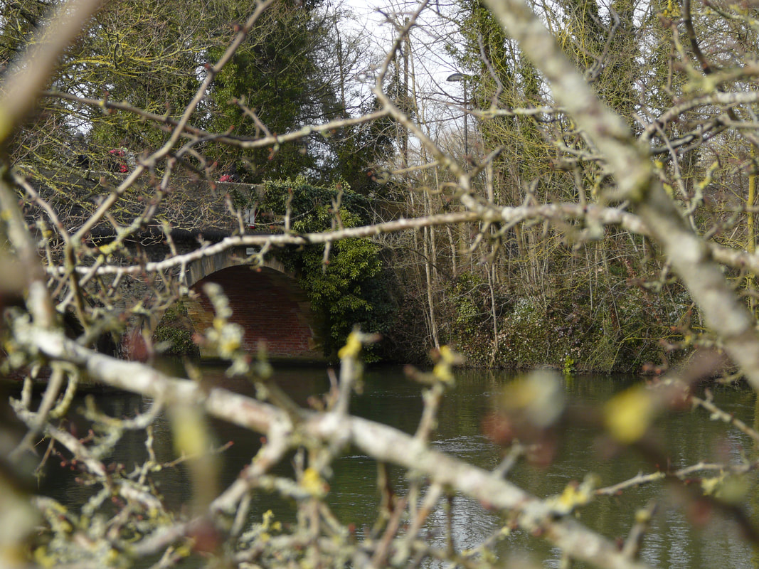
Grant Simon Rogers: 1964-present
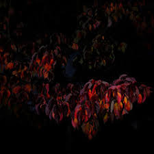
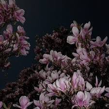
Born in Singapore, Rogers now goes between living and working in London and Berlin. Rogers is passionate about photographing landscapes and trees but with a unique touch. He chooses to use a mid-twentieth century cinema technique called 'Day for Night' which creates the effect of the images having been taken at night, even though they haven't. By creating a very dark and underexposed image along with him using a torch to light up the subjects, he causes the once quite delicate flowers to become beautiful, and even haunting, depictions of themselves. Once again, the use of the dark and the shadows creates a sense of tension due to there being hidden places that our eyes cannot reach. This highlights the theme of secrets. The fact that he uses the 'Day of Night' technique is also, in a way, breaking conventions of not only how we expect photos to be taken, but also what we expect photos to be taken of. This means that we have this expectation that photos present to us the real world but here, Rogers is manipulating this world to create something else. |
|
|
|
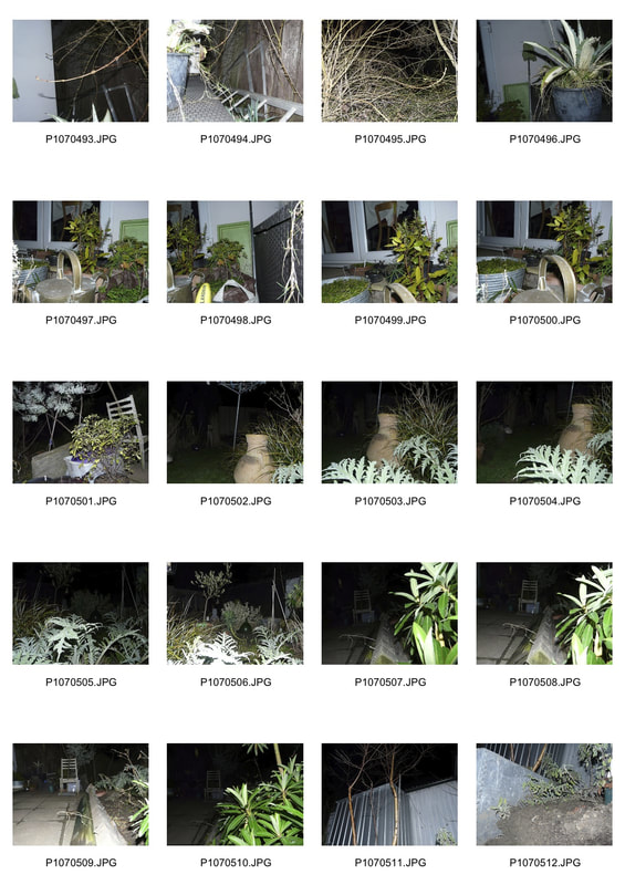
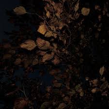
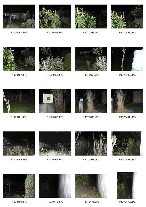
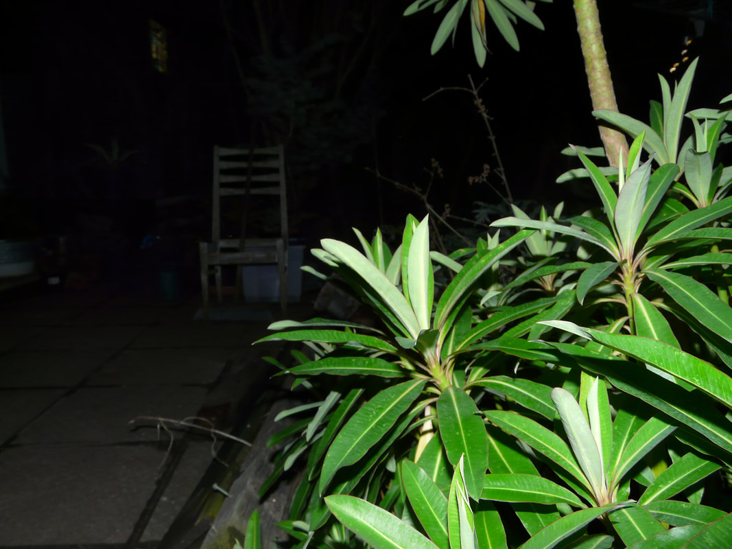
For this task, I photographed my garden at night with the flash since I don't have the technology to create the effect 'Day for Night'.
|
|
1
2
 3
3
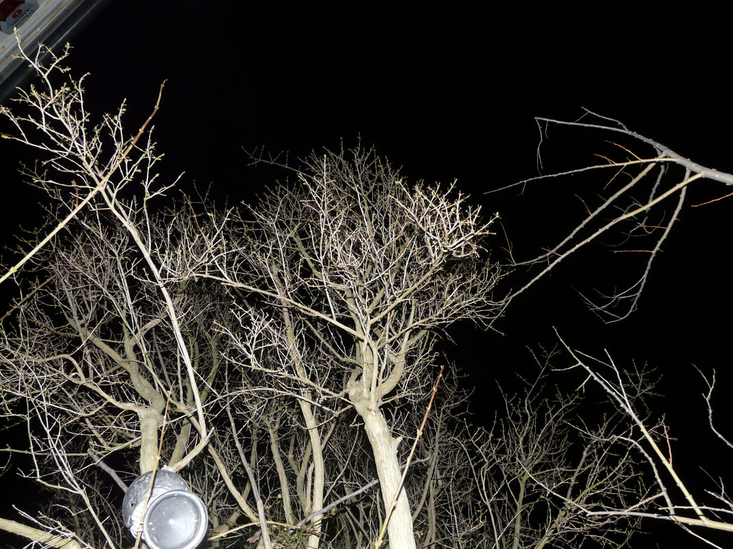
Photo 3 is interesting because the flash lights up the plant in the foreground which accentuates the surrounding darkness and so leaves somewhat 'floating' objects behind. This includes the just slightly visible sculpture in the background, which if you didn't know what it is, you would find it very difficult to identify. The mystery of what that object is and how the darkness reshapes and reworks things, leaves something in the photo which the viewer can immerse themselves in and ponder on. This successfully portrays my intention of creating secrets and hidden places.
Unfortunately, the use of the flash has flattened out the image causing it to lose its depth and therefore that essence of secrecy. This is apparent with the washing line behind the plant which appears as if it has been collaged on. This effect could be avoided by perhaps using a different source of light which is a lot softer and similar to daylight.
Unfortunately, the use of the flash has flattened out the image causing it to lose its depth and therefore that essence of secrecy. This is apparent with the washing line behind the plant which appears as if it has been collaged on. This effect could be avoided by perhaps using a different source of light which is a lot softer and similar to daylight.
 4
4
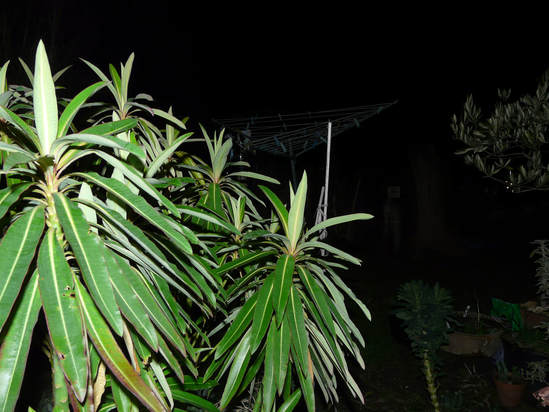
Photo 4 is much more flattened than photo 3, making it a much less successful image. As everything seems to be in view, this ruins the theme of hidden places causing it to not meet my initial intention. It would have been a lot better if some of the objects weren't under the light and also if it was less busy.
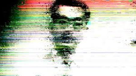
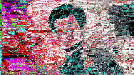
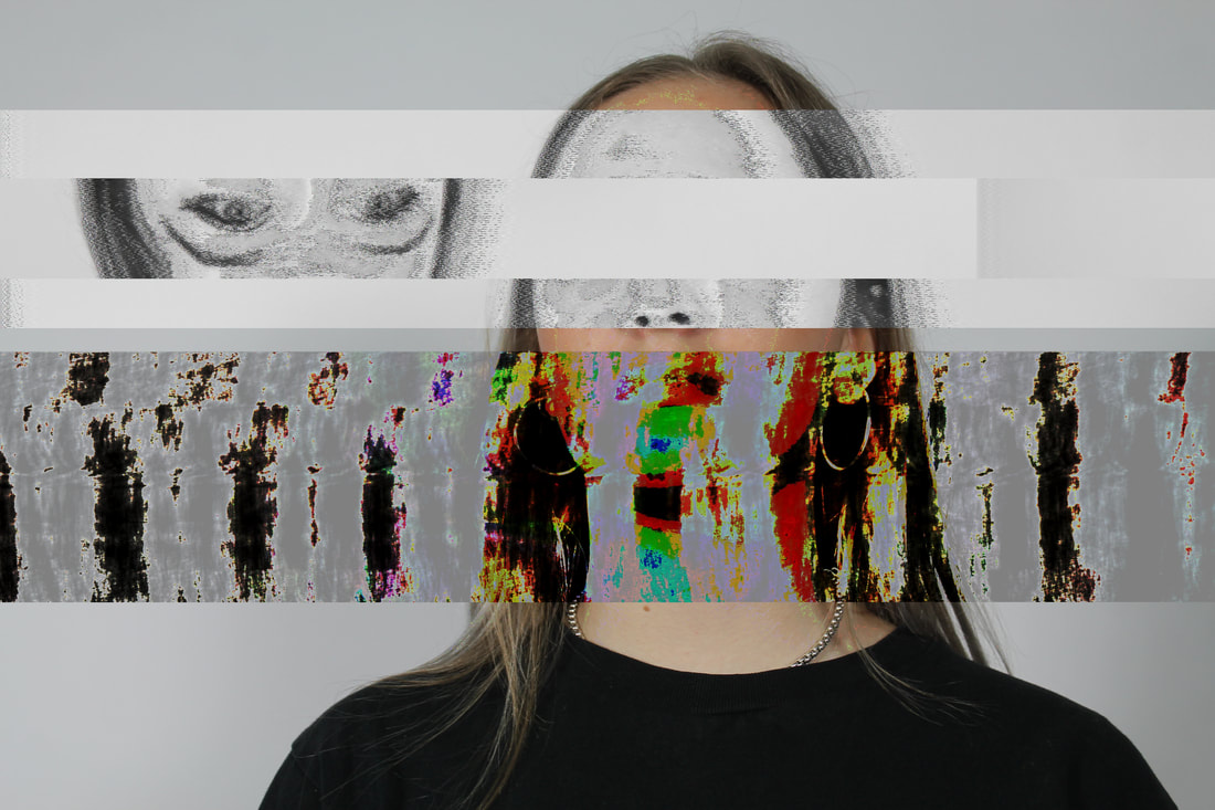
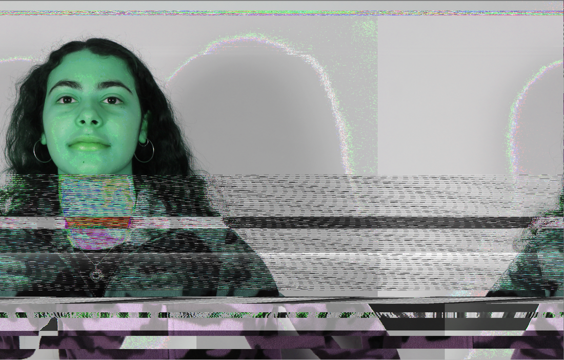
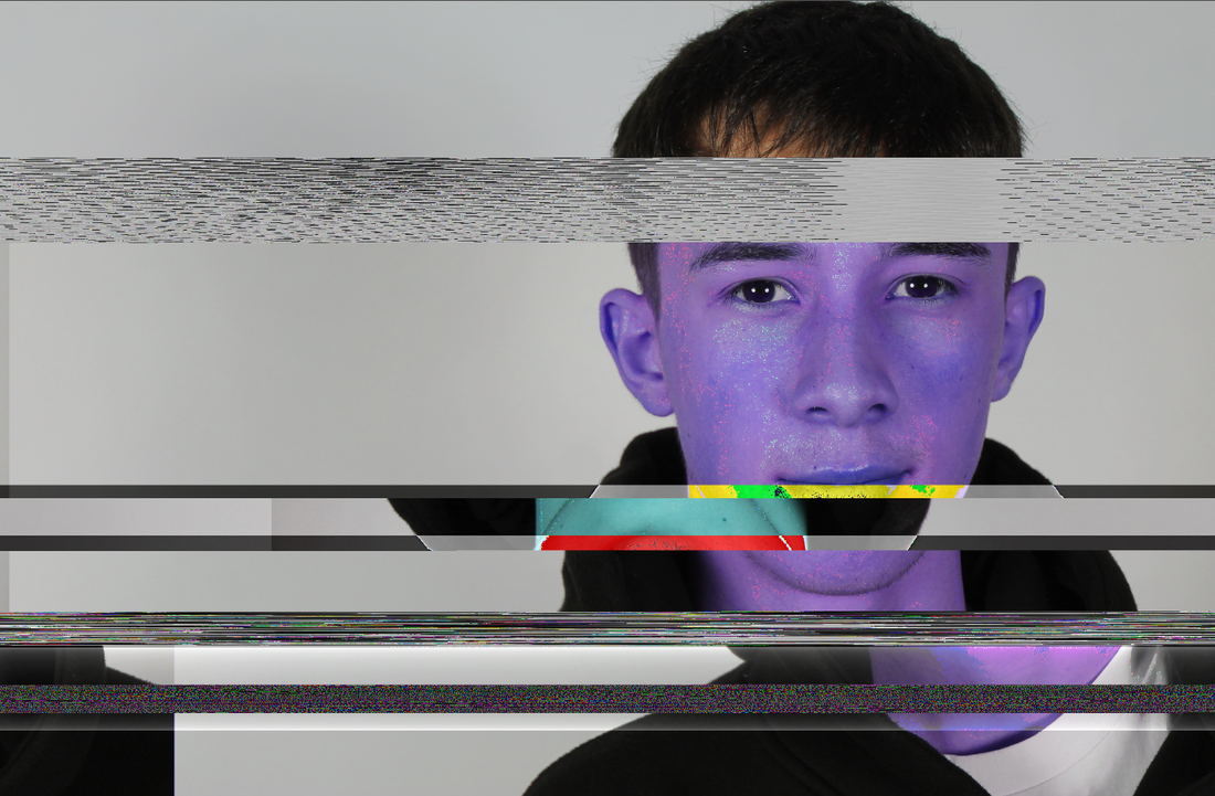
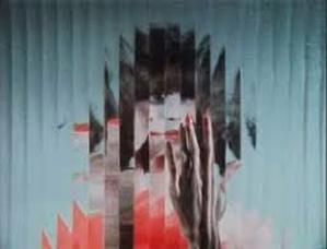
Task 4: Glitch
Mathieu St-Pierre:
|
St-Pierre grew up in Montreal, Canada and recently moved to South Korea. He uses different computer software to edit his photos and videos to create glitch art. His interest in glitch art sprouted from a love of cinema, after he studied experimental cinema and art at university. St-Pierre's inspiration comes from Takeshi Murata's "Pink Dot"- a video of a pink dot constantly glitching and changing into other things, which he came across in 2010. He then formed the Facebook group Glitch Artist Collective, where a community of glitch artists (of music as well as art) can come together and share their work. It now has over 50,000 members.
St-Pierre's work fits into the theme of Secrets, Codes and Conventions as not only is he breaking the conventions of the photo industry- by using a technique which we would usually connect with something as being broken- but as we cannot see the figures clearly, like the eyes which are 'scratched' out, it's as if they are hiding something. The onlookers play a game of guessing what is behind the 'curtain of glitch', making the images very mysterious. |
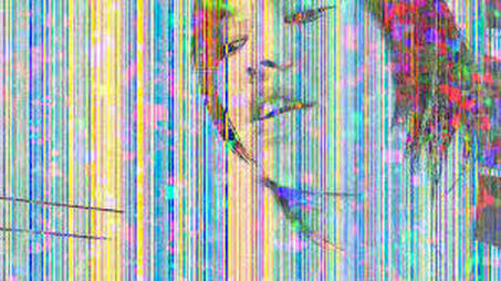
Inspired by Mathieu St-Pierre's work, I took photos of three people in my class and then using software such as audacity and text edit, I edited the images. In audacity, a music software, I adjusted things like the 'speed', or added some 'echo'etc., after highlighting a certain part of the 'sound wave'. For text edit, I would copy parts of the text and place them elsewhere, delete sections and even insert text from a song. After editing the images, I would finally be able to see them by exporting them to the desktop. Because I only got see the results of the edits at the end, it was difficult to keep track of which adjustment creates which effect and also whereabouts in the image the adjustment is made. This meant that I could only guess what the outcome would look like.
|
|
Photos 1, 2 and 3 are created using audacity and photos 4 and 5 using text edit. I prefer using audacity to text edit because it creates images with more texture, like in photo 2 with the layer of dotted noise. I find the slices in photos 4 and 5 too clean and therefore less interesting. As I couldn't view the image whilst editing it, this meant that the images were cut in slightly odd places, like the eyebrows and eyes in 4 and 5, which causes some dissatisfaction as it is not clean and neat; but in some way this is also the point as it is meant to be a glitch, a malfunction, a disruption in the conventional, ordinary, every day life. And so, these images have achieved my intention of breaking conventions in photography.
|
1
|
|
2
|
|
3
|
4
|
5
|
I then used the idea of glitch but in the darkroom. This involved printing a photo onto cellophane which can be used as a negative. I chose to glitch the image in three ways: blur, squash and scratch. For blur I simply shook the cellophane under the light on top of the printing paper for about 4 seconds, for squash I crumpled up the cellophane and finally for scratch, I printed the photo out normally and then at the end of the whole process of chemicals, I used some teased metal to distress the print.
6
|
7
|
8
|
Task 5: Hidden Beauty
|
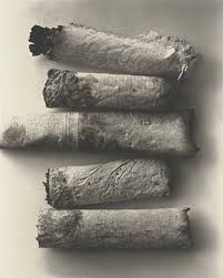
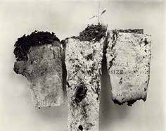
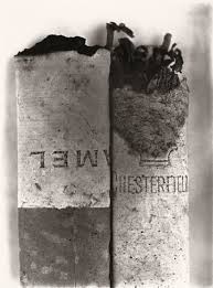
Irving Penn: 1917-2009
Penn was born in Plainfield, N.J. Starting off as an apprentice artist sketching shoes, he went on to become the art director of the Junior League magazine. Penn then moved to Mexico for a year to immerse himself in painting when he was 25 and after that decided that he will "never be more than a mediocre painter". When he returned to New York, Alexander Liberman, the art director of vogue magazine, was immediately interested in what Penn could produce (unlike many of the people he came across). Irving Penn was introduced to photography by Liberman who asked him to take his own photographs for the magazine. One of Penn's still life was published as the Vogue front cover for the 1st October, 1943 issue. In Cigarettes, Penn's intention was to transform normal, every day objects and recreate them to show, or even unveil, their 'hidden beauty'. He picked up the discarded subjects from the streets and brought them back to his studio where he arranged them in minimalist compositions. He printed these images in the platinum palladium process which is a very difficult photographic technique. This technique leaves the prints with "soft, broad tonal ranges and gentle contrasts". The fact that Penn decided to use this technique presents what effect they had on him. Although they were harsh pollutants which lead to many diseases and health issues, Penn takes the effort to not only photograph them, but display them using a time consuming skill. The contrast between the beauty and simplicity within the photo and the knowledge that we have about these objects creates a complicated image in which we are confused as we are appreciating something toxic. This shows there can be beauty in anything. The fact that this beauty is 'hidden', links to the idea of secrets as it is something which the object holds within itself, for itself. It is also representing the codes within general society and the smoking community. For general society there is an understanding that smoking is bad and cannot be carried out in public places, and for the smoking community there is an underlying pressure to conform because it is deemed as 'cool' and even 'social'. |
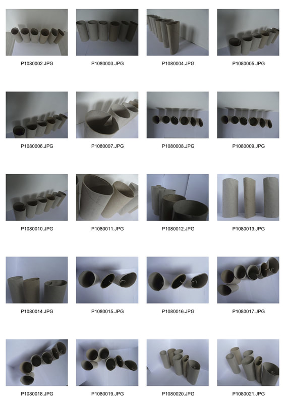
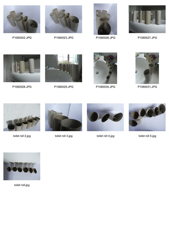
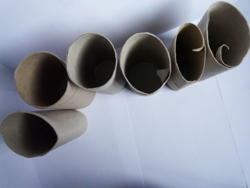
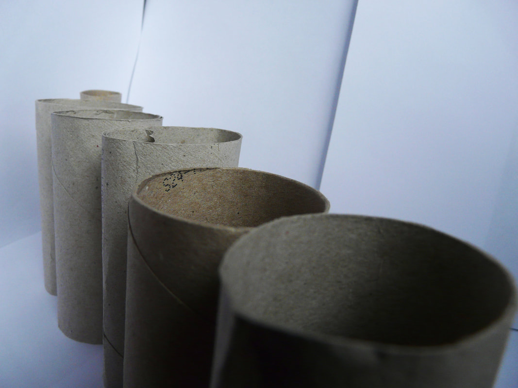
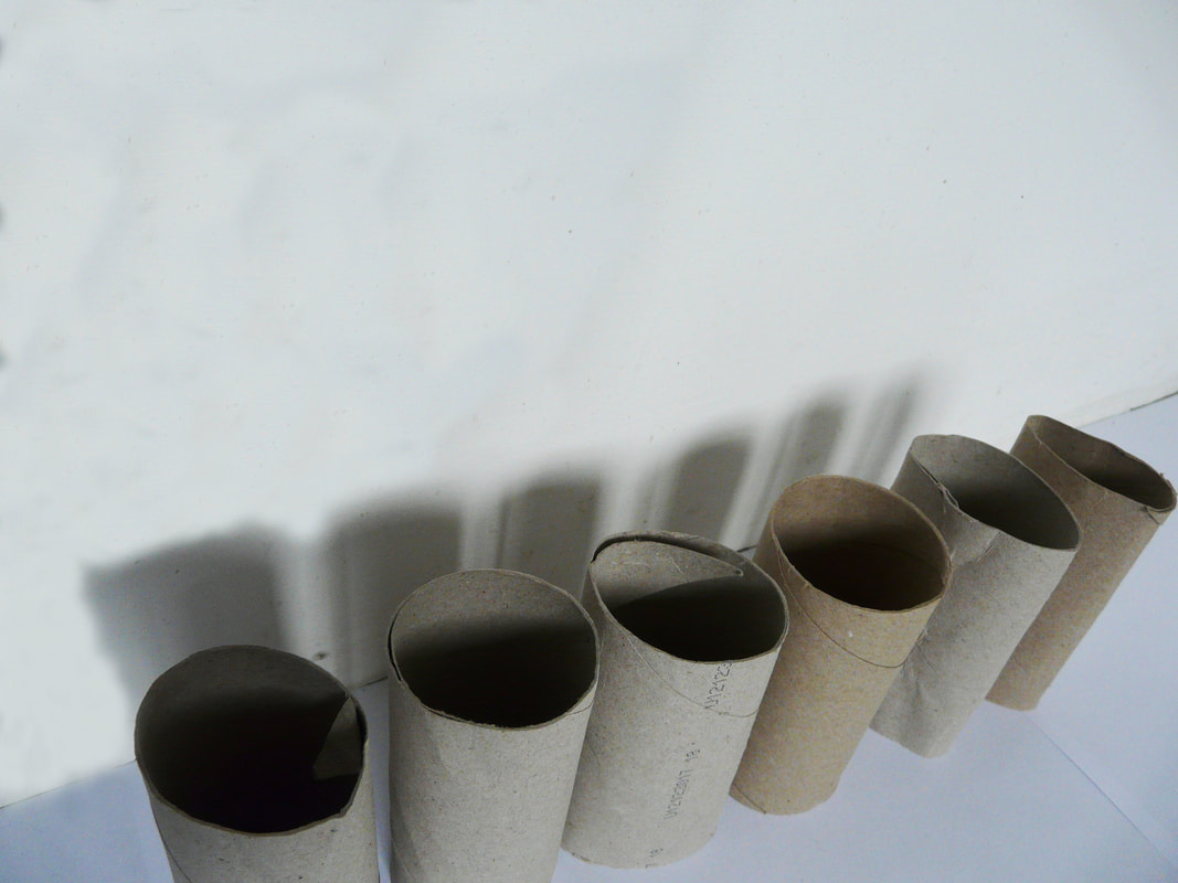
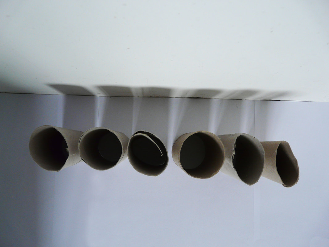
For my interpretation of Penn's work I chose to photograph the ends of toilet roll as they are often discarded with no second thought. I wanted to present them in a way that they haven't yet been perceived. To do this, I rummaged through the bin and searched my house to find as many rolls as possible. Initially I was frustrated that they weren't perfectly shaped and sized but I then realised the true beauty of the 'toilet roll' is the character of it. The fact that they are slightly deformed, ripped and squashed makes them an intriguing image because it shows the imperfections and how that is beautiful in itself. I placed the rolls in different positions with a white backdrop near a window so that I could capture the shadows that the rolls created.
I then returned to the images on Photoshop to adjust the lighting and contrast as it was quite a dark day when I photographed them. I decided to do this so that the photos stand out a lot more and are more striking. |
|
|
1
2
3
|
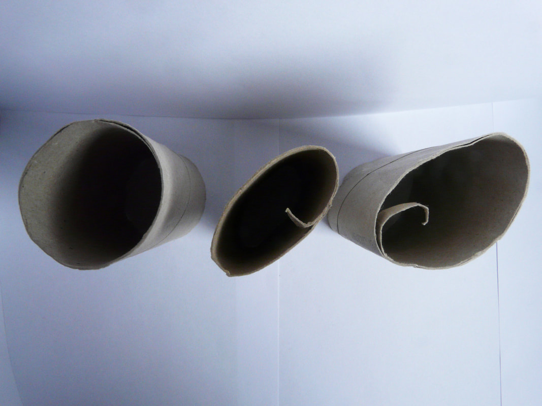
The texture of the rolls in photo 3 is prominent due to the camera being so close to them. This is interesting because the onlooker feels as if they can reach out and touch the slightly rough and bumpiness of the toilet rolls. The viewer can sympathise with the photo because they can remember holding and feeling a toilet roll themselves. It would have been even better if instead of using many A4 pieces of paper to create the backdrop, I only used one or two so that I didn't get the lines going through the image, taking the concentration away from my chosen subject of the toilet roll.
|
|
Photo 4 is not very successful because even though the composition is interesting with good contrast and a pattern of shadows, I poorly used Photoshop to remove a large, distracting shadow on the left of the image. I used the clone stamp. My editing is obvious in the photo and it would have been a lot more successful if I went over the 'shadow' again but with a much lower intensity clone tool. This would have made the transition a lot smoother and cleaner.
|
4
|
5
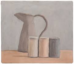
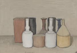
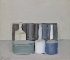
These loo rolls, that have very greyish tones, are much like many of Georgio Morandi's bottles ( as shown below ) which have subtle changes of tonality creating quite a serene atmosphere, accentuating their beauty. Morandi's bottles and my toilet rolls do present 'hidden beauty' tranquil and subtle way which was what I initially wanted to capture.
|
|
|
Task 6: Compromises
|
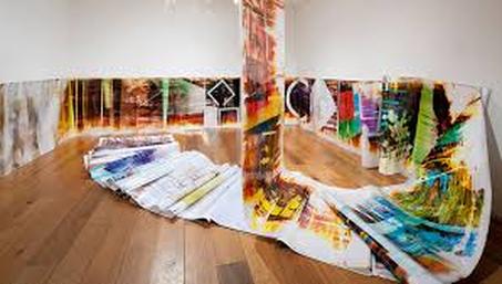
Mariah Robertson: 1975-present
Robertson was born in Indiana but moved to California where she spent her childhood. Now a 'New Yorker', she spends her days in a yellow protective suit in the darkroom creating unusual rolls of art. Her work today derived from a complete accident when her and her friend were searching for something in the cupboard, and her friend, to the horror of Robertson, opened up a roll of photography paper, exposing it to the light and even ruining it (or so she thought)... Determined to not completely waste the roll, Robertson decided to throw and dribble leftover and out of date chemicals on the paper, creating different chemical reactions. Mariah Robertson then discovered the beauty of this technique which created unpredictable, colourful patterns and shapes through breaking the conventions within photography. Robertson was also fascinated by ripping and cutting parts of the photo in unconventional ways, saying that the "rough edges turned out to be the best part". She created rolls of images that would be hung around a room, falling from the ceiling at different heights creating a promenade for the audience to follow when viewing her work, as shown in the image to the right. Her unusual way of creating art fits in with the theme of secrets, codes and conventions as her technique is a method which is usually avoided because it is seen as 'wrong' and also a 'mistake'. Here, Robertson has used something which originally was an accident and an error, and she has created something beautiful. |
|
Inspired by Robertson's work, I decided to use photo 5 from task 5 and experiment with different things in the darkroom to see what will be produced. To do this, I got the image printed onto cellophane so that I could use it as a negative, and then using old, ripped photographic paper, I printed the image. I then played around with leaving it in the developer for different amount of times and even before completely finishing fixing the photo, I exposed the paper to some light which caused the image to go slightly yellow. I also tried putting yellow and blue paint on to them to get the same bold colour in Robertson's work. I even scratched the paper, scrunched it up and taped it which meant light only reached part of the print.
1
2
3
Photo 3 succeeded in my intention which was to experiment in the dark room to create images that were quite abstract due to the unconventional way they were made. It also draws upon the idea of 'glitch', as seen in task 4. The lighter marks on the print were made by using strips of masking tape and putting them in different places on the unexposed paper which meant that the light didn't expose those parts as much as the rest of the image. The yellow tint to the whole of the paper was made when i took the image out into the light before I had put it into the fixer. The other yellow marks were formed by dipping the paper in diluted yellow paint which gives the image an old, rustic quality. Finally, the red mark on the bottom right hand corner was a complete accident and I am not sure how it occurred; but it is not a mistake as such since it adds to the whole idea of breaking conventions and what I was trying to create.
3 Strands:
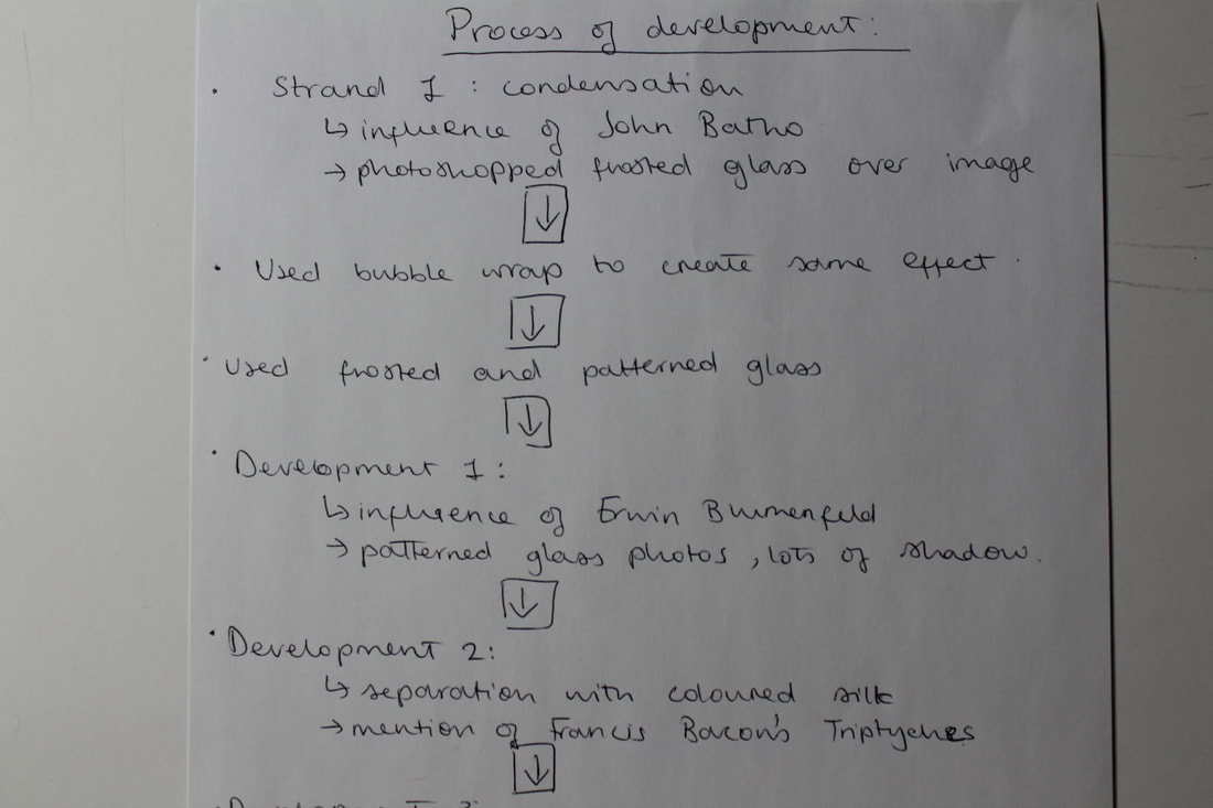
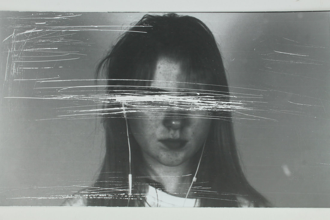
Strand 1: Condensation
|
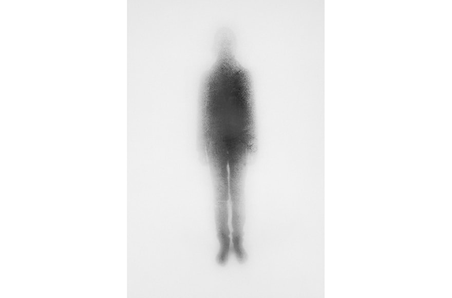
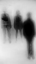
John Batho: 1939-present
Batho was born in Normandy, France and is a photographer who, in an era of predominantly black and white photography, he experimented with colour photography. Using ink-jet print he created images of bold, bright colours in which he explored how it 'enhances or devalues' the subject, focusing on parasols, roundabouts, tents and children's games. In 1998 he created a completely different series of images called "Present and Absent" in which he photographs dark shadows of people standing behind a condensed window with drips and marks which deform the body beyond. This creates a mysterious image where the body becomes quite ghostlike and although it is clear that there is something there, the effect leaves us feeling quite cold and isolated due to the body that appears to be absent in soul, emphasising the idea of "present and absent". Link with exam theme and so my intention for the strand: These photos present the concept of secrets, codes and conventions because of the way we are shown that there is something beyond the mist of the windows but the onlooker cannot see the details of the subjects. Their characters and personalities are hidden from us. My idea is to try and create a set of images which have the same effect by primarily looking at using the condensation of glass. |
|
When I saw Batho's work, I wanted to create something similar and see if I could achieve the same aesthetic. I started off by placing a bowl of boiling hot water under a window to try and steam up the glass, and I then put a very strong photography light outside so that the camera could capture what was out there. Unfortunately this technique did not work- perhaps because there wasn't enough hot water to mist up the whole window, or it just is not as effective at night. These images include the 7 photos that have a bright spotlight surrounded by darkness in the contact sheets below.
|
|
Photoshop:
When I returned to the studio I decided to take some shots with a white backdrop focusing on creating shadows on my subject. I then used Photoshop to place an image of frosted glass over the photos I took, and I gradually erased parts of the 'frost' so that we can see the people beyond. Although the idea is interesting, there is no change in the texture of the photo as the 'frost' is very flat and similar across the whole image; this makes the image less interesting and striking than what it could be with a change in the texture.
When I returned to the studio I decided to take some shots with a white backdrop focusing on creating shadows on my subject. I then used Photoshop to place an image of frosted glass over the photos I took, and I gradually erased parts of the 'frost' so that we can see the people beyond. Although the idea is interesting, there is no change in the texture of the photo as the 'frost' is very flat and similar across the whole image; this makes the image less interesting and striking than what it could be with a change in the texture.
1
|
2
|
Bubble wrap:
To improve upon this, I decided to use what was immediately at hand, and this time photograph my subject but with a sheet of bubble wrap directly in front of the lens. The fact that I was doing it in 'real life' allowed me to adjust the focus on either what was behind the bubble wrap (making the bubble wrap very blurry) or on the bubble wrap itself, making the subject in the background even blurrier. This successfully created a mysterious photograph in which we feel the dark silhouette is coming closer to the camera to confront us, which is what my intention was. I would have liked to have been more extravagant with the positioning of the subject, rather than just having him stand there, arms by his side, however, this posture and body language also shows how there is an essence of coldness and harshness in the photo, which radiates onto the viewer, just like in Batho's work.
To improve upon this, I decided to use what was immediately at hand, and this time photograph my subject but with a sheet of bubble wrap directly in front of the lens. The fact that I was doing it in 'real life' allowed me to adjust the focus on either what was behind the bubble wrap (making the bubble wrap very blurry) or on the bubble wrap itself, making the subject in the background even blurrier. This successfully created a mysterious photograph in which we feel the dark silhouette is coming closer to the camera to confront us, which is what my intention was. I would have liked to have been more extravagant with the positioning of the subject, rather than just having him stand there, arms by his side, however, this posture and body language also shows how there is an essence of coldness and harshness in the photo, which radiates onto the viewer, just like in Batho's work.
3
|
4
|
Frosted glass:
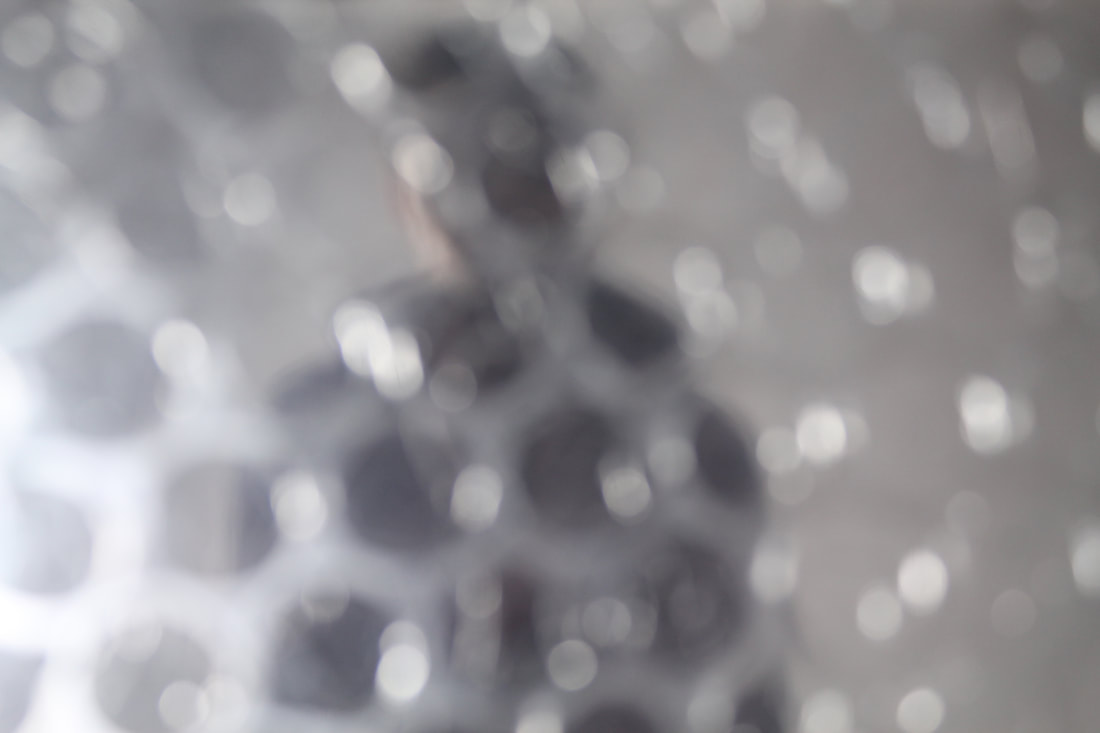
Even though I achieved my intention, I thought I would develop the idea even further and purchase some small sheets of different patterned glass with which I could do the same thing that I did with the bubble wrap. It was interesting to see the effect the glass had on the outcome of the image, refracting the light, causing the image to become completely unrecognisable. This clearly represents the idea of secrets as the face of the subject of the photo is being hidden from us. I would like to develop this idea even further using different methods to create a partition between the viewers and the people in the photo, and in different settings.
Even though I achieved my intention, I thought I would develop the idea even further and purchase some small sheets of different patterned glass with which I could do the same thing that I did with the bubble wrap. It was interesting to see the effect the glass had on the outcome of the image, refracting the light, causing the image to become completely unrecognisable. This clearly represents the idea of secrets as the face of the subject of the photo is being hidden from us. I would like to develop this idea even further using different methods to create a partition between the viewers and the people in the photo, and in different settings.
5
6
|
7
|
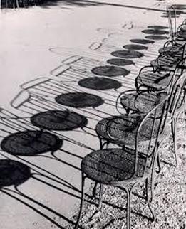
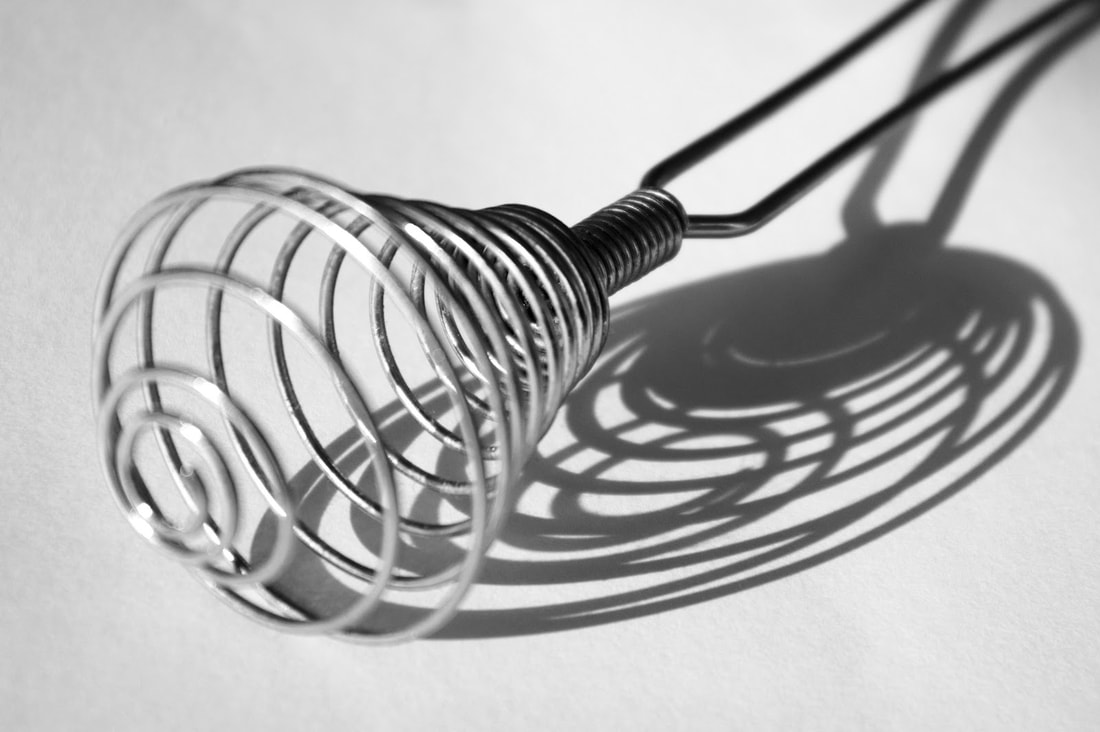
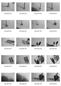
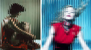
Strand 2: Distorted Shadows
|
Andre Kertesz: 1894-1985
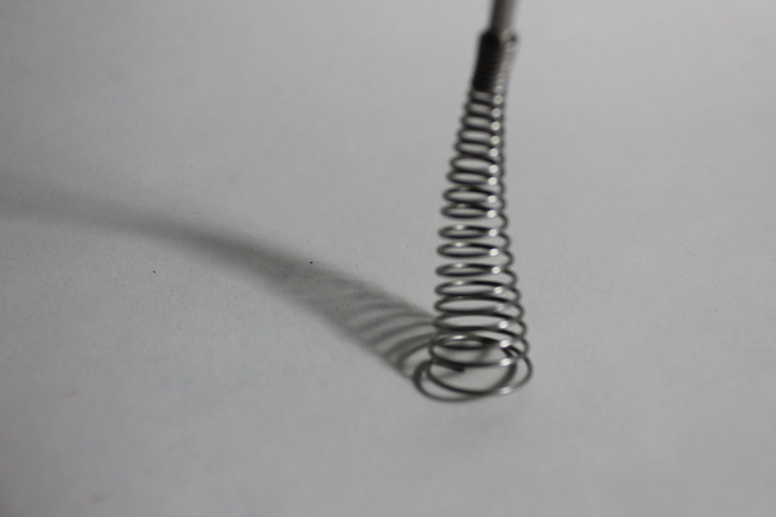
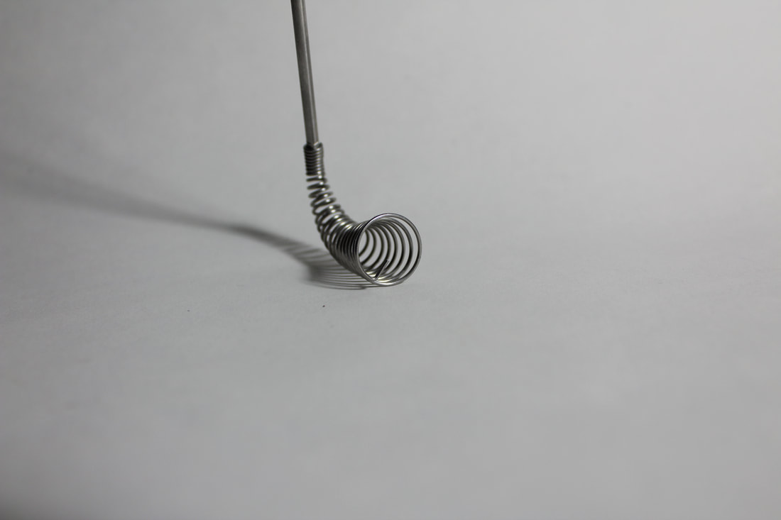
Kertesz was born in Budapest, Hungary to a middle-class Jewish family. Kertesz was interested in illustrated magazines and so once he had earned enough money he was able to afford to buy his first camera in 1912. He took photos of local peasants, gypsies and the landscape of the Hungarian Plains. At the age of 20 he was sent to the front line where he photographed life in the trenches; these photos were mostly destroyed. Eventually, after several years of his mother trying to persuade him not to, Kertesz left everything and everyone and moved to Paris, France to study at a photographic school. Whilst balancing work for magazines, he continued to photograph bold black and whites displaying different objects and incorporating their 'deformed' shadows. Link with exam theme and so my intention for the strand: This links to the idea of secrets, codes and conventions because the shadow of the object doesn't truly present how the object appears to be. The shadows distort and reshape the concept of the object, showing it in a new light. I wanted to experiment with this idea, solely looking at trying to capture the shadow without the object itself, playing a guessing game with the audience about what the object is. I used a photography light on one side of the subject to create the shadow, and then moved the object into different positions to try and find the most interesting composition. My intention was to create quite an abstract image in which the shadow becomes part of the idea of the object. |
|
|
|
|
1
2
|
3
|
In photo 2, it was difficult to make the spring in focus due to it being so close to the camera lens; if it was in focus, it could be a lot more successful. However, the intention behind the photo is not to get a clean depiction of the spring but to have another understanding of the form of the object by looking at it's shadow. Therefore it would defeat the image's purpose to show the spring in focus. Even so, this intention could be presented a lot more clearly if the composition was slightly different- perhaps the spring could be placed a lot more to the right of the photo, maybe even partially out of the picture, so that the attention of the viewer is more on the shadow.
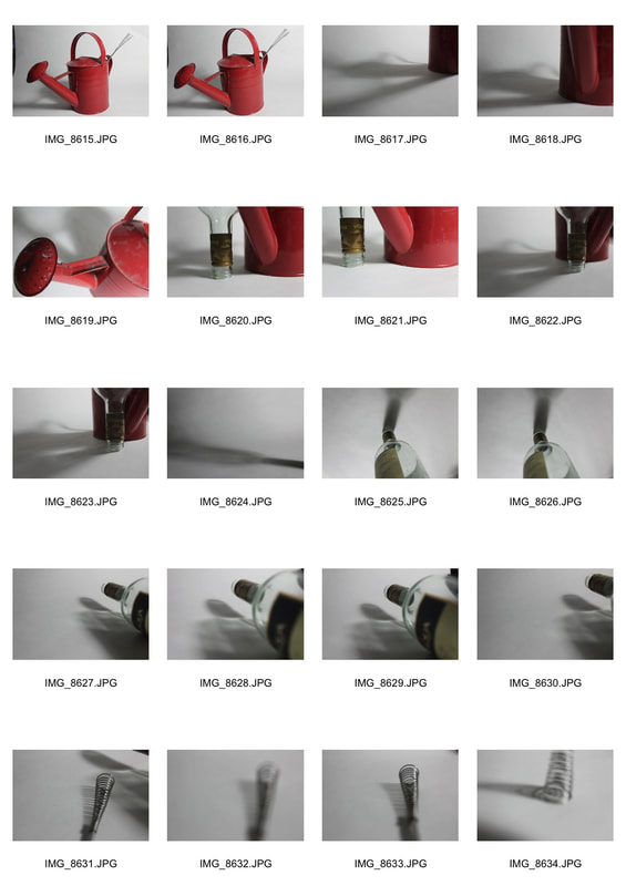
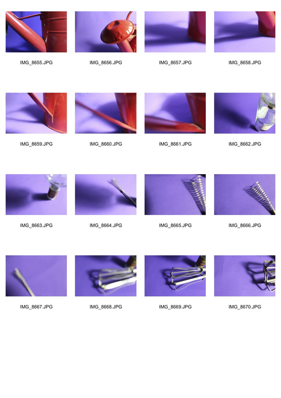
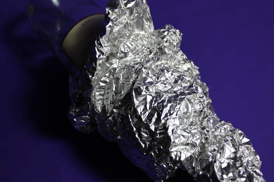
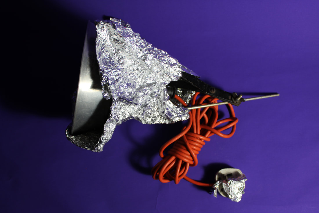
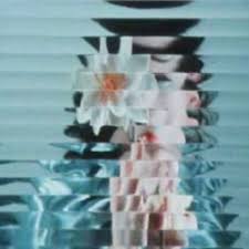
Strand 3: All Wrapped Up
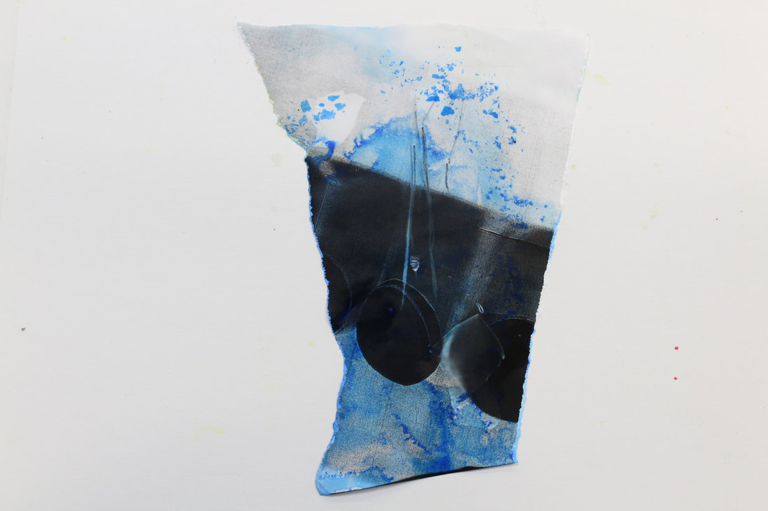
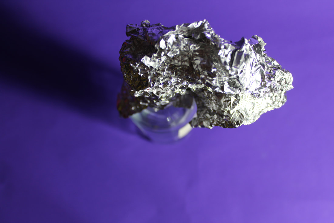
In this strand I wanted to experiment with an image which showed an object out of its natural environment-rather than the wine bottle placed at the end of a dark maroon wooden table amongst half-full wine glasses, it is on a blue backdrop, making the atmosphere of the photo quite technical, documentary-like and organised. To add to this effect I used some silver tinfoil which alienates the object even more from any previous ideas we had about it; this emphasises the theme of secrets, codes and conventions since the code of how the object should be used and presented in is broken.
|
|
1
 2
2
The texture of the silver tinfoil in photo 2 completely takes the onlooker's attention away from the wine bottle, as we observe each crumple, each sparkle of light and each dent of shadows. This encapsulates the audience and the intention of removing the original identity of the object is reached as without previously knowing there was a wine bottle, it may have taken a while for it to be recognised. Perhaps to improve upon this, the tin foil could be placed on the bottle in a much less obstructive way, allowing us more of a chance to ponder on the bottle in its circumstance.
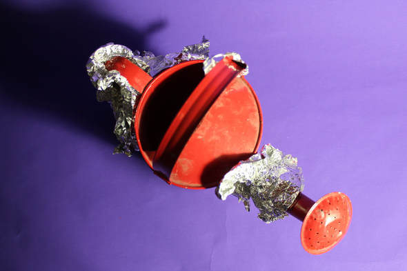 3
3
Photo 3 could be improved and be more successful if the tin foil and parts of the watering can were much more in focus, giving the photo a much more crisp quality. Perhaps it would also be more interesting if the whole of the watering can was covered by the tin foil, so that it would not be obvious that the object is a watering can- this allows the audience to interact with the image, asking themselves what the object could be. This would enforce the idea of secrets since the identity of the object is removed from us.
4
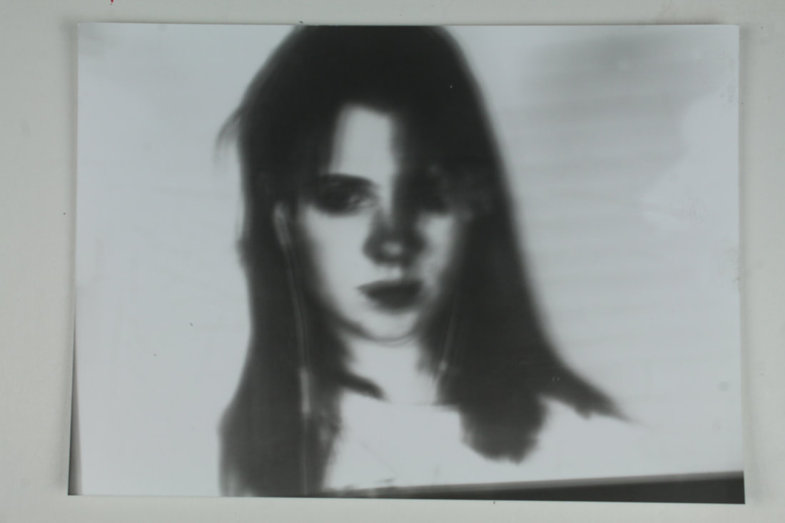
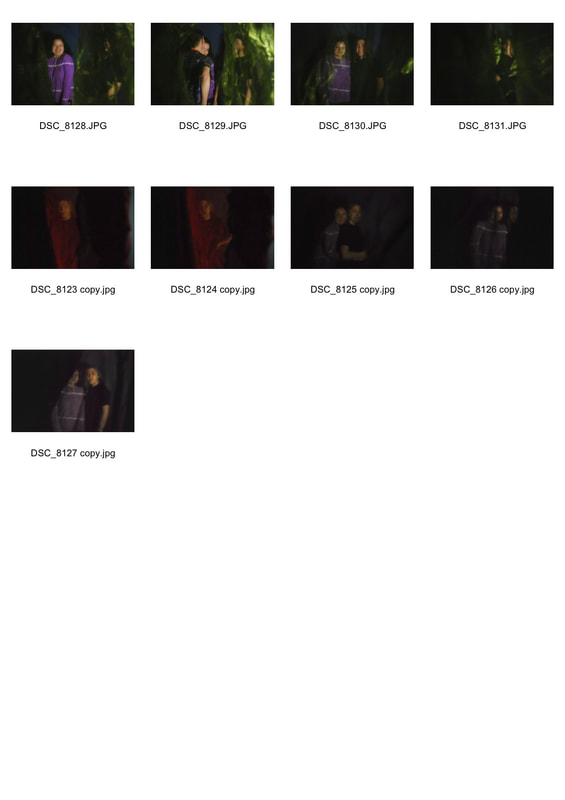
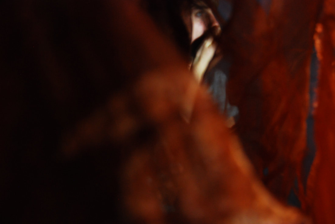
Development of 'condensation' strand:
|
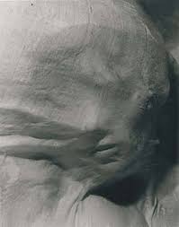
Erwin Blumenfeld: 1897-1969
In Berlin in 1897, Blumenfeld was born to Jewish parents. In 1907 he received a camera as a gift and so took up photography as well as becoming increasingly interested in experimenting with chemistry sets and a 'magic lantern'. His 'day job' was working at his company that he founded in Amsterdam in 1923, which was called the 'Fox Leather Company'- a store that specialised in ladies handbags- after he was an apprentice dressmaker to Moses and Schloechauer in 1913. His photography mainly included women and nudes, and when he found a fully equipped darkroom, he was able to take photos using some of his customers as models. By this time his company was bankrupt. In 1936, Blumenfeld moved to Paris where his career as a photographer truly 'kicked off' and he was commissioned to take portraits of people such as Henri Matisse. He also managed to get a contract with the French Vogue for who he took fashion photographs for. He then moved to New York where he secured a contract for Harper's Bazaar and then after 3 years he became a freelancer for American Vogue. There he continued his fashion photography. Blumenfeld then died in Rome in 1969 due to a heart attack. Throughout his life, Blumenfeld was confronted by various barriers such as the German army when he was planning on deserting it, many camps when he wanted to move to other countries and jail when he wanted to become a citizen of the Netherlands but was arrested due to letting a strap of his swimsuit slip on the beach. This connects to the idea of the barrier of the window. |
Link with exam theme and so my intention for the development:
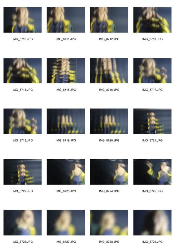
I am intrigued by Erwin Blumenfeld's work above as it incorporates the idea of having a barrier and the distortion of the figure. Both of these link with the concept of 'secrets, codes and conventions': the barrier of the patterned glass is an obstacle for the audience to truly understand the identity of the subject beyond. This creates quite a cold atmosphere in which secrets lay. The distortion defeats the conventions of society and portraiture as once again the subject in the background isn't visible in their true form. I wanted to recreate this idea as, like in my first strand, I was keen on creating an air of coldness and distance in my photos, and with the use of a physical barrier between the camera and the subject, I believed this could happen. I also wanted to focus on the use of light and shadow and how that can effect the atmosphere of the photo, with more shadows creating quite a chilling environment. |
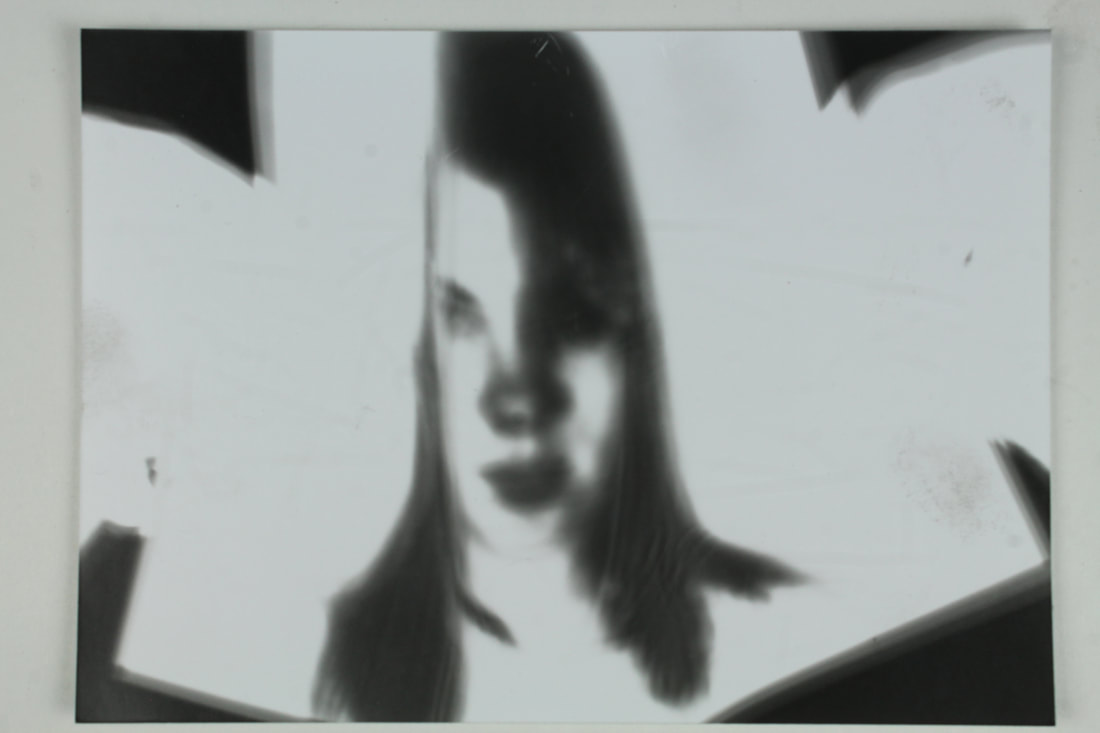
The effect of the following images makes the onlooker feel as if they are in a room looking out through the glass, seeing a figure that they are unfamiliar with. It comes across as quite ghost-like as, even when she is up close to us and the camera, there is a sense of a distance between us and the figure. The distortion adds to this effect as we can't see the facial expression, or any features, of the figure that could give us anything like emotions which we recognise in them- no relationship is built.
|
|
1
3
|
2
4
|
5
|
6
|
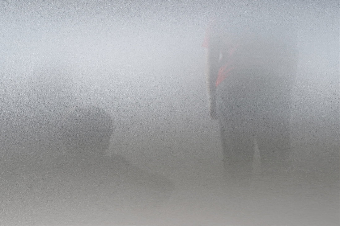
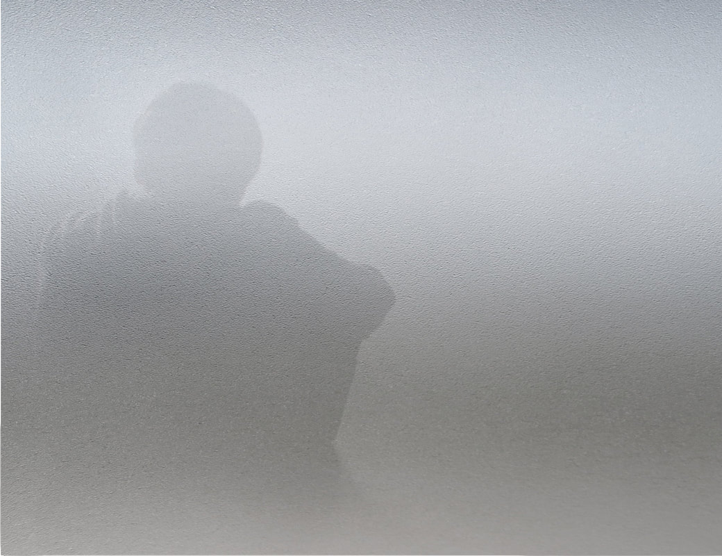
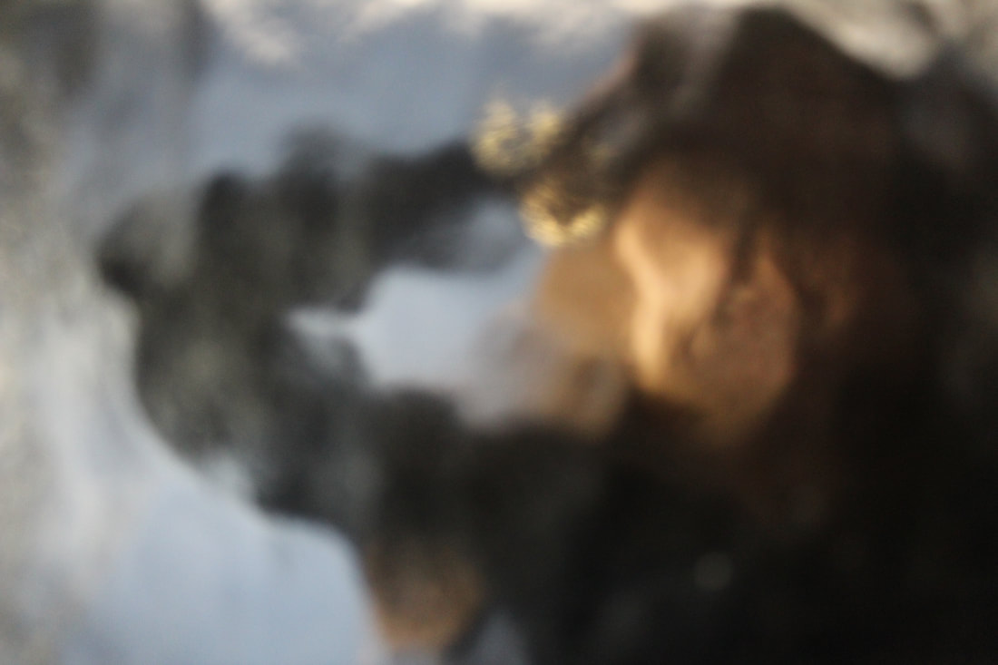
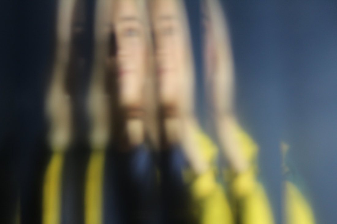
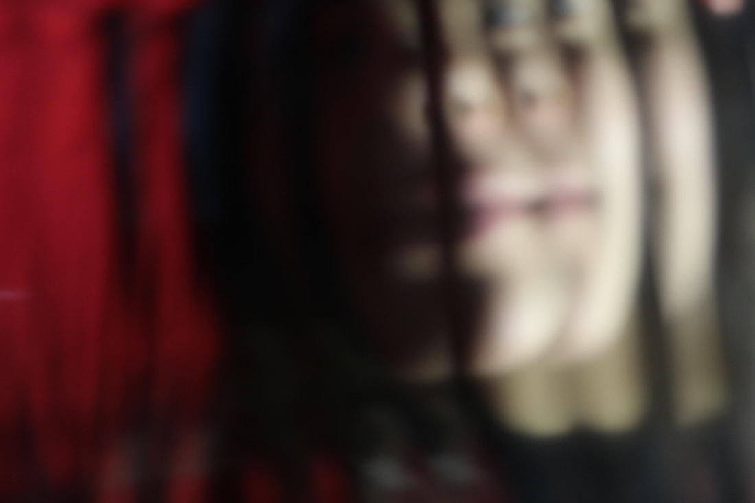
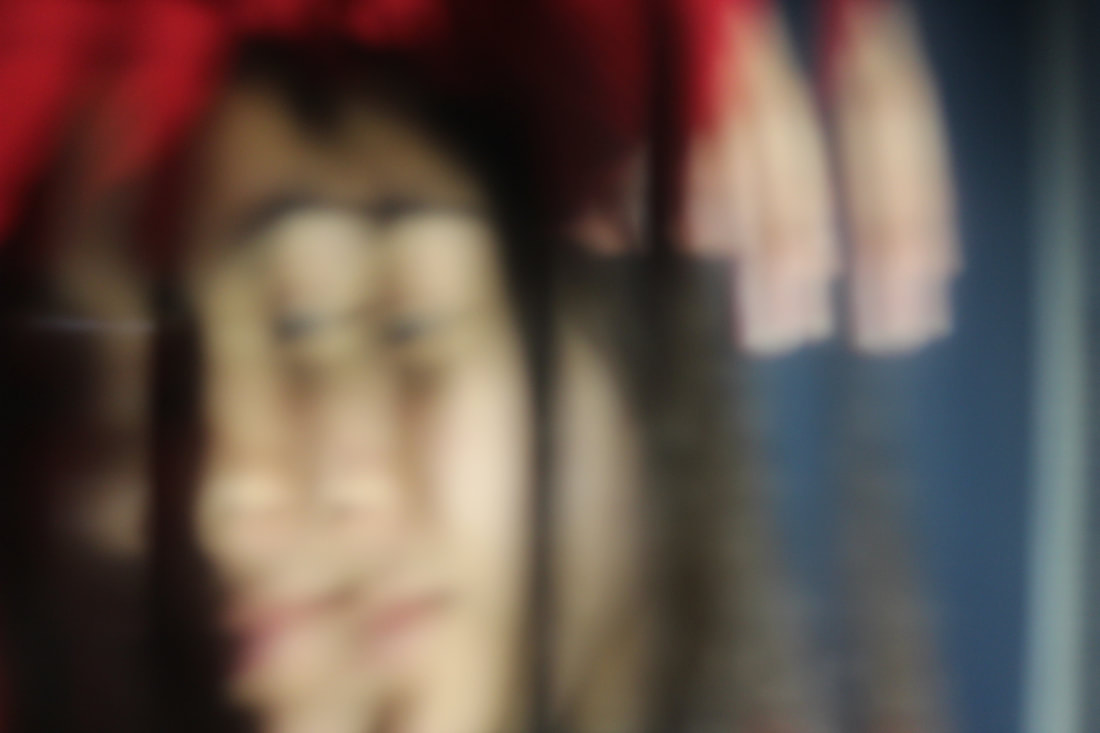
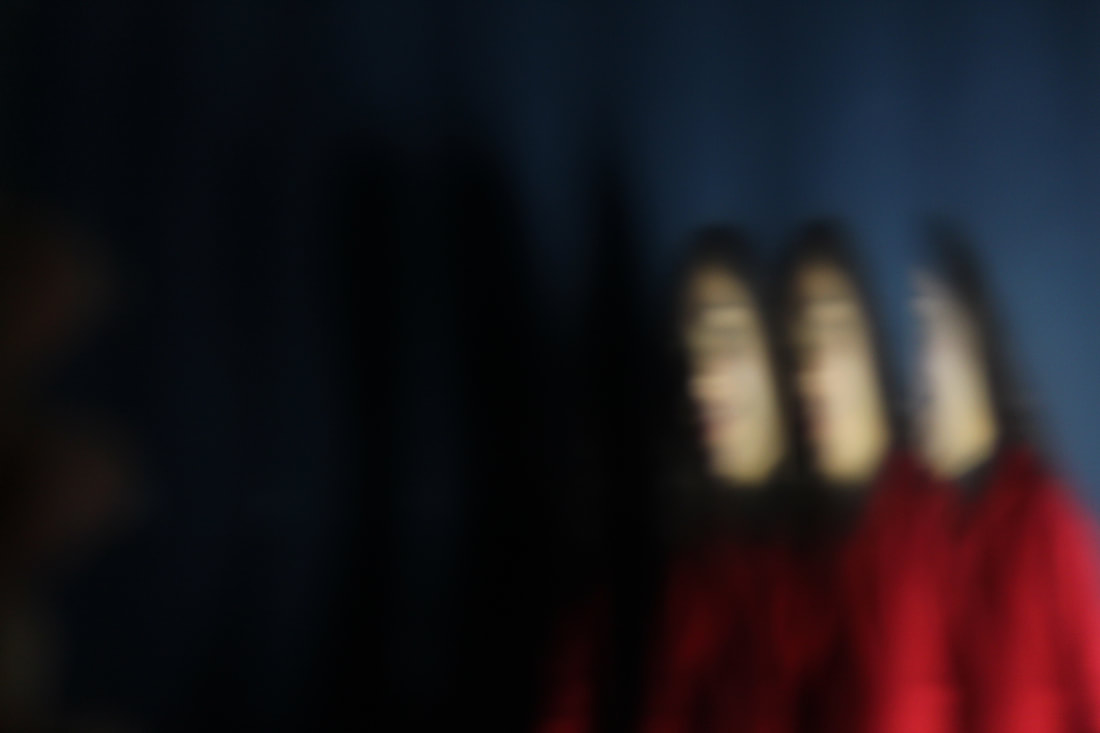
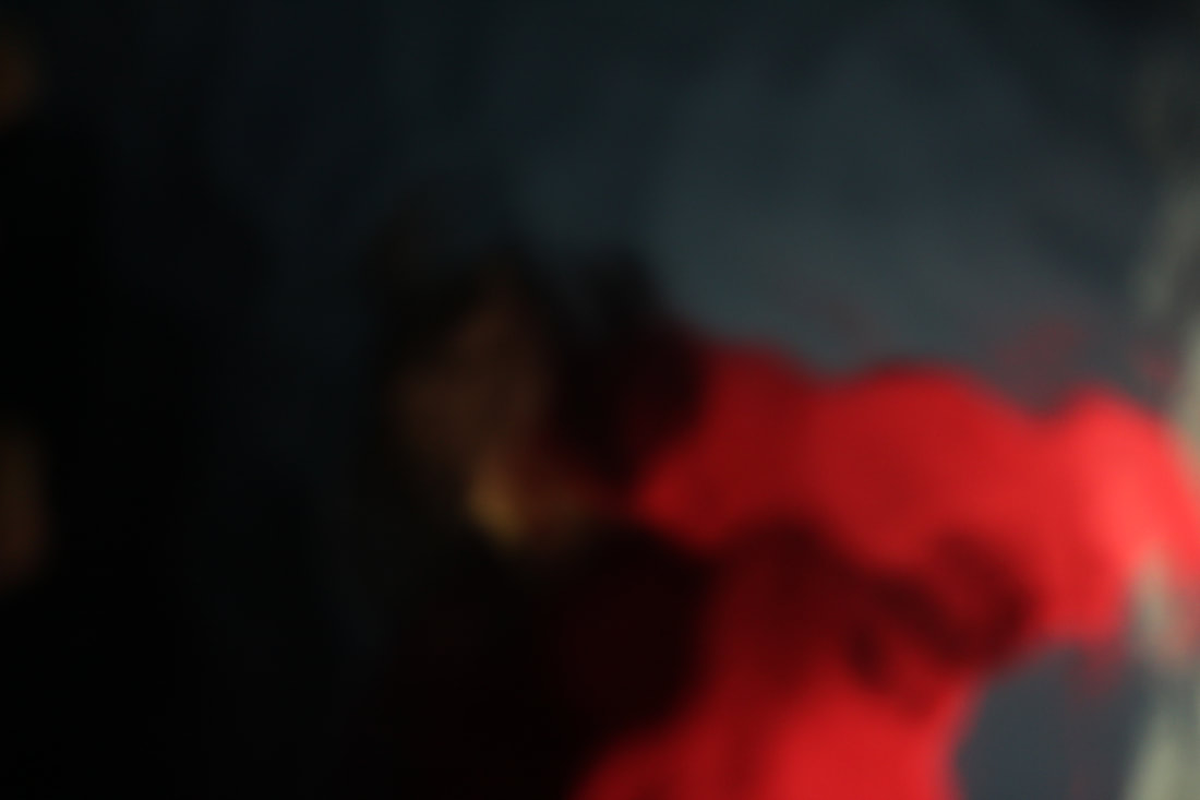
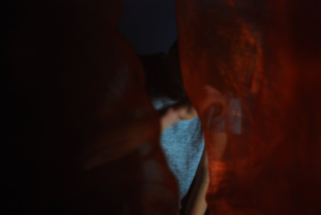
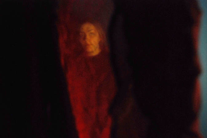
Photos 5 and 6 clearly represent the idea of the use of lighting within the image to add to the effect of an eerie photo. The manner in which the darkness encompasses the majority of the image creates the same effect as in the garden at night in task 3: there's a space that the viewer can never know if anything is there creating a sense of uneasiness. This also means that the audience's full attention is on the lady in red, analysing her movement, body language and shape. The fact that the patterned glass creates repetition in the image emphasises the idea that we can't comprehend the lady's 'true' form. It also brings about an idea that perhaps the camera is shaking- even though it isn't. I would like to reuse the bold colours, like the red, and how there is a lot of shadows which cover half of the figure, creating a sense of mystery.
|
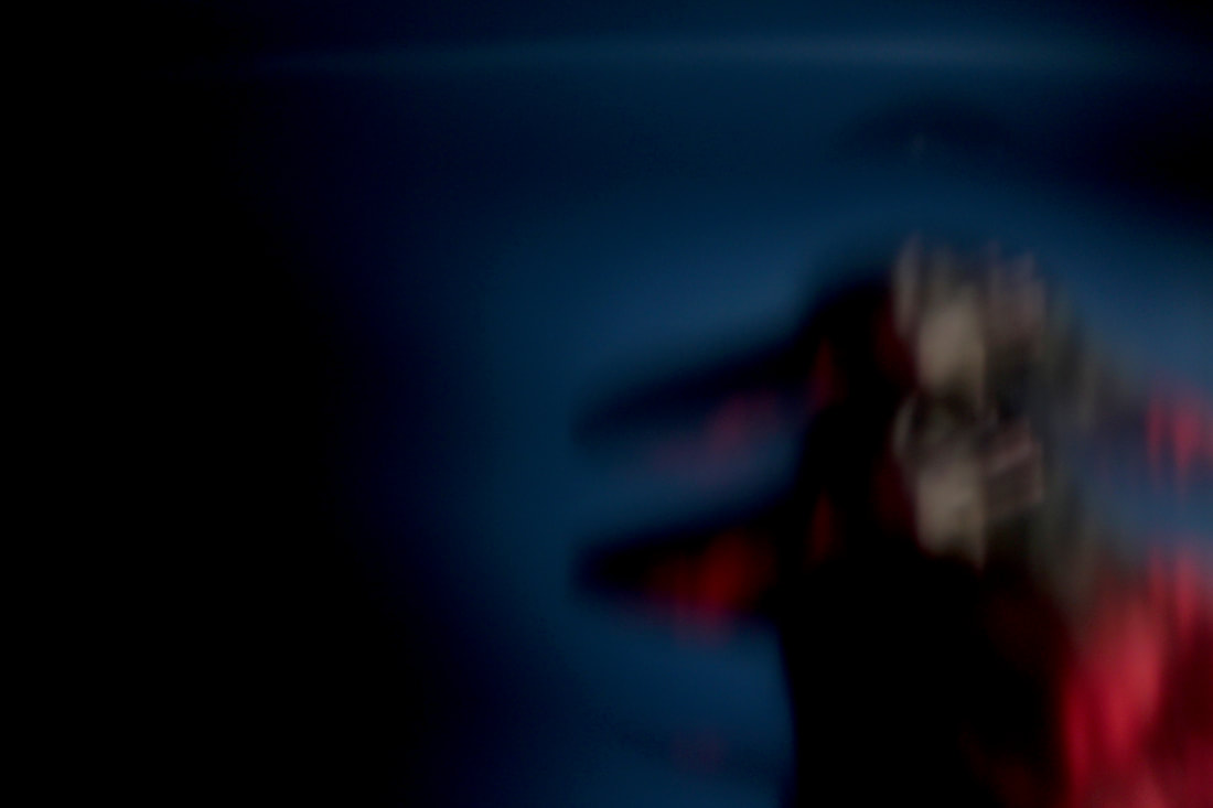
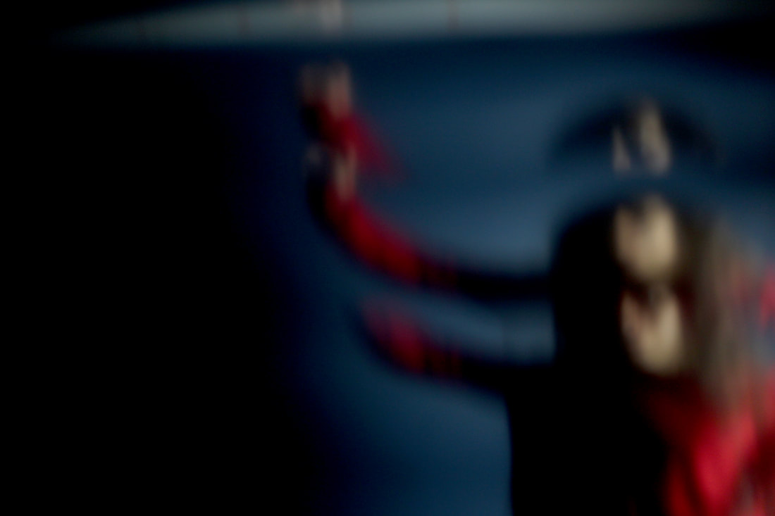
Photo 7 is not as successful compared to photo 8. This is because although it uses the same concept of repetition as the photos above, each section is very similar to the last and there seems to be no change. It is a very static photo. Picture 8, however, uses a different type of patterned glass which makes the refraction a lot more fluid and pleasant to the eyes. This fluidity makes it appear as if there is movement when in fact, there's as much physical movement in photo 8 as there is in photo 7. The shadow also embraces the whole face of the figure, leaving quite an abstract blotch of bright red- this creates much more mystery compared to photo 7. However, although photo 7 isn't as successful, the harsh light showing only part of the model's face contrasts with
|
7
the pitch black/ blue right to the left of it. This contrast is effective in creating the eeriness and the uneasiness I was looking to create as it feels like this figure has come out of nowhere.
|
8
Development:
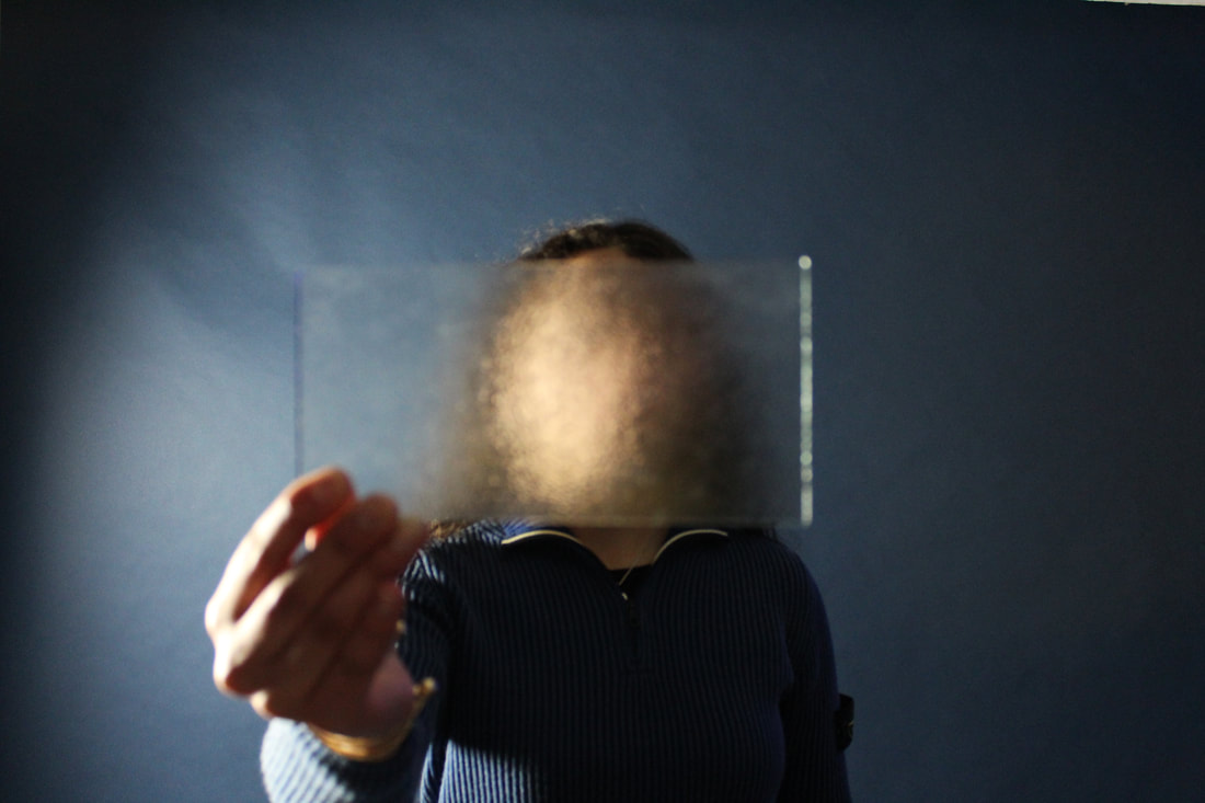
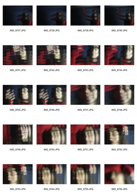
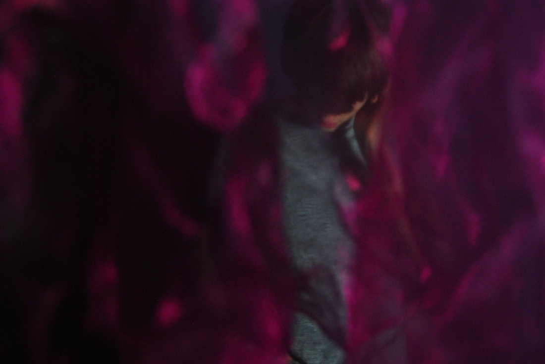
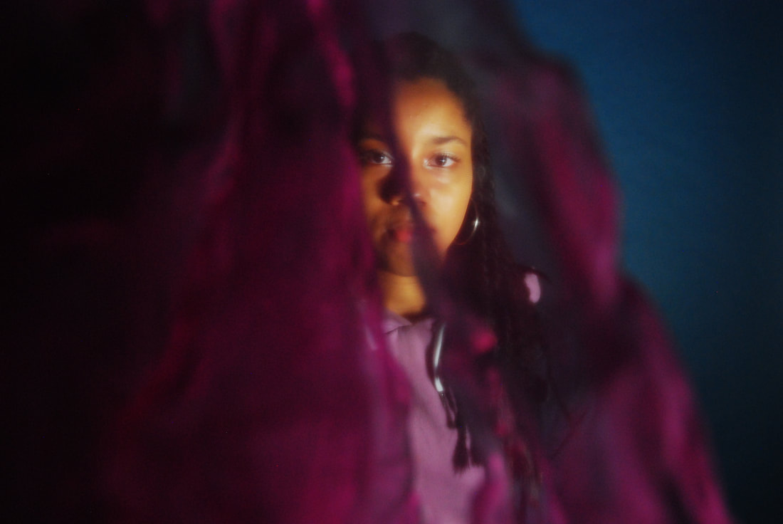
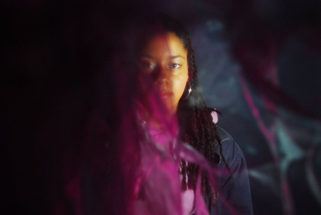
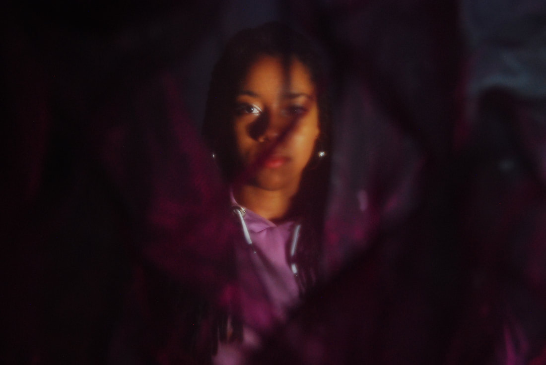
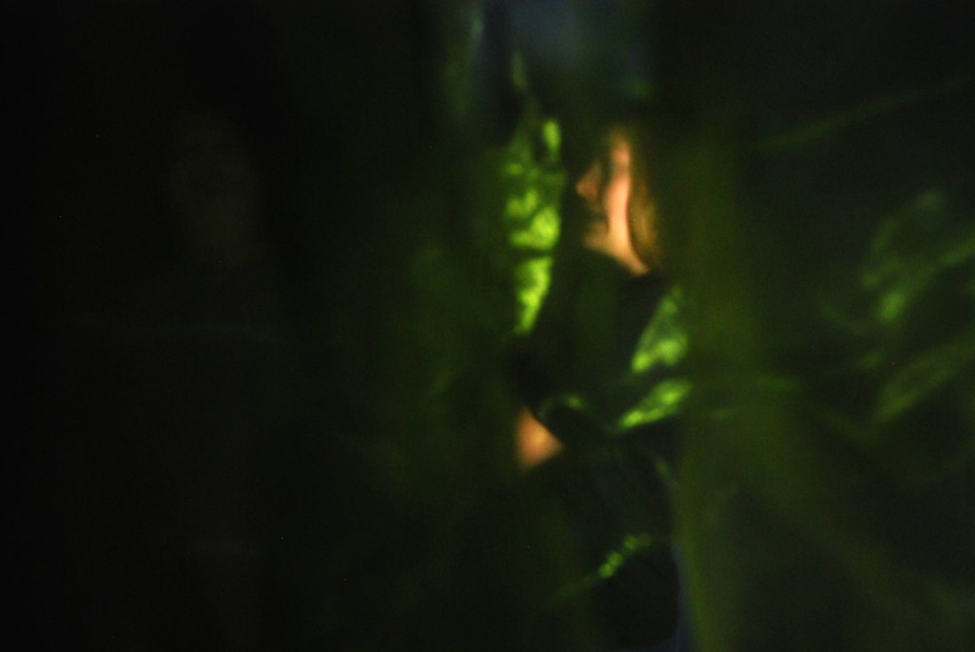
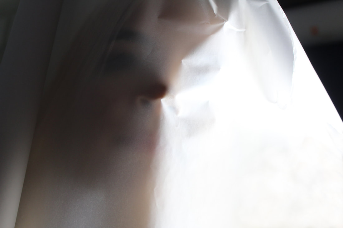
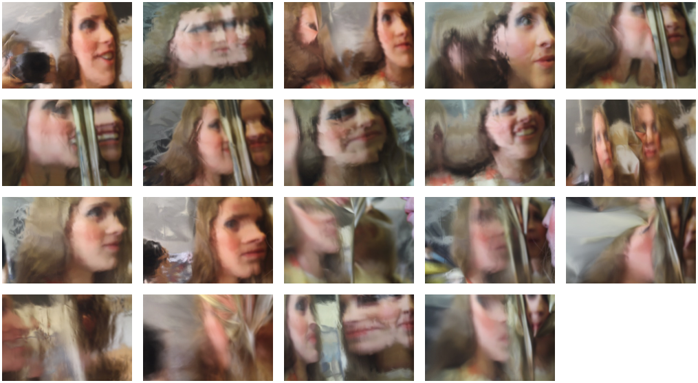
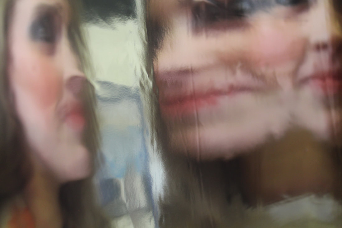
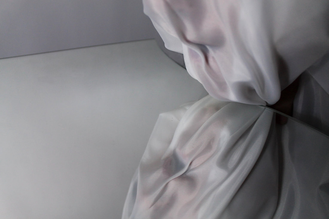
In this development I wanted to continue with the idea of having a barrier between the onlooker and the figure. This time I wanted to use a curtain of silk for a much softer partitioning which allowed the atmosphere to be much lighter and less sinister. The use of bold colours was still implemented into the image. Unlike the previous development, I find that in these following images, rather than us looking out at the figure, this time we are looking in. What this means is that there is a lot more movement and activity occurring beyond the curtain, and so it feels as if we are observing the person, taking a glimpse of their life. This is highlighted by how the material falls which only gives us a small window to see the person in the background. Now it is us, the audience, who is the 'secret'.
|
|
1
2
|
3
|
4
|
5
|
6
|
|
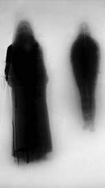
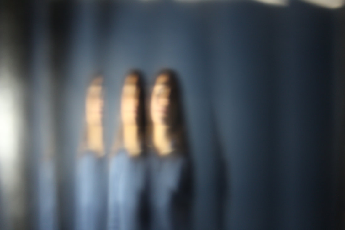
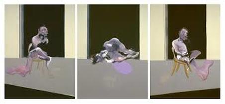
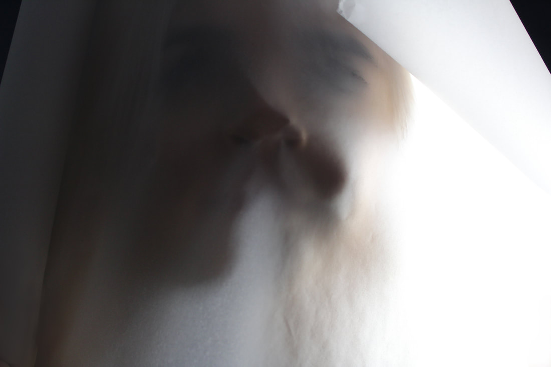
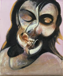
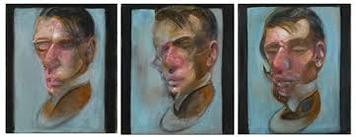
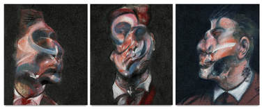
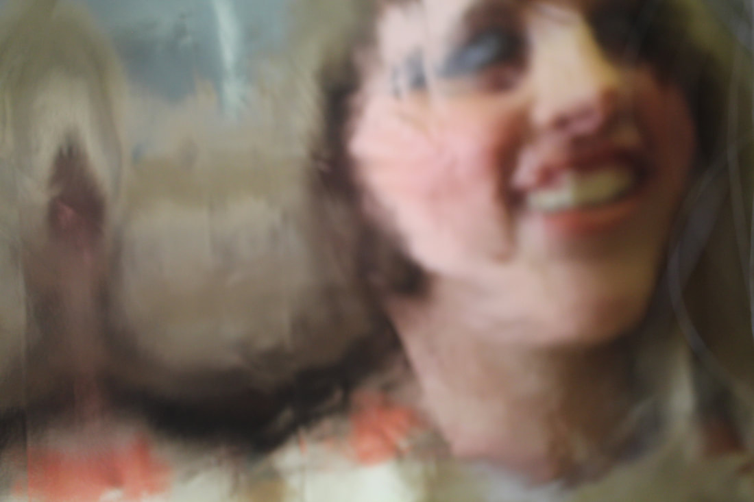
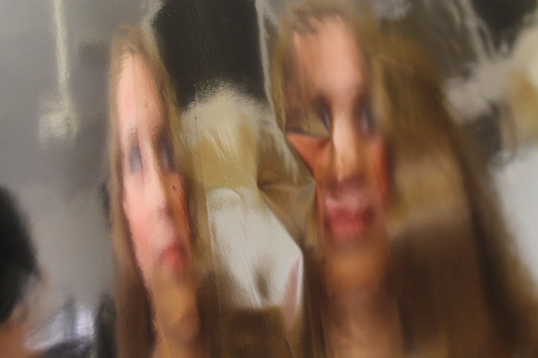
Photos 4, 5 and 6 are quite striking. The way that the model is staring directly at the camera, at us, creates a juxtaposition as it in some way removes the camouflage and the barrier of the curtain, exposing us to her. These three images work as a sequence as the silk is drifting from the left hand side to the right, swallowing up the girl. The structure of the piece as a whole reminds me of Francis Bacon's triptych in which he has three sections- the two on the outside are very similar whilst the middle one stands out as being different. This would be an interesting idea for a final piece as it neatly ties the photos together and can create a story within them.
|
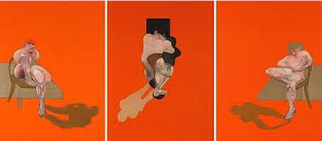
a Francis Bacon Triptyche
|
 7
7
For this photo, number 7, the fabric was quite thick which meant a small amount of light that was reflecting off of the model was received by the camera. Therefore the image was very dark which meant that I had to use Photoshop to adjust the brightness and contrast using that specific tool. This then means that the image is very 'noisy' in terms of how crisp the quality is. Although this would normally make the photo unsuccessful, I find that here it actually adds to it, causing the features of the figure to be less recognisable.
8
Development:
|
Erwin Blumenfeld:
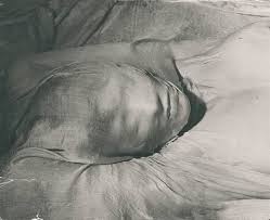
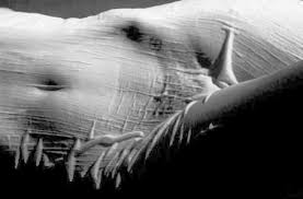
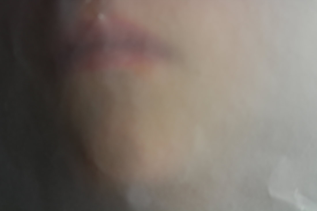
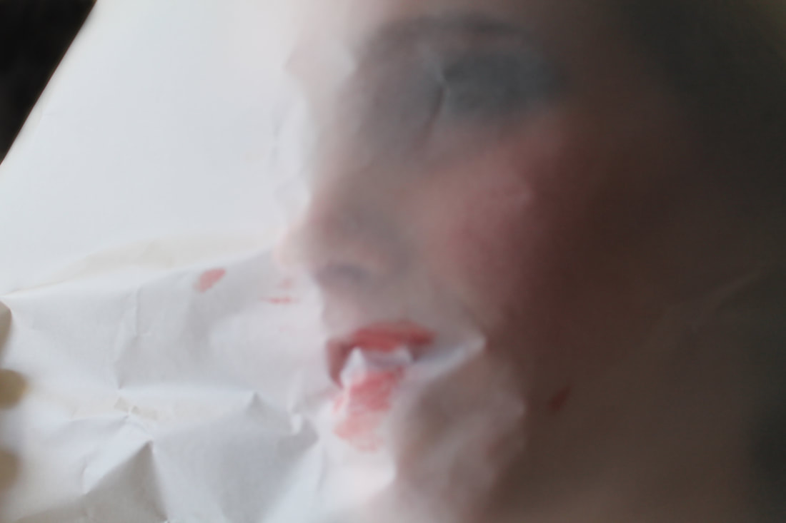
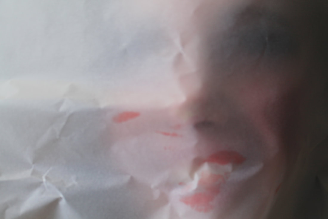
To develop the idea of barriers and partitioning even further I looked at Blumenfeld's work again. He experimented with covering women in wet silk which allowed it to reach every crevice of the body, leaving only an imprint of the face; this resembles the bodies preserved from the volcanic eruption in Pompeii which gives them a very sorrowful and melancholic, yet peaceful and still, quality. I decided to use tracing paper which is translucent so there is still a lot of texture for the camera to pick up. I found that it creates a very tranquil atmosphere, causing the colours of the figure's face to become much more neutral and pastel-like. The crumples and dips in the tracing paper not only add to the texture of the image but also deform the features of the face by allowing the light to hit different parts making it too bright for us to see. Link with exam theme: The way that the fabric covers the face hides the details from us in a very secretive way. Once again this deforms the structure of the face and the body which is breaking the conventions within how things should be presented. |
|
|
|
1
|
2
|
3
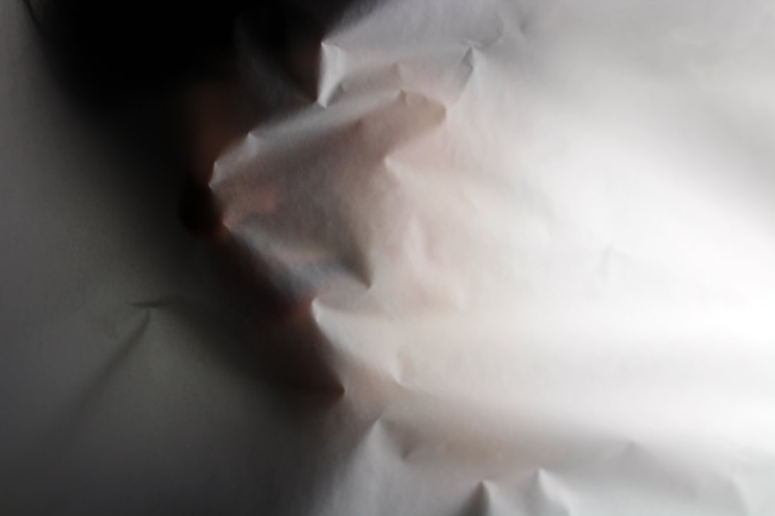
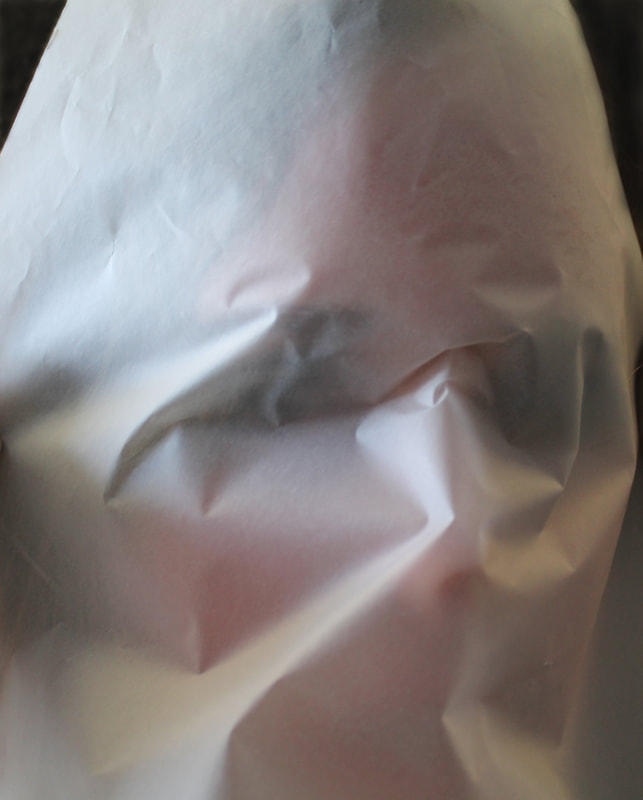
Photo 3 has a very peaceful and serene air about it which is due to the soft palette of colours. Once again,the way that the paper crumples changes the composition and structure of the face, deforming it. This was precisely my intention. It is interesting to see the colour of the lips through the paper when considering how bold it is compared to the rest of the image. Perhaps the photo could be even better if this colour was much brighter because it would create a stronger focus point in the image. In my next development, I will experiment with this idea of colour.
4
|
5
|
6
Development (with colour):
In this development I wanted to continue to experiment with the idea of using tracing paper to create a distant yet intimate relationship with the viewer, but this time with much more colour by adding very drastic makeup to the model. Unfortunately it was difficult to create the same serene effect due to there being no photography light and studio at hand, so I used the natural light with the window to the side to attempt to get some shadow on one side of the face.
1
|
None of these photos are as successful as the previous development which is evident through the fact that there is not a lot of change of tone across each image and the composition of them are not as well set up as before. The prior reason is due to not using the proper lighting system in the studio (lack of access to the right resources) and the latter could be because of losing inspiration for other images to create using the tracing paper. I also find the use of colour is not as effective as I thought it would be as it does not seem to fit with the haunted and serene style and atmosphere I was originally going for.
In photos 2 and 3, the smearing of the lipstick on the paper interests me as it adds to the idea of changing the face. I would like to use this again, focusing on the 'smear' idea. Perhaps these two photos would be more effective if they were more in focus and more crisp, presenting a clearer view of each dent in the paper. |
2
|
3
|
Development:
|
For this development I explored deeper into the idea of distortion and "smear"- which I mentioned in the last development- by using a shimmery golden material with which I photographed the reflections of the model whilst I shook the curtain and they occasionally blew on it. This meant that I could capture multiple reflections of the figure with their strange face proportions. The curtain also presents much more of an abstract idea of separation and barriers, which adds to the deformation of the images.
This links with the theme of Secrets, Codes and Conventions as it violates the codes of how the proportions of a face should be and that they should be presented in such a way within traditional art. It disobeys the conventions much like Francis Bacon's work as shown to the right, who I acknowledged earlier. |
|
1
2
|
3
|
Photo 3 is intriguing due to the way that there is so much distortion which makes it quite difficult to recognise the subject of the image and where it actually is. This may be because of the movement of the face into the crease on the left hand side, removing most of the figure's key features which is also slightly haunting. This effect was created by the model blowing into the material. The two repeated faces on the other side of the crease add another dimension to the photograph as they give it something static to hold it together. It also creates quite an uneasy sense that there are more people beyond the forefront of the image, who we can only glimpse at, with there gaping mouths and dark holes for eyes.
This photo, for me, is more successful and interesting than photo 4 as there is a lot more 'going on'... Photo 4 only has two static figures who are both facing the camera, which removes any disturbing atmosphere since they are not hiding anything from the viewer. There also is not much depth to the image, especially compared to photo 3, as the background does not have a lot of form which means that even though this allows us to focus on the two figures, it prevents the audience from having an insight of the context and setting of the photo. Although this in some way could create a mystery, in this image there is absolutely nothing to entice us to regard the background so in fact, it is not even holding back any information that the onlooker may be struck by.
This photo, for me, is more successful and interesting than photo 4 as there is a lot more 'going on'... Photo 4 only has two static figures who are both facing the camera, which removes any disturbing atmosphere since they are not hiding anything from the viewer. There also is not much depth to the image, especially compared to photo 3, as the background does not have a lot of form which means that even though this allows us to focus on the two figures, it prevents the audience from having an insight of the context and setting of the photo. Although this in some way could create a mystery, in this image there is absolutely nothing to entice us to regard the background so in fact, it is not even holding back any information that the onlooker may be struck by.
4
Development:
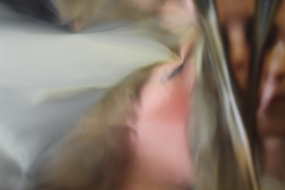
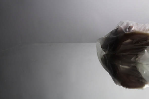
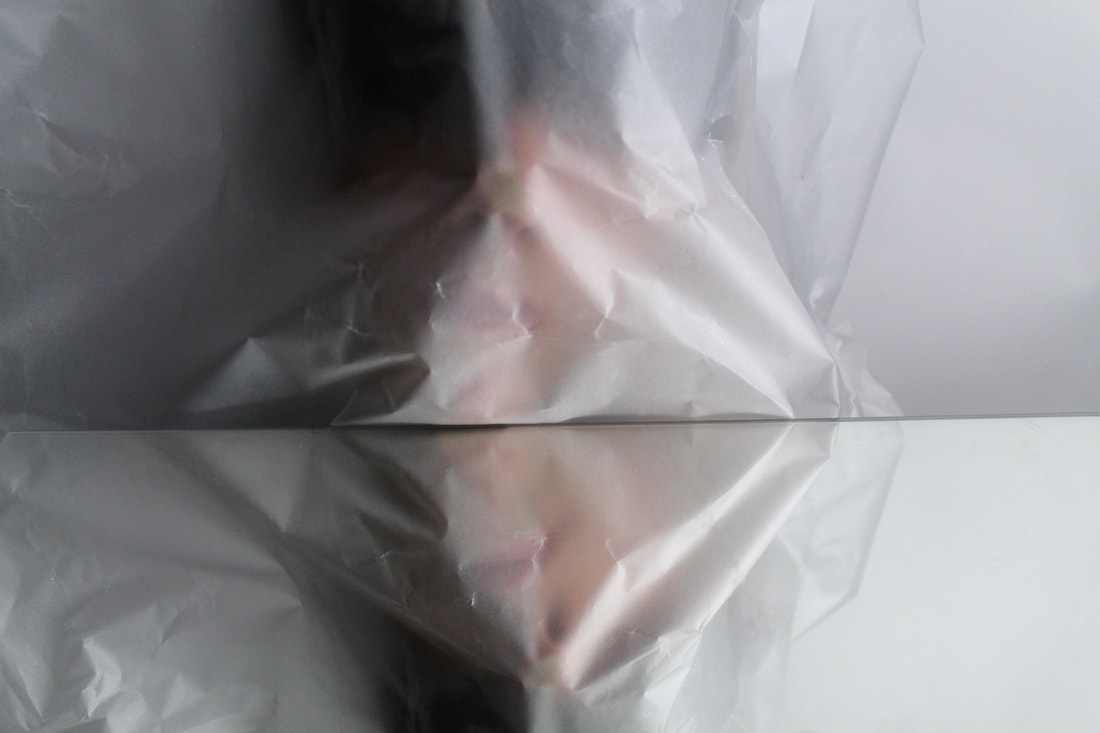
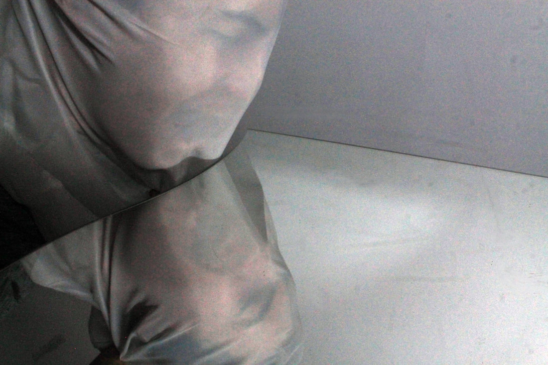
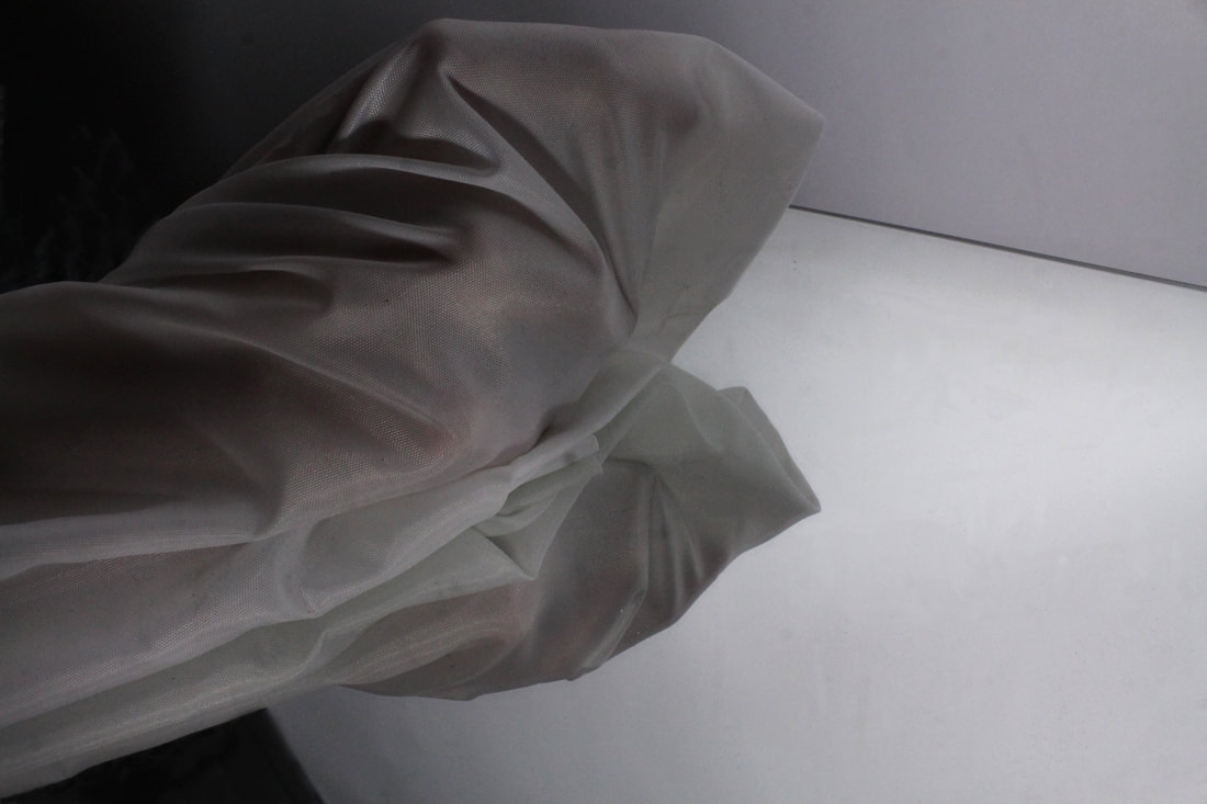
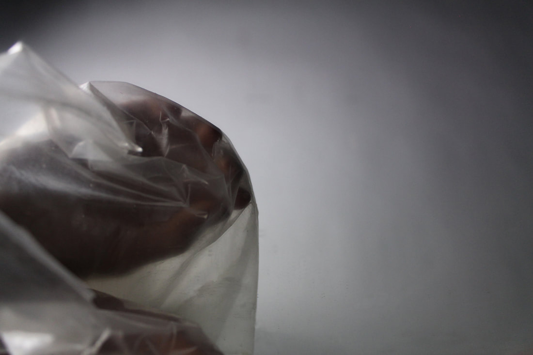
I decided to return to the idea of using tracing paper to create the barriers and sense of disjunction and separation as, unlike the previous development in which this concept was very abstract, I wanted my final piece to present the idea more clearly, especially if there is no context for the audience to understand my intentions. This time, as well as using tracing paper, I used some other mediums as well which included a plastic bag and a piece of thick, silky material and a mirror. This allowed me to explore various other techniques to present my intention, for example, with the silky material, I instructed my model to breathe in a lot more forcefully than normal to allow the fabric to arrange itself closer to the face, so that we could see more of the figure's physiognomy, like in photo 2 in my final piece. The mirrors draw upon the idea of reflection from my last development, however this time there is a lot less movement and deformation. It also has an effect of creating much more empty, negative space that creates the sense of isolation which highlights the theme of Secrets, Codes and Conventions; this is because secrets can leave someone feeling so lonely.
|
|
 1
1
Photo 1 is a very simple photo. This simplicity comes from the large amount of negative space in which there is a gradual change of tone from dark to light, the closer we get to the hand on the right. The use of the horizontal line dissecting the image, which also fades out but in the opposite direction, in some way creates a balance between the strong silhouette of the hands and the sheer void of the open space. The fact that the hands (the one hand and its reflection) are in so much open space creates an atmosphere of isolation, this is added to by the very neutral cold colours of the image as a whole- this has an effect of having no comfort or hospitality within the photo, which was my intention. Emphasised by the suffocation of the hands in the plastic, perhaps the onlooker can empathise or even feel a connection to the photo as maybe, once, they have felt so secluded.
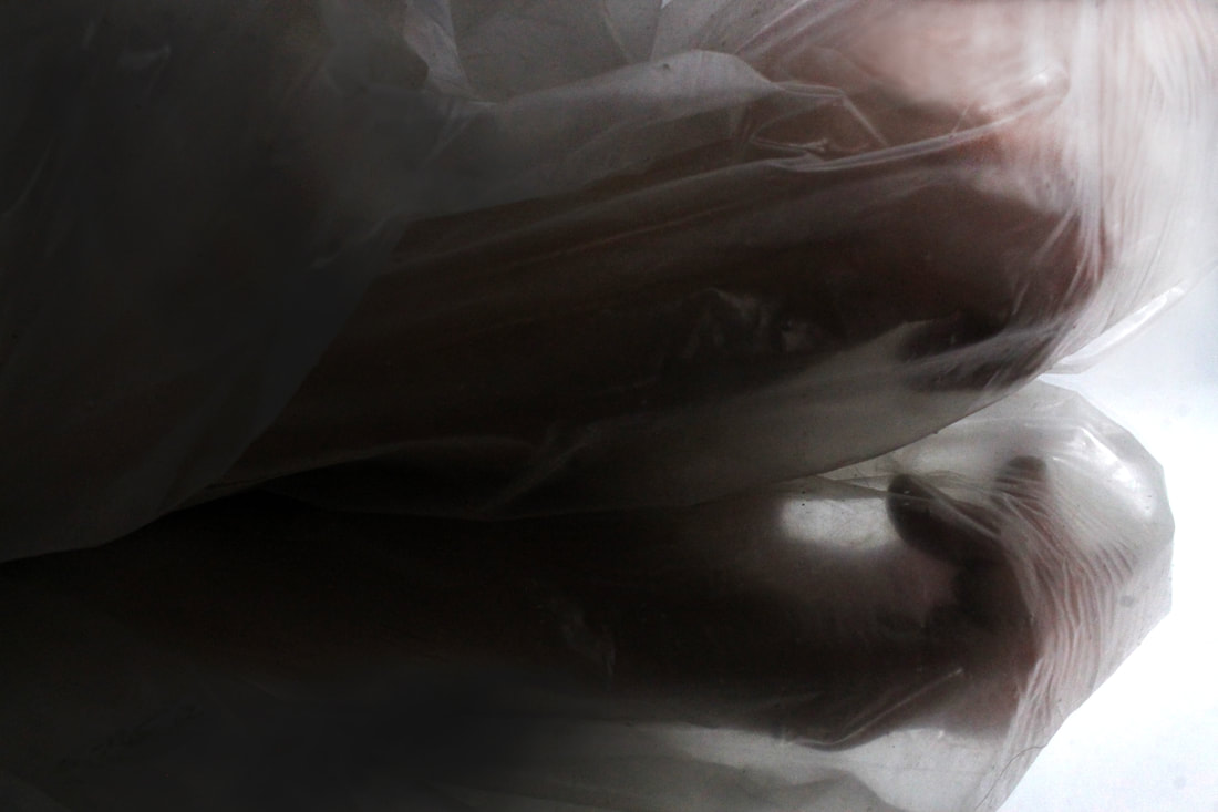
For this image, I used Photoshop to remove any visible dirt on the mirror or unwanted shadows or shapes. I did this by using the clone stamp tool and pressing 'alt' on a near by area, then holding the mouse over what I wanted to remove. This decision was based on the fact that I wanted a very clean photo with no distracting features. This image could be improved even more if the hand was much more crisp and in focus.
For this image, I used Photoshop to remove any visible dirt on the mirror or unwanted shadows or shapes. I did this by using the clone stamp tool and pressing 'alt' on a near by area, then holding the mouse over what I wanted to remove. This decision was based on the fact that I wanted a very clean photo with no distracting features. This image could be improved even more if the hand was much more crisp and in focus.
2
|
3
|
4
5
Final Piece:
Three Studies of Solitude
My final piece for the theme of Secrets, Codes and Conventions, the "Three Studies of Solitude", has quite a heavy influence of both Erwin Blumenfeld's and Francis Bacon's work. The idea of having a series of 3 images comes from many of Bacon's pieces, and the fact that it is focused on partitioning and the use of barriers which creates distortion of the subject comes from both. The reason I named this piece "Three Studies of Solitude" is because I find that the composition of each image within their individual mediums of separation, and also the very neutral tones, creates quite a cold and suffocating atmosphere, that for me presents the feeling of isolation. This links with the exam theme through many ways:
- The loneliness can be an effect of having or knowing a secret- one can feel out of their depth and beyond help.
- The use of distortion through the pieces of material changes the way we see the subjects, and removing many of their features breaks the traditional codes and conventions of how 'things' must be represented and shown simply as how they are.
1
2
3
Process of developments: